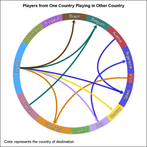
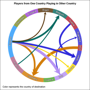
 One request came in for the previous article on Circle link graph, for the addition of arrow heads to indicate the direction of the flow. Given that I am using a SERIES plot to render the links, it is relatively easy to add arrow heads to the links as the SERIES plot statement itself supports options for displaying arrow heads.
The arrow head sizes depend on the shape of the arrow head and also on the thickness of the line. Arrowheads generally work out well for smaller line thicknesses. So, in the case of the graph on the right, I have remove the response thickness option and made all the arrows 5px thick. Click on the graph for a higher resolution view.
series x=x y=y / group=link
lineattrs=(pattern=solid thickness=5)
grouplc=colorTo transparency=0.05
nomissinggroup
arrowheadpos=end arrowheadshape=barbed;
One important change in the code is related to the length of each link. Previously, without arrow heads, the links were drawn from and to the middle of the circle rim, and then overdrawn with the circular nodes. Now, that is not suitable since portion of the arrow head would be hidden. Also, drawing the links over the circular nodes looks less aesthetic. So, I have to stop the link short on the "To" side of the node.
For this graph, I am computing the spline curve myself. In the %makelink() macro, the vertex values for the curved links are computed for t=0 to 1.0 by 0.05. So, I can stop the computation short of 1.0, say, 0.97 to get the shortened links so the arrow heads are fully visible. Also, when the SERIES plot computes the arrow head, the thick line needs to be stopped a bit early so the arrow head point is not overdrawn by the thick line. To allow this to happen, the last link of the series needs to be long enough to allow it to be shortened. To do this, I used: do t=0.0 to 0.85 by 0.05, 0.97; This provides a longer last line segment from t=0.85 to 0.95 for the last link.
 Variable line thickness can still be supported, but I reduced the max line thickness, as seen in the graph on the right. If the links are made translucent, the overlap between the arrowhead and line segment can be seen. So, it is better to have a high level of opacity. Just for aesthetics, I moved one of the links, but it would still work.
Full SAS 9.40M3 SGPLOT code: directed_circle_graph

2 Comments
Hi Sanjay,
Really great sas program and easy to modify for other input data. Since two years I was looking for something similar to this graph: https://www.energy-charts.de/exchange.htm based on SAS technology, and now you published it using one of the simplest graphics Procedures: SGPLOT!!! Off Course as usual 99.9% of the intellectual work is done in the preceding Data Management macro.
Would it be possible to scale the width of the calculated data links according to the share of "exports" as don on the energy page above?
Best Regards,
Ulrich
I believe that can be done by shifting the start and end positions along the arc. As you said, most of the work will be in the data step.