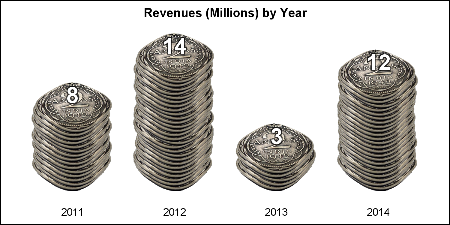
Tag: SGPLOT procedure

Data Visualization
Dan Heath 0
The Power of Stacking

Amazing things can be created when you start with small pieces and stack them together. Just ask Bryan Berg. He is the current world record holder for the tallest house of cards. This same principle can be applied to the SGPLOT and SGPANEL procedures. You can take the individual plot

Data Visualization | Learn SAS | Programming Tips
Sanjay Matange 0
Survival plot with a twist using SGPLOT procedure

Survival plots are automatically created by the LIFETEST procedure.  These graphs are most often customized to fit the needs of SAS users.  One way to create the customized survival plot is to save the generated data from the LIFETEST procedure, and then use the SGPLOT procedure to create your custom

Data Visualization
Sanjay Matange 0
Diagonal tick values

Fitting of long category values on a x-axis is usually a challenge.  With SAS 9.4, the SGPLOT procedure tries to fit the values by first splitting the values at white space to see if the values will fit in the space available.  This normally works well for a small number

Data Visualization
Sanjay Matange 0
Layers vs annotation

Last week a user asked about BY variable group processing for SGAnnotate with SGPLOT procedure.  The user provided a simple use case for the question (always a good idea) using the sashelp.class data set.  The graph included a display of reference lines for the mean value of height using annotation.  The

Data Visualization
Sanjay Matange 0
Polar Graph - Wind Rose

Last week I posted an article on displaying polar graph using SAS.  When the measured data (R, Theta) are in the polar coordinates as radius and angle, then this data can be easily transformed into the XY space using the simple transform shown below.     x=r*cos(theta * PI / 180);     y=r*sin(theta * PI

Data Visualization
Sanjay Matange 0
Polar Graph

There are many situations where it is beneficial to display the data using a polar graph.  Often your data may contain directional information.  Or, the data may be cyclic in nature, with information over time by weeks, or years.  The simple solution is to display the directional or time data

Data Visualization
Sanjay Matange 0
Swimmer plot

At PharmaSUG 2014 in San Diego, I had the pleasure of attending "Swimmer Plot: Tell a Graphical Story of Your Time to Response Data Using PROC SGPLOT", by Stacey Phillips.  In this paper, Stacey presented an interesting graph showing the effects of a study drug on patients' tumor size. Stacey

Data Visualization
Sanjay Matange 0
Grouped Timeline

Recently, a user posed a question on how to plot stacked frequencies on a time axis.  The data included frequencies of different viruses by week.  The data is modified to preserve confidentiality and is shown below. The user's first instinct was to use a bar chart with stacked groups.  This works for automatically computing frequencies

Data Visualization
Sanjay Matange 0
Report from PharmaSUG 2014

Just getting back from PharmaSUG 2014 in San Diego.  The conference was great, both inside and outside.  The organizers ordered up some great weather for the Padres game and also for dinner on the flight deck of the Midway Carrier. Our focus here being on graphics, we were all extremely gratified by the presentations in

Data Visualization
Sanjay Matange 0
Labeled curves

Often, the topic of an article is motivated by a question from a user.  A satisfactory resolution of the situation is usually a good indication of a topic that may be of interest to other users.  On such question was posed to me by a user this weekend.  He wanted to display fit

Data Visualization
Sanjay Matange 0
G100 with SGPLOT

The GCHART procedure has a popular option called G100 to display all the subgroups in % format such that all the subgroup values add up to 100% for each group.   Each subgroup is labeled with its own % values. SGPLOT procedure does not such an option, but with a little bit of

Data Visualization
Sanjay Matange 0
Axes Synchronization

Often we need to plot multiple response variables on Y axes by a common variable on X axis.  When the response variables are very different in magnitudes or format, we prefer to plot the variables on separate Y (Left) and Y2 (Right) axes. Here is some sample data with three response

Data Visualization
Sanjay Matange 0
Layered graphs

Browsing graphs on the web, this graph caught my eye:  The Arctic Sea Ice Volume Graph.   My interest is not so much in the debate on Climate Change or Global Warming.  To me, this graph has some interesting features that can help show the benefits of plot layering to

Data Visualization
Sanjay Matange 0
Survival Plot

One of the most popular graph amongst clinical and pharmaceutical users is the Survival Plot as created from the LIFETEST Procedure.  This is one graph that users most often want to customize.  See Creating and Customizing the Kaplan-Meier Survival Plot in PROC LIFETEST - Warren F. Kuhfeld and Ying So, SAS Institute

Data Visualization
Sanjay Matange 0
Two-in-one Graphs

A large variety of graphs fall in the category of what I call a "Single-Cell" graph.  This type of graph consists of a single data region along with titles, footnotes, legends and other ancillary objects.  Legends and text entries can be included in the data area.   The data itself is displayed

Data Visualization
Sanjay Matange 0
Broken Axis

In my previous post I described the new Polygon plot statement that is included with the SAS 9.4M1 release.   So, a valid question is - what is my motivation for discussing the new features in SAS 9.4M1 when most users are at SAS 9.3 or SAS 9.2 versions?  Here are a

Data Visualization
Sanjay Matange 0
New Polygon Plot

The SAS 9.4 Maintenance 1 release is now shipping to users. This is great news for GTL and SG procedures users as this release includes some useful new features. Some of these are in direct response to your requests, and others are enhancements that we think you will come to like.

Data Visualization
Sanjay Matange 0
Survey Charts

Often we have situations where the category values on the graph have long character strings.  This is often the case when graphing survey responses to questions.  The questions may be sentences, sometimes moderately long. With SAS 9.4, GTL and SG now support the ability to display tick values split over

1 2 3