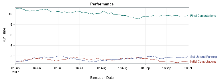
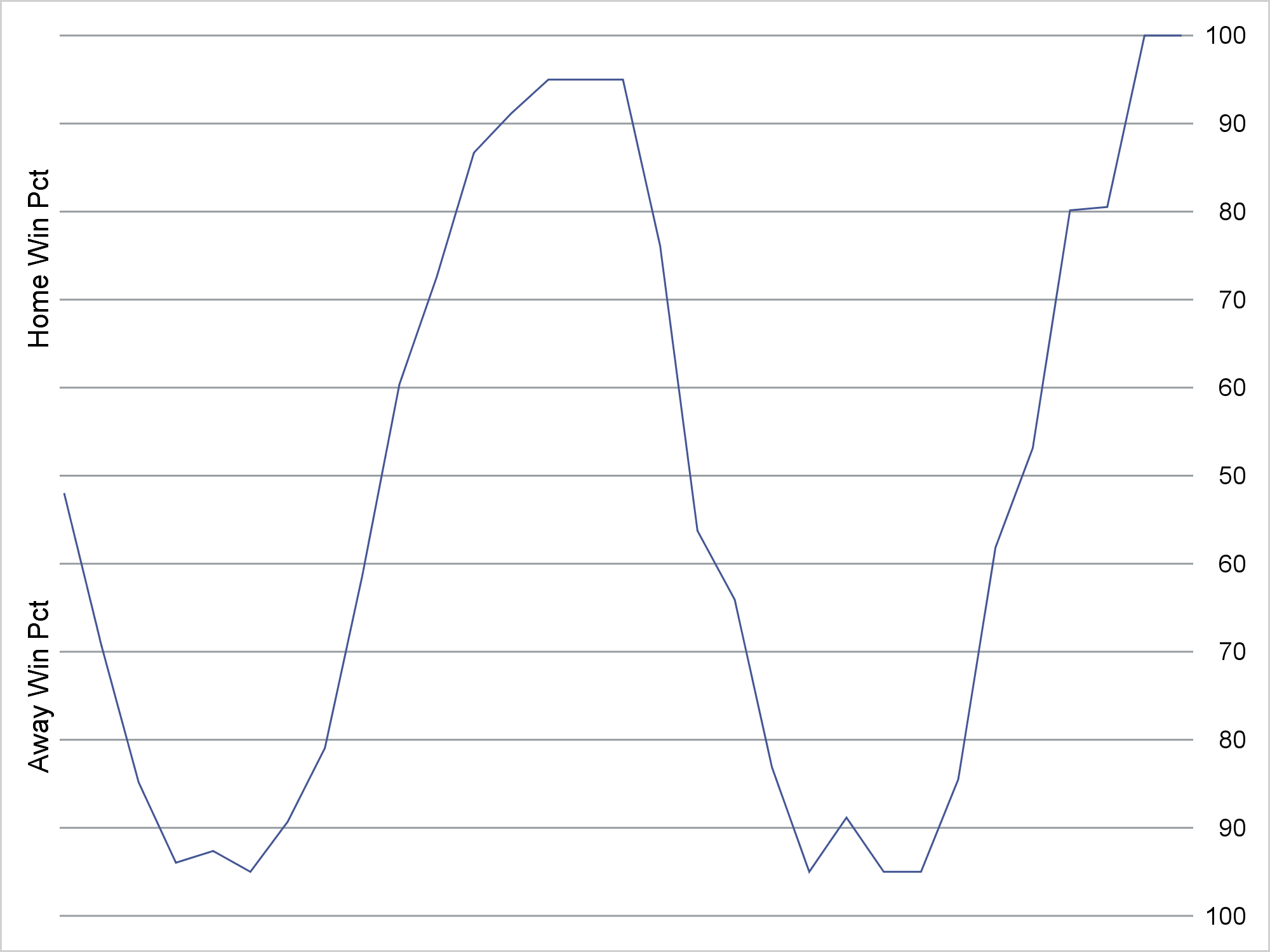
Tag: SERIES Plot

Data Visualization
Sanjay Matange 0
Financial graphs

Browsing on the web, I ran into a simple but visually interesting graph of financial data.  Really, it could be any data, but this one showed up under "Financial Graphs".  I thought this would give me an opportunity to speak about an interesting new feature added to SERIES plot with

Data Visualization
Sanjay Matange 0
Stock Plots

This weekend I was reviewing my portfolio of stocks as usual.  Yes, I do have a small stock portfolio with a few stocks, and normally I use free stock charting software to review the stock plots.  These sites allow you to view the daily stock prices along with many technical

Data Visualization
Sanjay Matange 0
Attributes Map - 2

Last week I wrote about how you can use the Discrete Attributes Map to ensure that group values with specific names are represented in the graph with specific colors or other visual  attributes such as marker symbol or line pattern. This attributes map also supports a special keyword "OTHER" which can be used to

Data Visualization
Sanjay Matange 0
Spark lines made easy

Spark lines, made popular by Edward Tufte, provide a way to visualize trends in a concise space, often inline with the rest of the narrative or data. Previously, I posted an article on Spark Plots in which I created different plot types, some of which included multiple graphs and data in each row.  For such

Data Visualization
Sanjay Matange 0
LFT Panels

CTSPedia.org is a website of Knowledge Base for Clinical and Translational Research.  On this site you can find sample graphs for statistical analysis of safety data for Clinical Research.  Graphs included in this resource have been submitted by contributors, and include a graph for Liver Function for different tests by treatment.

Data Visualization
Sanjay Matange 0
Bar-Line graph

A user recently posted a question in the SAS communities forum about  how to best display two measures by one classifier using a Bar-Line graph, where the scale of the two measures is vastly different.  This got me thinking about various different ways to represent such data.  Here are some of my thoughts,

Data Visualization
Sanjay Matange 0
Simply useful

Let us ring in the new year with something simple and useful. A recent question by a user over the holidays motivated this article on what is likely a commonly used graph.  We want to compare the preformance of two categories along with a third measure.  This could be something like "How

Data Visualization
Sanjay Matange 0
Adding a spark to your data

When viewing time series data, often we only want to see the trend in the data over time and we are not so concerned about the actual data values.  With multiple time series plots, forecasting software can find clusters to help us view series with similar trends. Recently I saw a graph showing the trend of unemployment