Spark lines, made popular by Edward Tufte, provide a way to visualize trends in a concise space, often inline with the rest of the narrative or data. Previously, I posted an article on Spark Plots in which I created different plot types, some of which included multiple graphs and data in each row. For such cases one has to use GTL and the possible variations are unlimited.
A recent question by a user prompted me to revisit this topic with the aim to go from "Can do with GTL" to "Easy to do with SGPlot". Here we will see that a simple spark line plot with multiple columns of data can be created easily using the SGPLOT procedure. Here are a couple of examples.
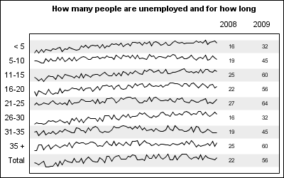
Spark Lines of Unemployment Trends:
SGPLOT code:
title h=1 'How many people are unemployed and for how long'; proc sgplot data=all noautolegend; refline ref / lineattrs=(thickness=20) transparency=0.85; series x=x y=y / group=group lineattrs=graphdatadefault(pattern=solid); scatter y=group2 x=y2008label / markerchar=y2008 x2axis url=url; scatter y=group2 x=y2009label / markerchar=y2009 x2axis url=url; xaxis display=none offsetmin=0.02 offsetmax=0.25; x2axis display=(nolabel noticks) offsetmin=0.8; yaxis values=(1 to 9) display=(nolabel noticks); run; |
As you can see from above, the SGPLOT code is relatively straightforward. Primarily, we have a series plot of the trend data by group, along with a few scatter plot statements to render the tabular data itself. Here, we have shown two columns of data, but there is really no limitation with this process, as long as all the columns of data are on one side or other of the graph.
Frequent readers of this blog may see a familiar technique of using the X axis to draw the graphical plot and the X2 axis to draw the columns of data. Alternate horizontal bands are drawn using the refline statement to help the eye across the width of the graph.
The key aspect of this graph is the restructuring of the grouped series plot data into a stacked format. In this example, I actually generated the data in this format as you can see in the program: In this program I have also added URL links to the table values for drill down. One can add the URL to the series itself, but it will generate a larger image map, so I took the easier path.
SAS code for Spark Table: SparkTable_SAS92_Code
The data reformatting technique will be more apparent in the stock table example below.
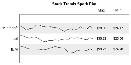
Spark Lines of Stock Prices:
SGPLOT code:
title h=1 'Stock Trends Spark Plot'; proc sgplot data=spark noautolegend; format y yc yref stock.; refline yref / lineattrs=(thickness=32) transparency=0.85; series x=date y=yc / group=stock lineattrs=graphdatadefault(pattern=solid); scatter y=y x=MaxLabel / markerchar=yearmax x2axis; scatter y=y x=MinLabel / markerchar=yearmin x2axis; xaxis display=none offsetmin=0.01 offsetmax=0.3; x2axis display=(nolabel noticks) offsetmin=0.75; yaxis values=(1 to 3) valueshint display=(nolabel noticks); run; |
The code is very similar to the one above. The main step is to transform the grouped data into a stack, where each group's data is normalized into a 0.0 - 1.0 space and then stacked by adding to an increasing Y variable. In this case, I have further restricted each spark line data to 60% of the space. The attached code transforms the SASHELP.STOCKS data into a spark-friendly format. The rest of the code is to help draw the columns and the alternate bands.
SAS code for Spark Table of SASHELP.STOCKS: StockTable_SAS92_Code


