When viewing time series data, often we only want to see the trend in the data over time and we are not so concerned about the actual data values. With multiple time series plots, forecasting software can find clusters to help us view series with similar trends.
Recently I saw a graph showing the trend of unemployment over time grouped by length of unemployment. For each group, additional statistics were displayed. I got to thinking how one might make such a graph using ODS Graphics. The graph below is created using GTL to demonstrate the idea using simulated data to explore the possibilities.
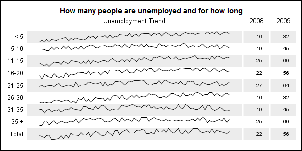
The first way that comes to mind is to use a LAYOUT DATALATTICE with the group (duration of unemployment) as the ROWVAR, and a PROTOTYPE that has a SERIESPLOT. If this was a simple Lattice of series plots, that would work, but it is harder to include the additional statistics columns on the right. Also, the group would be displayed as cell headers, rendered vertically. Full code for this graph can be seen here: Spark_Table
Furthermore, we may want additional column with graphs of some statistics of the entire group. Then we cannot use a LAYOUT DATALATTICE since the prototype (repeated graphical rubber stamp) cannot have multiple graphs arranged in a grid as shown below.
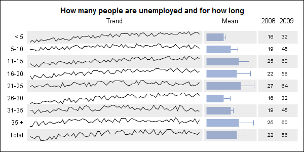
In this graph above, the first column shows the spark line graph of the timeseries. The second column shows a graph of some statistics for the different groups. Columns 3 and 4 display the value of other statistics for the group. Full code for this graph can be seen here: Spark_Bar_Table I actually used a VECTORPLOT to create the appearance of bars. Can you guess why I did not use the BARCHART?
This last version below shows the same spark lines with a dot plot of some statistics, along with other statistics for each group.
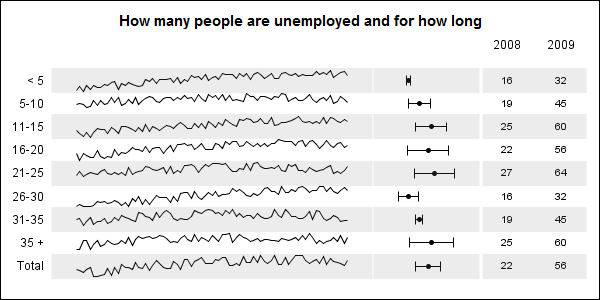
Full code for this graph can be seen here: Spark_Dot_Table
The key idea used here is to reorganize the grouped series data such that each series is normalized into a small strip, and then each series is positioned at increasing value of Y (1 to 9). A user defined format is used to map each index to the group value actually shown. Thus, the Spark Line plot is not a panel of individual series plots, but one series plot, with multiple spark lines.
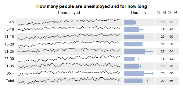
With this, we do not need to use aDataLattice or DataPanel at all, but instead use a simple LAYOUT LATTICE. That allows us to populate different graph types in each column, each having the same (or matching) Y axis variable. The numeric statistics display uses our trusted SCATTERPLOT with MARKERCHARACTER.
We have also used wide reference lines to shade alternate rows of the data to better guide the eye across the wide table.
The SAS HASH object is used to process the batch of data for each individual series. Since the hash object cannot append to the same data set, we output data to multiple data sets, then append all data sets into one table. Summary statistics columns are appended later.


5 Comments
Great work Sanjay. Now to find a project I can try this out on!
Really nice.
Will this also run under 9.2?
Yes.
Really fantastic and helpful. However, I think I need spend time to grasp it to create a grouped vbars with CI.
For example, If I have a dataset like this:
data error;
input Month $ Product $ Revenue Upper Lower;
datalines;
Jan Desks 2000 2200 1800
Jan Chairs 1500 1700 1300
Jan Lamps 1200 1100 1300
Feb Desks 2200 2400 1900
Feb Chairs 1200 1300 1400
Feb Lamps 1300 1100 1400
;
run;
how can I use GTL to produce the grouped vbars, with xaxis showing month? Thanks
BTW. I just posted this same question in SAS community.
Pingback: Spark lines made easy - Graphically Speaking