Let us ring in the new year with something simple and useful.
A recent question by a user over the holidays motivated this article on what is likely a commonly used graph. We want to compare the preformance of two categories along with a third measure. This could be something like "How does our company measure up against a peer given the state of the economy?".
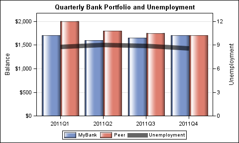
Working off the data snippet provided by user, let us create a graph to compare the quarterly portfolio balance of MyBank against a Peer given the Unemployment rate. Here is the graph:
The code for the graph using SAS 9.3 SGPLOT procedure is as follows:
title 'Quarterly Bank Portfolio and Unemployment'; proc sgplot data=bank; vbarparm category=date response=balance / group=group dataskin=gloss name='b'; series x=date y=Unemployment / y2axis name='u' legendlabel='Unemployment' lineattrs=(thickness=10) transparency=0.4; keylegend 'b' 'u'; xaxis display=(nolabel); yaxis offsetmin=0 grid; y2axis offsetmin=0 min=0 max=12 integer values=(0 3 6 9 12); run; |
The full code for this graph can be seen here: Full SAS Code
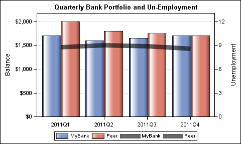
The first impulse would be to use the VBAR and VLINE statements to create this graph. That would work, except that using a VBAR statement imposes some restrictions. The CATEGORY and GROUP variables for the VLINE must be the same as those for VBAR.
This means the VLINE is also plotted as grouped, and therefore the two groups are also represented in the legend. Missing data can be provided for unemployment to reduce overplotting. See the last example in the attached code and the graph is shown below. Note the entries in the legend.

We need to get around this restriction with the VBAR statement. With SAS 9.3, the SGPLOT procedure supports a new VBARPARM statement, which expects summarized data (only one observation per category / group combination). One benefit of using VBARPARM is that it has no restrictions on overlay combinations with other plot statements supported by the SGPLOT procedure.
As long as your data is summarized, we can use the VBARPARM statement and then layer the SERIES statement to create the line plot of unemployment over the bars. Other aesthetic changes can be made such as:
- Use data skins for the bars and thick line and transparency for the series plot.
- Set YAXIS OFFSETMIN=0 ensures the bars sit on the base line.
- Force equal number of ticks on Y and Y2, then we can use GRID lines.
- X axis label can be suppressed as it is not necessary.
Some aspects of Layered Graphs are explained in a previous article by Dan Heath.
We wish you all a Happy New Year and we look forward to an engaging conversation on SAS graphics in 2012.


2 Comments
hello.
i have a problem.please help me 🙁
order of below for drawing graph for my data not working.(plot=impulse)
data grunfeld;
input year y1 y2 y3 x1 x2 x3;
label y1='Gross Investment GE'
y2='Capital Stock Lagged GE'
y3='Value of Outstanding Shares GE Lagged'
x1='Gross Investment W'
x2='Capital Stock Lagged W'd
x3='Value of Outstanding Shares Lagged W';
datalines;
1935 33.1 1170.6 97.8 12.93 191.5 1.8
1936 45.0 2015.8 104.4 25.90 516.0 .8
1937 77.2 2803.3 118.0 35.05 729.0 7.4
... more lines ...
/*--- Vector Autoregressive Process with Exogenous Variables ---*/
proc varmax data=grunfeld plot=impulse;
model y1 y2 / p=1 noint lagmax=5
print=(impulse=(all))
printform=univariate;
run;
You may want to put this question on the SAS Communities page in the Statistical Procedures thread. https://communities.sas.com/community/support-communities/sas_statistical_procedures