When I give presentations on using the SG procedures, I try to describe how you can take simple plots and layer them to create more complex graphs. I also emphasize how you must consider the output of each plot type so that, as you overlay them, you do not obscure the data from the previous layers. A simple example I give is a histogram with density curves:
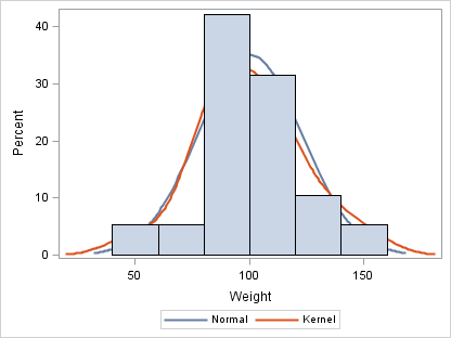
proc sgplot data=sashelp.class; density weight; density weight / type=kernel; histogram weight; run; |
Notice in this first graph that the histogram obscures the density curves. That happened because the histogram was added as the last layer. As a general rule, plots or charts that create filled areas should be added as the first layers in your graph.
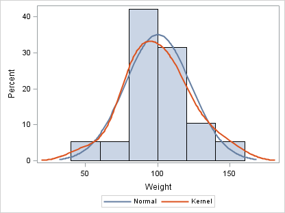
proc sgplot data=sashelp.class; histogram weight; density weight; density weight / type=kernel; run; |
One exception to that rule is masking effects. Suppose you have a large number of points that fall within an acceptable range and you want to create a graph that emphasizes the outliers. You can specify the filled-area plot that defines the acceptable range after the SCATTER plot, but use transparency to prevent the points from being completely obscured.
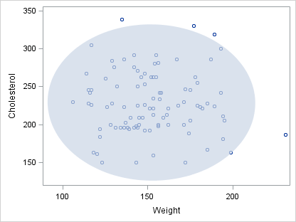
proc sgplot data=sashelp.heart(obs=100) noautolegend; scatter x=weight y=cholesterol; ellipse x=weight y=cholesterol / fill transparency=0.3; run; |
Another powerful masking effect is to use one area plot to mask out part of another area plot to emphasize data that goes beyond certain limits. The following plot emphasizes when the price-earnings (PE) ratio of the S&P 500 is greater than 20.
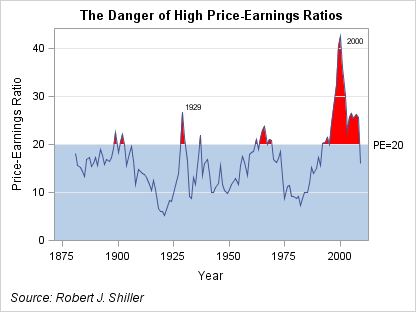
title "The Danger of High Price-Earnings Ratios"; footnote j=l "Source: Robert J. Shiller"; proc sgplot data=pe_data noautolegend nocycleattrs; yaxis offsetmin=0; band x=year upper=pe10 lower=0 / fillattrs=(color=red); band x=year upper=20 lower=0; refline 20 / label="PE=20"; refline 10 20 30 40 / lineattrs=GraphGridLines; series x=year y=pe10 / lineattrs=GraphData1 datalabel=label; run; |
The best way to understand how this graph is constructed is to watch it developed a layer at a time.
STEP 1: Plot the actual data using a BAND plot as an area plot.
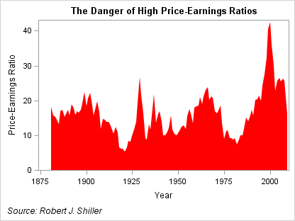
proc sgplot data=pe_data noautolegend nocycleattrs; yaxis offsetmin=0; band x=year upper=pe10 lower=0 / fillattrs=(color=red); run; |
STEP 2: Mask the area below PE=20 by layering another band plot on top of the previous band.
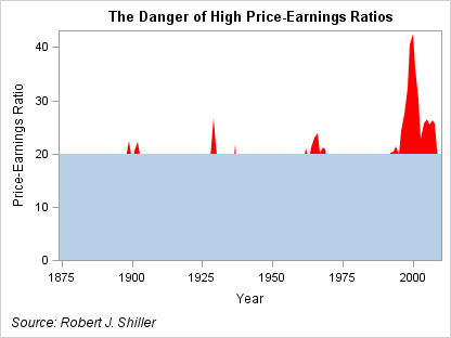
proc sgplot data=pe_data noautolegend nocycleattrs; yaxis offsetmin=0; band x=year upper=pe10 lower=0 / fillattrs=(color=red); band x=year upper=20 lower=0; run; |
STEP 3: Layer the reference lines on the graph.
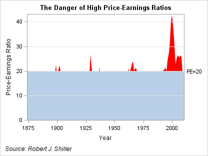
proc sgplot data=pe_data noautolegend nocycleattrs; yaxis offsetmin=0; band x=year upper=pe10 lower=0 / fillattrs=(color=red); band x=year upper=20 lower=0; refline 20 / label="PE=20"; refline 10 20 30 40 / lineattrs=GraphGridLines; run; |
STEP 4: Finally, to restore the plot of the original data, add a SERIES plot on top of the other layers. The DATALABEL option on the SERIES plot is used to label critical years.
title "The Danger of High Price-Earnings Ratios"; footnote j=l "Source: Robert J. Shiller"; proc sgplot data=pe_data noautolegend nocycleattrs; yaxis offsetmin=0; band x=year upper=pe10 lower=0 / fillattrs=(color=red); band x=year upper=20 lower=0; refline 20 / label="PE=20"; refline 10 20 30 40 / lineattrs=GraphGridLines; series x=year y=pe10 / lineattrs=GraphData1 datalabel=label; run; |
The SGPLOT and SGPANEL procedures support an ever-increasing number of plot and chart types that can be combined in a variety of ways. As you create your graphs, think about how you can combine these types to build a complete graph that conveys your message.


5 Comments
It would be really helpful if you also supplied data so that viewers could run the samples. Or is there a place to get the 'pe_data' dataset used in the examples? thanks.
The original data source can be found at Robert Shiller's website here. The complete program for the PE plot, including the data step, can be found here. Thanks for the input!
For the histograms in SGPLOT, how do you change the bin size? Easily done in Proc Univariate but I am missing (can't find out how) to do it in SGPLOT and this capability is pretty essential for my application if I am going to use SGPLOT.
I really like this blog and I am starting to work through your new book; it is very, very nice.
Thanks
Dick
Hey Dick,
Histogram bin control was added to SGPLOT and SGPANEL in SAS 9.3, which was released last summer. Until you can get it, you can use GTL directly to get the control you need. Here is a little boilerplate code you can use to generate a histogram similar to the one in the blog:
You can use options like BINSTART, BINWIDTH, and NBINS on the HISTOGRAM statement to control the bins. The BINAXIS option controls the display of a bin axis vs. a continuous axis.
Glad you like the book 🙂
Thanks!
Dan
Pingback: Simply useful - Graphically Speaking