Last week I published an article on creating bar charts with visual category values. The idea was to use visual icons for the category values in a HBAR of age by animal. For the data, I referred to a visual from the 2010 Encyclopedia Britannica Inc. that I found on the web. I included that visual in my article, and many readers were intrigued by the visual itself, and how it cleverly placed many items on the compressing squiggly timeline.
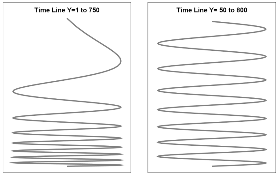
A couple of readers proposed some ideas to create the visual using SGPLOT, and I decided to follow up over the weekend. The results are shown below. The first task is to generate the sinusoidal timeline with a reducing pitch so there is more space available in the early part where there are more animals, and less space later. This was easy to do by using the TYPE=log option on the y-axis. I computed a simple sine wave over 7.5 cycles, with y starting with 1 and ending with 751. Since I want to use the log option, I need to avoid zero or negative values on the y-axis.
The shape of the log transformed sine wave with ymin=1 was undesirable. The ymin value can be adjusted to obtain the shape you want. Here are two curves. I settled on the curve on the right with ymin=50.
Now, I created a separate "Animals" data set with animal name and age. I computed the equivalent x and y coordinates for each animal by using the reverse equation from the one used to generate the sine curve. For the curve, the value of age=20*angle/360. So, the (x, y) of animal by age can be computed as angle= age*360/20. Then, (x, y) can be computed as in the timeline data.
A simple join of the timeline and animals data set results in the combined data set that has all the information we need to plot the graph. Once again, we use the SYMBOLIMAGE statement to define image markers for each of the animal and use the STYLEATTRS statement to enter these into the group symbol list. Then, we can use the SCATTER statement to display the image of the animal at the appropriate (x, y) location. I shifted the icon up by 2 units. The name of the animal is displayed below the icon using a TEXT statement.
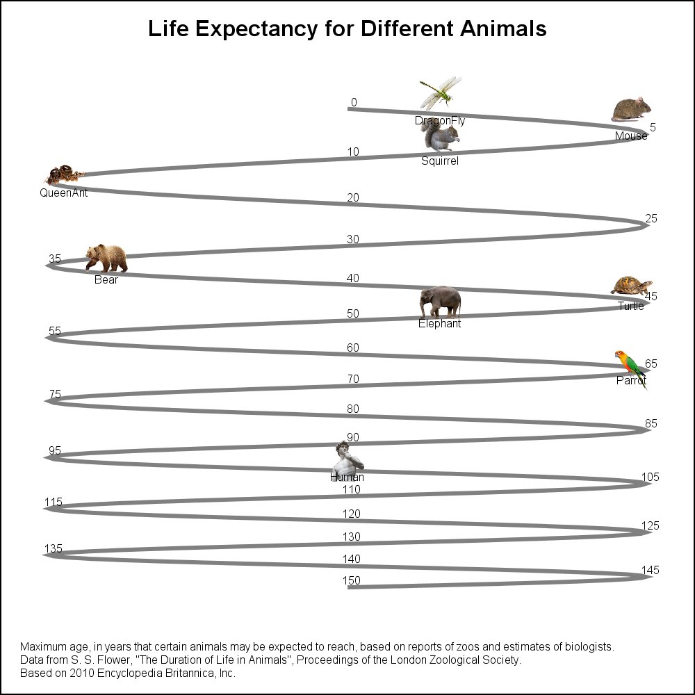
I only had the patience to place 9 icons on the timeline, but it would be straightforward for the motivated person to add all the animals needed. A label for each animal is placed below the icon using a TEXT plot statement.
SAS 9.40M3 SGPLOT program:
title 'Life Expectancy for Different Animals'; footnote j=l h=6pt 'Maximum age, in years that certain animals may be expected to reach, based on reports of zoos and estimates of biologists.'; footnote2 j=l h=6pt'Data from S. S. Flower, "The Duration of Life in Animals", Proceedings of the London Zoological Society.'; footnote3 j=l h=6pt 'Based on 2010 Encyclopedia Britannica, Inc.'; proc sgplot data=combined nowall noborder subpixel noautolegend; symbolimage name=human image="&human"; symbolimage name=parrot image="&parrot" / voffset=-0.2; symbolimage name=elephant image="&elephant"; symbolimage name=turtle image="&turtle"; symbolimage name=bear image="&bear"; symbolimage name=queenant image="&queenant"; symbolimage name=squirrel image="&squirrel"; symbolimage name=mouse image="&mouse"; symbolimage name=dragonfly image="&dragonfly"; styleattrs datasymbols=(dragonfly mouse squirrel queenant bear turtle elephant parrot human); series x=x y=y / lineattrs=(thickness=3) transparency=0.5; text x=xage y=yage text=age / position=top textattrs=(size=6); scatter x=xicon y=yicon / group=animal nomissinggroup markerattrs=(size=30); text x=xicon y=ylbl text=animal / position=bottom textattrs=(size=6); xaxis display=none offsetmin=0.05 offsetmax=0.05; yaxis display=none reverse type=log logbase=2; run; |
Note the following features of the program:
- A SERIES plot to draw the curve.
- A TEXT plot to display the age values along the curve.
- A SCATTER plot to display the image of the animals.
- A TEXT plot to display the name of the animals below the icon.
- Y-axis with TYPE=LOG and LOGBASE=2.
Full SAS 9.4M3 code: LifeExpectancyName
Zip file of icons (Unzip to C:\Icons folder): Icons


4 Comments
Love how the previous blog post commentary discussion spurred the progression of the sinusoidal timeline graph! Love your work Sanjay!!!
Thanks for a great example of how you can create clever graphics from simple building blocks. I love the creativity of this graph so it's fun to see how it can be done in SAS.
I am happy to know you like the graph, Susan. I did mention in the related previous article that, personally, I would not normally use such a representation. While it does allow placement of the animal with widely varying ages, the visual may not provide for good magnitude comparison as a bar or needle plot.
Pingback: Basic ODS Graphics: Axis Options - Graphically Speaking