This weekend I was reviewing my portfolio of stocks as usual. Yes, I do have a small stock portfolio with a few stocks, and normally I use free stock charting software to review the stock plots. These sites allow you to view the daily stock prices along with many technical indicators such as moving averages, Bollinger bands and more.
 One technical indicator often talked about is the range bands. The conventional wisdom being that the prices tend to stay within this range, until they don't. I could not find a way to do this on the website I use, so I have to take a screen shot of the graph, and then lay straight lines at the upper and lower range of the stock prices using Microsoft Publisher. The result is shown on the right.
The process above is a bit tedious, so I figured I could use the power of SAS to create the graph I need as shown below. Click on the graph for a higher resolution version.
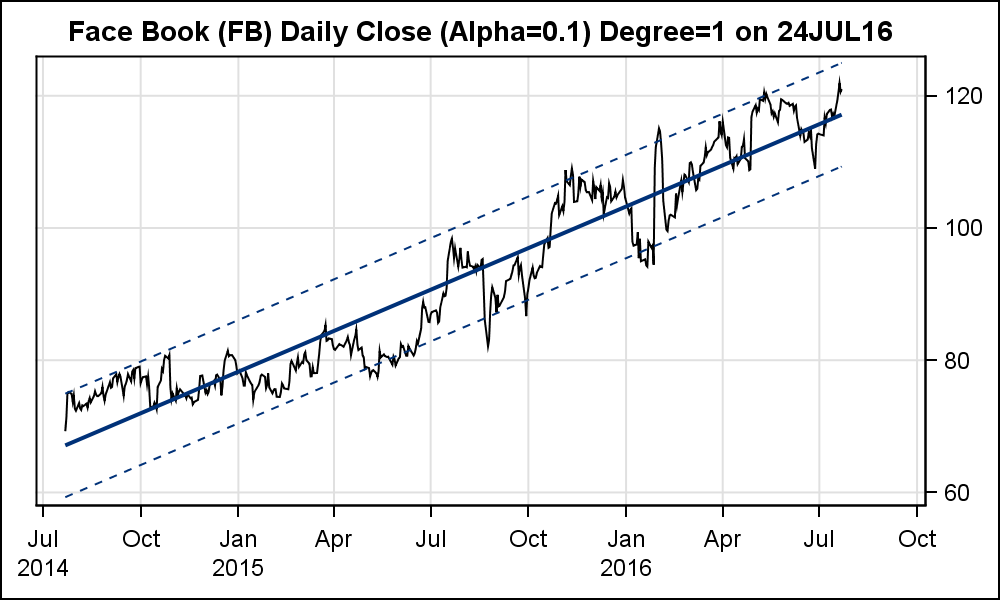 I created this graph by downloading the 2-year stock data for Face Book (FB) from the NASDAQ site. For sure, there are many other sites available. Then, I used the SGPLOT procedure to create the graph, plotting a time series of Close x Date using the SERIES plot with an overlay of a REG plot (nomarkers). The default 95% confidence works quite well to bound the low and high values of the graph. However, I adjusted the Alpha value for a tighter fit, at least for this graph, and settled on Alpha=0.1.
SAS SGPLOT code:
title "&name (&symbol) Daily Close (Alpha=&alpha) Degree=1 on &sysdate";
proc sgplot data=&symbol._2yr_data noautolegend subpixel;
series x=date y=close / y2axis ;
reg x=date y=close / y2axis nomarkers cli alpha=α
y2axis grid display=(nolabel);
xaxis grid display=(nolabel);
run;
Note the use of the &name, &symbol and &alpha macro variables. These are used because I made this into a macro that will download the data, process it, and create multiple graphs given the stock name and symbol. See the full code linked below.
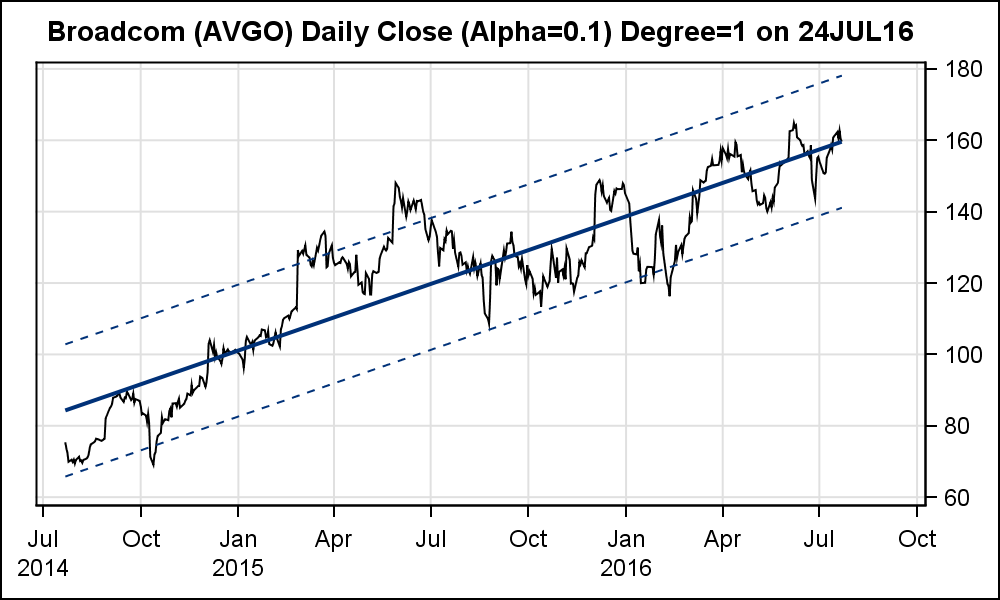
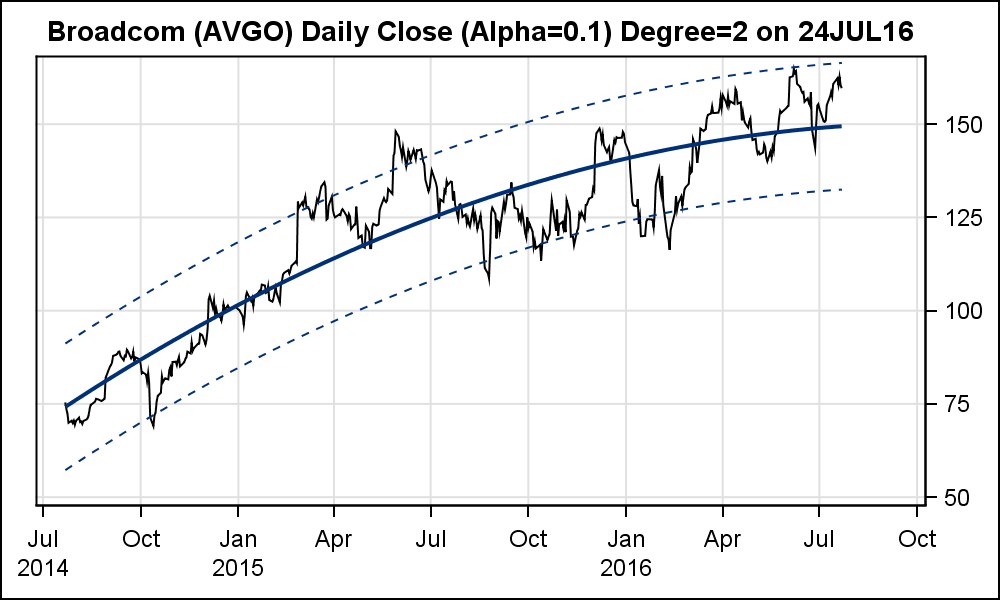
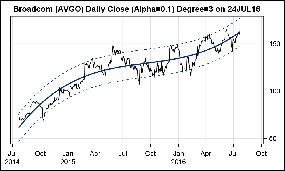
Just to compare the results, I also tried a quadratic fit and one with ORDER=3. The results are interesting. The different graphs indicate different potential for the stock, each indicating some room for the stock prices to go up before they become "over bought". Note, the previous conclusion is purely speculation on my part, and not meant as "financial advice". Alpha=0.1 is likely to not fit different stocks based on individual "beta", and can be changed in the macro invocation.


The same can be done for other stock symbols as shown below. Note, the 90% CLI bands are used for all the graphs. The last graph uses a HighLow plot with 1-year data.
Full SAS code: StockPlotMacro_2


2 Comments
Very nice graphics, thank you! Now some of the sites providing quotes (e.g. Yahoo) do so by writing all the necessary information in the URL. The quotes for Facebook for the last 2 years of data look like this: https://finance.yahoo.com/quote/FB/history?period1=1406325600&period2=1469397600&interval=1d&filter=history&frequency=1d
The values for period1 and period2 are Unix timestamps. SAS has given a solution as to how to convert it to SAS datetime: http://support.sas.com/documentation/cdl/en/hostunx/63053/HTML/default/viewer.htm#n1klm4vi8lx0qsn1v4r7g375uolc.htm
Why am I doing this? Using filename URL, I now can let SAS get the data and run your macro without having to manually download the csv files from the internet!
Thanks for the suggestion. I did want to get the data directly into SAS so I can run the program nightly to produce the graphs.