 Yesterday, I published an article on Axis values display, where I mentioned the desire expressed by many users to get x-axis tick values in Hotel text orienttion. The name comes from the way many hotel signs are displayed as shown on the right. Such arrangement of text can also be very useful for many Asian languages.
There is no direct support for displaying this text in SGPLOT or GTL using some option. So, I brought up the topic during lunch, and Lingxiao made a great suggestion - We could use the axis values splitting feature to get such arrangement of the x-axis tick values.
If you recall, we can use the FitPolicy=SplitAlways, and this means the value will be split on every occurrence of the split character, which is a space by default. So, if we can add spaces between each character of the category values and use this FitPolicy, we should get x-axis tick values displayed as hotel text.
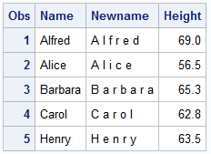 Here is the code for modifying the names and a view of the data. First, I find the longest string for name (code not shown below), then I used the prxchange function to replace each character by the same character plus a space.
data class;
length newname $&maxlen;
set sashelp.class;
newname = prxchange('s/(.)/$1 /', -1, name);
run;
Now, we can use this new variable as the category and set FitPolicy=SplitAlways to get Hotel text as shown below right. This method is very scaleable and can be applied to any use case. Some details in the code are trimmed to fit. See linked program below for full details.
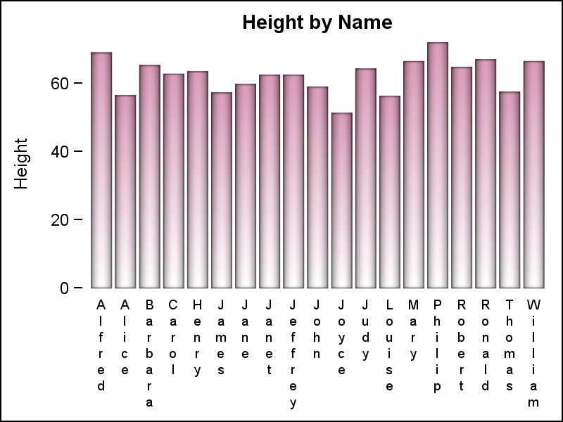 title 'Height by Name';
proc sgplot data=class noautolegend noborder;
vbar newname / response=height;
xaxis display=(nolabel noline noticks)
fitpolicy=splitalways;
yaxis display=(noline);
run;
SGPLOT code: hoteltext


9 Comments
Very clever! An early holiday gift. Thanks!
Thanks, Louise and Susan. If you are a GTL user, the code is even more simple and elegant. Just use the eval expression in the BarChart statement directly with the FITPOLICY. No need to generate a new data set.
barchart category=eval(prxchange('s/(.)/$1 /', -1, name)) response=height;Yes, very clever--and elegant in its simplicity too!
This is really nice. Thanks
I noticed that Hotel Text is not included in the Visual Index (http://support.sas.com/rnd/datavisualization/graphicallyspeakingindex/). The index seems to have stopped accumulating posts as of August 15, 2016. 🙁
Sorry, that is my fault for not keeping the visual index up to date. I will do that.
I have added the latest articles to the Visual Index. I will add more over time.
I'm not liking it! Best practice for data visualization would suggest the use of a horizontal bar chart so that the labels can be easily read. Ditto for the y axis label.
Pingback: Diagonal tick values - Graphically Speaking