One of the key benefits of creating graphs using GTL or SG Procedures is their support of plot layering to create complex graphs and layouts. Most simple graphs can be created by a single plot statement like a Bar Chart. Complex graphs can be created by layering appropriate plot statements to add the complexity needed like a Swimmer Plot.
When creating graphs with multiple VBAR statements, we sometimes run into a limitation on how VBAR statements can be layered. In general, VBAR and VLINE statements can be layered only when all the layered statements have the same category variable. If a group classification is in effect, all statements must have the same group variable. So, it is not possible to layer VBAR and VLINE statements that have different category or group classification.
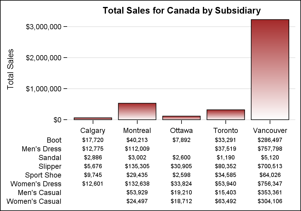 Consider the example on the right. This graph has a bar chart of Total Sales by Subsidiary for Canada. Each subsidiary has multiple observations for the type of shoes sold, as seen by the table under the bar chart.
One would expect we could simply layer an XAXISTABLE with the VBAR statement to create such a graph. The code is shown below. Some options are thinned to fit. See the linked code below for all the details.
title "Total Sales for ®ion by Subsidiary";
proc sgplot data=sashelp.shoes;
vbar subsidiary /response=sales;
xaxistable sales / x=subsidiary class=product;
xaxis display=(nolabel noline);
yaxis display=(noline) grid;
run;
 Unfortunately, this will not produce the desired results. The reason is that while the VBAR statement has only one classifier (subsidiary), the XAXISTABLE has two classifiers, x=subsidiary and class=product. Each bar shows the summarized value of sales as one bar per subsidiary. When you submit the code above, you will get the following warning in the log, and the graph on the right is produced.
WARNING: The CLASS option is ignored when the axis table is used with bar charts, line charts, or dot plots. The GROUP option from these charts is used as the CLASS variable for the axis table.
The CLASS option on the XAXISTABLE is ignored by the procedure, so the table has only one row of data, which is the summarized value for each bar. Also, "x=subsidiary" is not required for the axis table as it is default. I use it here for clarity. I also used a different color for the graph just for variety.
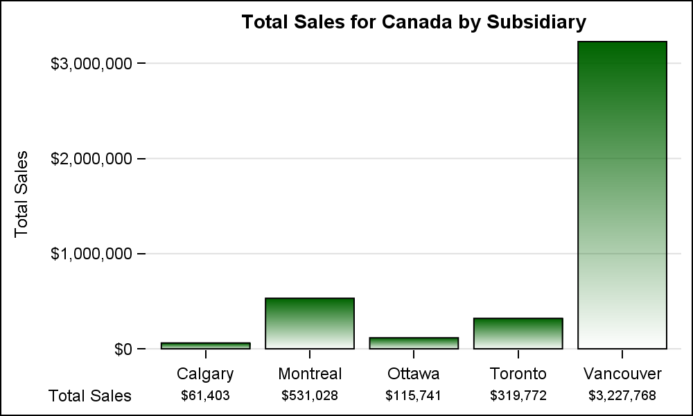
So, how do we get around this to create the graph shown at the top?
The VBARBASIC statement was released with SAS 9.40M3 to address such use cases. The VBAR statement does its own data processing to support additional features. This requires that all layers used with VBAR have the same set of classifiers. But the underlying GTL BarChart statement does not have such restrictions. So, we decided to surface a way directly to the GTL BarChart using the VBARBASIC statement. VBARBASIC can still summarize the data by subsidiary and does not have any restrictions on layering with other statements with different classifications. The code is shown below. Some options are thinned to fit.
title "Total Sales for ®ion by Subsidiary";
proc sgplot data=shoes;
vbarbasic subsidiary /response=sales;
xaxistable sales / x=subsidiary class=product;
xaxis display=(nolabel noline);
yaxis display=(noline) grid;
run;
Now, the VBarBasic statement displays the bars summarized by subsidiary, while the XAxisTable can display the detailed information by subsidiary and product.
 Another example of layering plot statements with different classifiers is shown on the right. Here, we have displayed the summarized Actual Sales by Product shown by the blue bars. On that, we have overlaid a graph of the Actual Sales by Product and Quarter. This is possible using the VBARBASIC statement. All the values by quarter add up to the total shown by the blue bar. This allows us to compare across products, and by quarter within each product.
title "Actual Sales";
proc sgplot data=sashelp.prdsale noborder nocycleattrs;
vbarbasic product / response=actual;
vbarbasic product /response=actual group=quarter
groupdisplay=cluster dataskin=matte;
xaxis display=(nolabel noline);
yaxis display=(noline) grid;
run;
Full SAS 9.4M3 Code: vbarbasic


4 Comments
I really like the VBARBASIC statement. Another situation where it is useful is in overlaying continuous curves on discrete bar charts. For a statistical example (overlaying a normal curve on a binomial bar chart), see "Overlay a curve on a bar chart in SAS".
Cool. Bar charts also support scaled linear axes, where each bar is positioned on the correct scaled location on the axis. This includes clustered and stacked bars. Just set axis TYPE=LINEAR.
Hi Sanjay,
Amazing timing with your post. I've been using xaxistable in proc sgplot and was trying to figure out how to word my question when, low and behold, I came to your blog and today's post showed xaxistable data that makes it easy to ask my question!! (Thank you!!). In the "Total Sales for Canada Subsidiary" plot, the xaxistable row labels are right justified. I cannot find a way to left justify them while still leaving them on the left side of the table. Is there a way to do that?
Thanks!
Janet
While the YAxisTable does have the options to Align and Justify the labels and text entries in the columns, there is no such option for the XAxisTable. Now that I think about it, it is doable for the label, though harder for the values. I would suggest you call in this requirement to Tech Support, as that will help us "officially" prioritize this work for the next release.