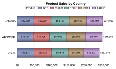
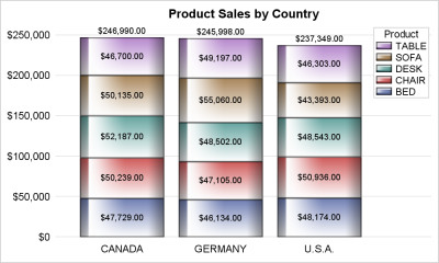
Flying drones was a new & exciting hobby, and very cool fad a few years ago. In recent years, the drone manufacturers have added some really nice features to make the drones easier to fly and more capable ... but the government also added some new rules that have curbed
Search Results: stacked (138)
How do you explain flat-line forecasts to senior management? Or, do you just make manual overrides to adjust the forecast? When there is no detectable trend or seasonality associated with your demand history, or something has disrupted the trend and/or seasonality, simple time series methods (i.e. naïve and simple
I recently showed how to create an annotation data set that will overlay cell counts or percentages on a mosaic plot. A mosaic plot is a visual representation of a cross-tabulation of observed frequencies for two categorical variables. The mosaic plot with cell counts is shown to the right. The
In these modern times, my utility bill has a bar chart so I can see how my current consumption compares to my historical usage. I decided to create my own version of this utility bill bar chart, and make a few improvements along the way. If you're into SGplot bar
In this 'Rosetta Graph' example, I demonstrate how to control bar chart colors in Gchart and SGplot. But first, here's a little diversion... some artwork in my office here at SAS. There's a *lot* of artwork hanging around at SAS, but this particular painting wasn't created by the SAS artists
There's been a lot of hype regarding using machine learning (ML) for demand forecasting, and rightfully so, given the advancements in data collection, storage, and processing along with improvements in technology. There's no reason why machine learning can't be utilized as another forecasting method among the collection of forecasting methods
US farmers grow a lot of food ... but did you know some of them also grow fuel for our vehicles? Follow along and you'll learn how much fuel they grow, and also learn some tips about plotting this type of data! These days most gasoline in the US has
With the US census coming in 2020, I've decided to sharpen my skills at graphing census data. And today I'm working on creating a population pyramid chart to analyze the age and gender distribution. Follow along if you'd like to see how to create such a chart ... or jump
Many areas of the US are experiencing record low unemployment. This is great at the national level, and also great at a personal level (for example, I now have fewer unemployed friends asking to borrow money!) But just how low is the US unemployment rate, and how does it compare
Numbers don't lie, but sometimes they don't reveal the full story. Last week I wrote about the most popular articles from The DO Loop in 2018. The popular articles are inevitably about elementary topics in SAS programming or statistics because those topics have broad appeal. However, I also write about
There are four widely recognized styles of machine learning: supervised, unsupervised, semi-supervised and reinforcement learning. These styles have been discussed in great depth in the literature and are included in most introductory lectures on machine learning algorithms. As a recap, the table below summarizes these styles. For a comprehensive mapping
I started my computer career as a Unix system administrator, and when I began using SAS almost 30 years ago it was only natural that I used it on Unix computers (they were the most powerful/capable computers I had access to at the time). I've picked up a lot of
A question recently popped up in a discussion forum about creating table plots using SAS. So I thought I'd dabble in this topic, and see what I could come up with. If you're interested in tableplots, or American Community Survey (ACS) data, or data visualization, I invite you to follow
Why do people donate money to politicians and political parties? Sometimes it's because they agree with the platform, but sometimes it might be for potential financial benefits. When it comes to large donations from Fortune 500 companies, I suspect the latter! And since politics has been in the news a
How many planets are there in our solar system? The answer hasn't always been 9 ... er, I mean 8 (sorry Pluto!). The count has changed throughout history as we got a better understanding of astronomy, discovered new planets, and redefined what a 'planet' is. Wouldn't it be helpful to
These days, it's all about music streaming ... You sign up for a service, you let them know your music preferences, and they create a virtual "radio station" that plays the songs you probably want to hear. But that just doesn't compare with going to a physical record store, buying
The egg aisle is a confusing place! The egg cartons are plastered with pictures of happy chickens and seemingly healthy terms like farm fresh, natural, organic, free range, and cage free. So many options can make your head spin! How do you decide which one to buy? Let’s dig a
‘국영수코(co)’라는 신조어 들어보셨나요? 국어, 영어, 수학, 코딩(coding)의 약자인데요. 교육부의 ‘2015 개정교육과정’에 따라 올해 3월부터 중학생, 내년부터는 초등학교 5, 6학년 학생의 소프트웨어(SW) 교육이 의무화되면서 코딩 교육과 관련 자격증 열풍이 불고 있습니다. 미국, 영국 등 IT 선진국들은 이미 발 빠르게 코딩 교육을 의무화하며, 4차 산업혁명 시대의 인재 확보에 나섰는데요. SAS 역시 2014년, 학습이나 비상업적인
A common request on the communities page is to place data labels on horizontal bar charts. Often users want to display stacked horizontal bar charts, with the values displayed for each segment and the overall value of the bar itself as shown in the example below. In this example, the
If N random people are in a room, the classical birthday problem provides the probability that at least two people share a birthday. The birthday problem does not consider how many birthdays are in common. However, a generalization (sometimes called the Multiple-Birthday Problem) examines the distribution of the number of
Money magazine (Jan/Feb 2018) contains an article about how much it costs to give birth in the US. The costs, which are based on insurance data, include prenatal care and hospital delivery but exclude infant care. The data are compiled for each state (including Washington, DC) and by type of
This post shows ways to display the upper or lower triangle of a correlation matrix. You can also use colors to show the magnitude of the correlations.
Once in a while you run into a pesky situation that is hard to overcome without resorting to major surgery. Such a situation occurs when you have a stacked bar chart with a discrete legend positioned vertically on the side of the graph. A simple example is shown below. title
SAS 9.4 maintenance release 5 was released on Sept 19, 2017. This release includes many new items including integration with SAS Viya and SAS Studio, a web application for SAS development. Also Included with this release are some cool new features in the graphics domain, some of which were requested
"Coming to America" - it's been the name of a funny movie and a dramatic song (can you name the actor & singer without cheating?!?) It's also been a dream for many, and an action for some. People have been coming to America both legally and illegally for many years, but there's one special category
Bar charts in SGPLOT procedure have some new features that everyone may not be familiar with. In this article we will create bar charts with color response on linear axes. Normally, the VBAR statement treats the x-axis as discrete, placing each unique value by itself, equally spaced on the x-axis.
Stretches torso and arm & strengthens ankles, knees, legs, abdomen, buttocks and spine; Cultivates balance, opens chest and shoulders Balancing Half Moon (Sanskrit: Ardha Chandrasana)
1980년대 후반에만 해도 머신러닝(machine learning)이나 데이터 과학자와 같은 개념은 없었습니다. 대신 통계, 분석, 데이터 마이닝, 데이터 모델링과 같은 단어가 사용됐는데요. 이후 글로벌 기업들은 30년 이상 머신러닝 모델을 연구해 왔으며, 페이스북의 이미지 인식 소프트웨어, 아마존의 음성 비서 알렉사, KT의 인공지능 서비스 기가 지니(GiGA Genie)까지 그 결과들이 연이어 쏟아지고 있죠! 이러한 결실
This is the third post in my series of machine learning techniques and best practices. If you missed the earlier posts, read the first one now, or review the whole machine learning best practices series. Data scientists commonly use machine learning algorithms, such as gradient boosting and decision forests, that automatically build
This past weekend, I was a volunteer helping with an Ironman 70.3 race. I was really impressed & inspired by the athletes ... I was also excited about the quantity and variety of data generated by this type of race (compared to a regular marathon). And as a 'graph guy' I