These days, it's all about music streaming ... You sign up for a service, you let them know your music preferences, and they create a virtual "radio station" that plays the songs you probably want to hear. But that just doesn't compare with going to a physical record store, buying that new album from your favorite artist, carefully removing the clear plastic, and playing it for the first time, eh!?! How many different kinds of music media have you used, and which one was your favorite?
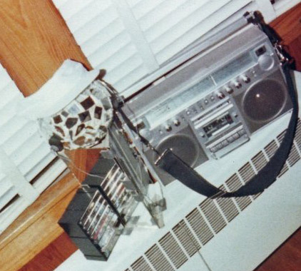
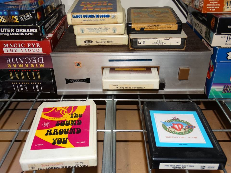
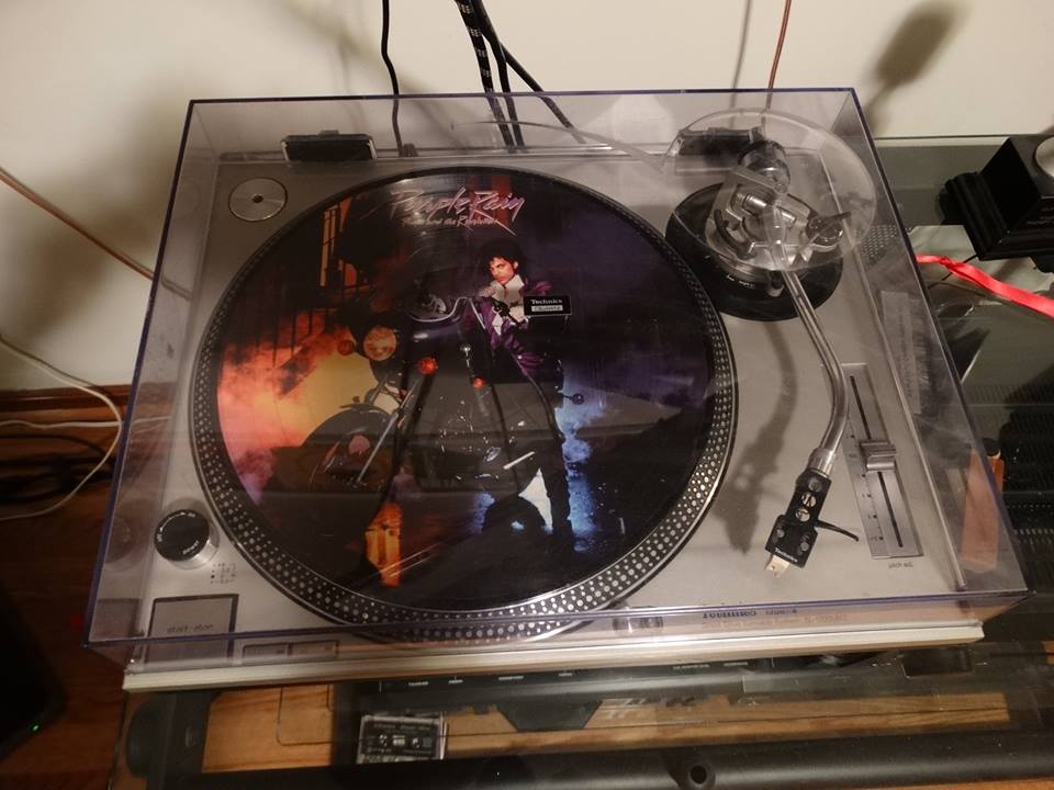
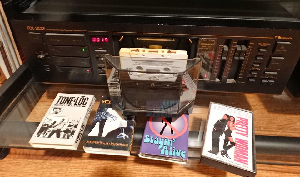
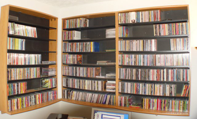
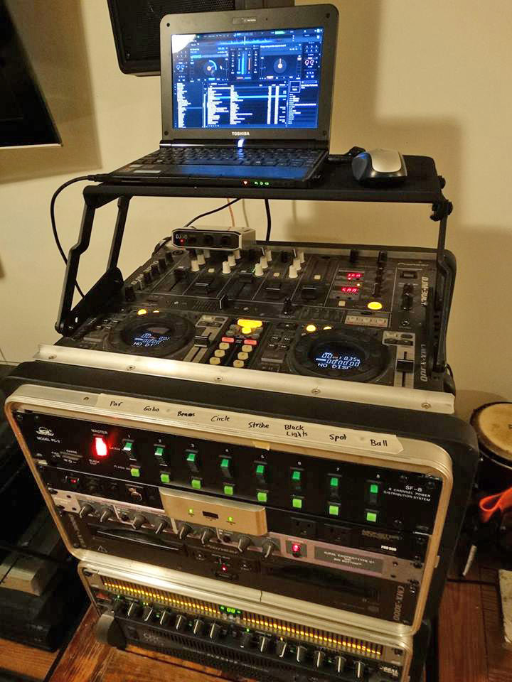
To get you into the mood for this blog post, I took six pictures of media players around my house, and I invite you to guess what they are (post your guesses in a comment if you'd like). Hopefully you can identify what kind of media they play ... and if you're really good, you might be able to also guess the specific brand & model of my hardware.
This was a fun trip down the music memory lane, but what does it have to do with my data visualization blog? Well, of course, I found some data on this topic!
Here's a graph from Bain & Company that shows when each type of music media was popular, and how the amount of money spent on music increased over the years:
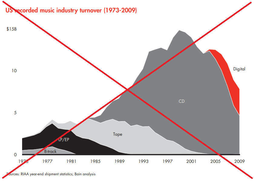 Michael DeGusta picked that graph apart, and pointed out that it did not account for inflation or the increasing population. Here's a link to his excellent article - I encourage you to read it! He then created a new/better version of the graph, showing the amount spent per person in constant (2011) dollars.
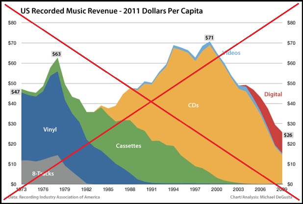
His graph was a much better representation of the data, but there were still a few things I would have done differently, so I decided to create my own version...
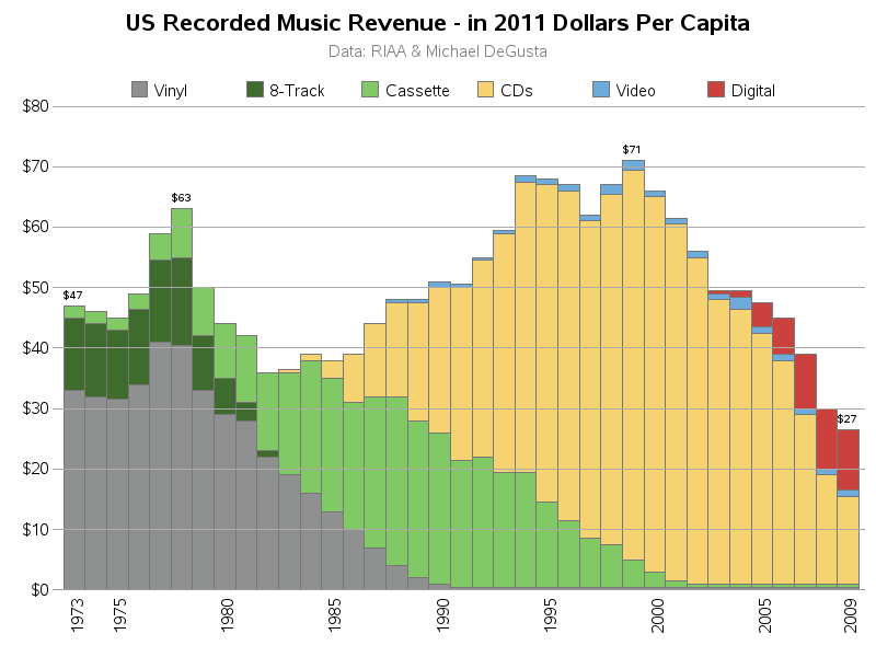 My changes are a bit subtle, so I'll point them out:
- I used a stacked bar chart, rather than a stacked line/area chart. I think the stacked bar segments represent the discrete annual data better, and with a line/area chart there's always the visual uncertainty of whether the areas are stacked, or overlaid.
- I controlled the stacking order such that the bar segments are arranged in the order they became popular - for example, vinyl came before 8-track tapes.
- I placed the reference lines on top of the graph, rather than behind, so you can more easily follow the axis tick mark values across the graph. This also eliminates the need to label the axis on the right-hand side of the chart (which would make it look more cluttered).
- I made the vinyl bar segments dark graph (similar to the color of a vinyl album), and I made the 8-track and cassette tape bar segments similar colors (two shades of green) since they are both forms of magnetic tape.
- It is easy to set up mouse-over text showing the annual values for the bar segments, whereas it is difficult/impossible for area-under-line charts.
- I turn the year labels sideways, so you can more precisely tell exactly which bar represents which year.
- And I used a traditional color legend, rather than placing labels directly on the graph.
So, what was your favorite album (or song) during the time period of this graph, and what form of media did you first buy it in?


7 Comments
I owned three copies of Fleetwood Mac Rumors - 8-track, album, CD. I wore out two copies of Boz Scaggs Silk Degrees albums (am on my third). I never really bought cassettes, just recorded my albums on them to listen in the car. Even having digital music, I tend to want to listen to an album of music rather than a shuffle playlist of everything - I might do a shuffle of an artist. I finally have my turn table set up again, ready to go!
Sounds like you're quite the recorded-music fan!
Me? - I *really* like random-shuffle ... on my portable mp3 player, each song is randomly picked from about 7,000 so I never know what's coming up next! :)
Very nice! Too bad the data only goes till 2009, I read something that vinyl was projected to capture 6% of music sales in 2017.
Yep! Someone said that the percent of vinyl sales was increasing, because music sales in general was decreasing (with people just using streaming services, rather than buying copies of the music). I would like to see the actual data though, to confirm or refute that!
You can see the RIAA data here (without paying 25 bucks):
http://www.riaa.com/wp-content/uploads/2018/03/RIAA-Year-End-2017-News-and-Notes.pdf
Boston. Bought as half-speed mastered vinyl. Immediately recorded to metal cassette (Maxell or BASF metal).
Nice trip down memory lane. Nice presentation as well.
Boston had some cool album covers (and some great music, of course!)