A common request on the communities page is to place data labels on horizontal bar charts. Often users want to display stacked horizontal bar charts, with the values displayed for each segment and the overall value of the bar itself as shown in the example below.
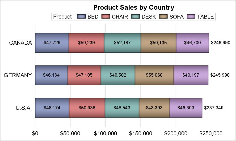
In this example, the graph displays the summarized values for actual sales by country and product as a stacked horizontal bar chart. There are multiple observations in the data set or each combination of country and product, so the values for each bar segment is also aggregated.
Prior to SAS 9.40M3, one would do this by summarizing the actual sales using the MEANS procedure with country and product as class variables. Then, one can use a stacked VBARPARM to display the bars by country and product with the overall bar value at the top. Then, we can use a SCATTER plot with MARKERCHAR to overlay the segment values in the middle of each segment. This is needed because you cannot layer a SCATTER plot on a HBAR, and you need to know the position where the text has to be layered.
With SAS 9.4M3, the HBAR statement supports the SEGLABEL option that automatically displays the summarized value for each segment. So, for the graph shown above, there is no need to first use the PROC MEANS step. The HBAR statemene does all the work for us. The program for the graph is shown below.
title 'Product Sales by Country';
proc sgplot data=sashelp.prdsale noborder;
format actual dollar8.0;
hbar country / response=actual group=product displaybaseline=auto barwidth=0.6
seglabel datalabel dataskin=pressed;
yaxis display=(noline noticks nolabel);
xaxis display=(noline noticks nolabel) grid;
keylegend / location=outside position=top fillheight=10 fillaspect=2 ;
run;
Note the following options used in the program above:
- SEGLABEL option is used to display the values for each segment.
- DATALABEL option is used to display the value for the full bar.
- DISPLAYBASELINT=AUTO option is used to only display the baseline if necessary.
- FILLHEIGHT and FILLASPECT options are used in the KEYLEGEND to shape the color swatches.
Stacking order for the group values can be reversed by setting GROUPORDER=ReverseData as shown in the graph below. We have also set a fill transparency so the segment labels show up better. Note, the order of the fill color swatches in the legend is also changed.
![]()
Finally, let us also discuss a new value for the option DATALABELFITPOLICY=InsidePreferrd released with SAS 9.4M5. For a non-grouped horizontal bar chart, users expressed a desire to be able to place the data labels inside or outside a horizontal bar. This is especially useful when the data label is not necessarily the value of the bar, but some other text string from another column in the data. When data labels are long, this can save space, and for shorter bars, the labels can be placed outside as shown in the graph below.
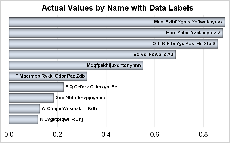
For this graph, I generated some random response values and random text strings as shown in the program in the link below. CATEGORYORDER=respdesc is used to get a graph with descending response values. Here is the SGPLOT program.
title 'Actual Values by Name with Data Labels';
proc sgplot data=bars noborder noautolegend;
hbar name / response=actual nostatlabel dataskin=pressed displaybaseline=auto
datalabel=name datalabelattrs=(weight=bold) datalabelfitpolicy=insidepreferred
categoryorder=respdesc;
yaxis display=none;
xaxis offsetmin=0 display=(nolabel noline noticks) grid;
run;
SGPLOT program: SG_Survival_Plot

22 Comments
I like the new DATALABELFITPOLICY=InsidePreferrd option! In your example, you used the GROUPORDER=ReverseData option to reverse the order of the bars. Another option is to use the new SORTORDER=ReverseAuto option on the KEYLEGEND statement (requires SAS 9.4M5).
If you have many categories (30 or more), a bar chart can get cluttered. If the categories are ordered (for example, years), you can switch to a stacked BAND plot.
Thanks, Rick. While you can use the SORTORDER option in the KEYLEGEND, it is not needed for the horizontal legend as reversing the group correctly reverses the items in the legend so they stay in sync. For vertical stacked plot, one needs the SORTORDER option to make the stack in the legend be in the same order as the stacked groups, if you use a vertical legend.
Sanjay:
In this example, if I also calculated the percentage of total sales and put them in a column called "PctOfTotal", can I display the summarized % outside the bar ? For example, assume that Canada has 35% of sales, Germany has 34%, and USA has 31%. I put "datalabel=PctOfTotal" in my code but found SAS just ignored it without any error message or warnings, and still printed the total sales for each country in the end of bar.
Is it possible to print summarized percentage numbers instead of sales for each country?
Thanks,
Yude
Yes. You can use DATALABEL option to display the summarized value for the bar response at the top of the bar. Additionally, you can use an AXISTABLE to display other values at the top of the graph from another column(s). OR, you could use the SEGLABEL to display the computed value per bar and group (OK if you don't have groups) inside the bar and then use DATALABEL=column to display values from another column at the top of the bar.
Hi Sanjay,
Recently I have been using SGPLOT a lot and have many questions to you. If I see you at PharmaSUG at Philly this year, I would love to ask my questions to you in person if you have time.
Meanwhile, I have general question about hbar (I am using hbarparrn but same issue I guess) statement option, barwidth. It's great that SAS automatically space out each bar within a page, but is there anyway I can specify the barwidth as absolute value like 0.1" 0.1pct, etc.? The reason is that some of my hbar chart will be multiple pages and the thickness of bar of each page is different depends on the number of bars per page. For an example, if first page bars are 10 and 4 at 2nd page, I would like to make all 14 bars the same thickness and make the 2nd page and "continued" so print only top half of the page.
Any idea?
Hi Raymond,
As you presumably have discovered, the BARWIDTH option in ODS Graphics only allows you to control how the total vertical space available for the bars is apportioned between bars and spaces.
Its range is 0 to 1. A value of 1 means that ALL of the space is devoted bars, and there are no spaces. A value of 0.5 means that the bars and spaces are equal in width. Etc.
I addressed the problem of trying to get equal bars in different views of the data, which is analogous, even if different in detail, to your objective.
I was delivering web-linked ranked bar charts of the same data.
Consider ranked sales by region. Four possible views could be: (a) Top 10 Regions; (b) All Regions with sales of at least $1M; (c) Enough Regions to account for 90% of total sales; and (d) All regions. Those numbers are just examples. The application needed to work with any number of regions, any specific numbers for the selection criteria. For the four different views, I insisted that the bar width be the same. Without the ability to set the barwidth to a specific value, that presented a challenge.
For the solution, see the section Adaptive SGPLOT Horizontal Bar Chart Macro Adjusts Image Height Based On Bar Count in my PharmaSUG 2013 paper:
http://www.pharmasug.org/proceedings/2013/DG/PharmaSUG-2013-DG11.pdf
If you have a question, I might be able to help.
Good Luck with your quest.
LeRoy Bessler PhD
Bessler Consulting and Research
Visual Data Insights™
Strong Smart Systems™
Le_Roy_Bessler@wi.rr.com
Hi,
I have More than 40 bars to be displayed in the Plot, Could you please suggest how to do that using HBAR in SGPLOT
You might need to use the WIDTH and HEIGHT options on the ODS GRAPHICS statement to grow the graph size large enough to see your text correctly on the bars.
Hi,
I am running SAS 9.4M7 but when I try to use DATALABELFITPOLICY=InsidePreferred it does not work. I get message in log saying "ERROR 22-322: Syntax error, expecting one of the following: NONE, ROTATE, SPLIT, SPLITALWAYS."
I am using two vbar statements. In some instances the var label is not visible since there is not enough space between the top of the smaller bar and the top of the bigger bar. I thought this datalabelfitpolicy would put the value which do not fit below the top of the smaller bar so that it is readable but option does not appear to work. Any suggestions?
My code is as follows:
proc sgplot data=a4 noborder;
vbar cod/ response=per datalabel categoryorder=respdesc FILLATTRS=(COLOR= BIBG) nooutline;
vbar cod/ response=perg3 datalabel FILLATTRS=(COLOR= LIP) DATALABELATTRS=(COLOR=WHITE) nooutline datalabelattrs = (size=8)
datalabelfitpolicy=insidepreferrd;
xaxis display = (nolabel);
yaxis label = "Incidence, %" max=1;
keylegend / location=inside position=topright across=1 down=2 noborder ;
run;
What version of SAS are you running?
Run: %put &sysvlong;
I'm running SAS 9.4 with maintenance release 7.
9.04.01M7P080520
Ah, I should have caught this earlier :-). That value works only on an HBAR statement, not a VBAR statement.
Hahaha! Okay. I wanted to do the same kind of thing so figured that option would work. Do you know of another way to have the value appear below the vertical bar if it does not fit above the bar?
I would use PROC MEANS or PROC SUMMARY to pre-summarize the data. Use a VBARPARM instead of a VBAR to create the bar chart (without data labels). Then, overlay a TEXT plot, using the bar chart CATEGORY/RESPONSE variables and setting the TEXT option to be the variable containing the label value. Two key options you will need on the TEXT plot are CONTRIBUTEOFFSETS=none and POSITION=BOTTOM. Let me know if that works for you.
Thank you so much for this suggestion! It helps but is not quite exactly what I need. Following your idea I did manage to get the value to appear below the line, however, I only want that to be the position when it does not fit above the bar. Similar to how the DATALABELFITPOLICY=InsidePreferred functions with the HBAR plot. For example, my graph has 10 bars and 8 of them fit nicely above the line and only 2 are smooshed/not visible. However, using the suggestion you provided, 6 of them are smooshed/not visible.
I had difficulty finding documentation of the syntax for the ideas you provided. Does POSITION= only have options of TOP/BOTTOM and no setting which puts it on the line?
Your help thus far has been GREATLY appreciated! Thank you so much!
The POSITION option can any of nine positions around a data point. The option can also take a column containing these keywords. That will be the key for you to simulate INSIDEPREFERRED for vertical bars Take your summarized data from PROC SUMMARY or PROC MEANS and process it though a small data step the looks at the response values and decides whether the label should go inside or outside of the bar by adding the TOP or BOTTOM keyword to a "position" column. Then, specify that column name on the POSITION option of the TEXTPLOT statement. If you need to fine-tune the position a bit, check out the POSITIONOFFSETY option as well.
Also, set CONTRIBUTEOFFSETS=NONE on the TEXTPLOT to maximize the data space for your bars.
Dan, your suggestions have been phenomenal! I created the new variable to specify in the POSITION option and I'm able to get the display I wanted/needed! I'm amazed that I've been able to do this. Would not be possible without your help. Thank you!
I was not able to find documentation about POSITIONOFFSETY and couldn't figure out proper syntax or function of it. It would be extra nice if I could get the label above/below the bar to be a little closer to the bar. Is that what POSITIONOFFSETY could do? Can you provide more details on the syntax/usage of this option?
POSITIONOFFSETY (or X) can take either a number or a column. For your case, you will need to use a column, as the value will change based on the POSITION value. In your POSITION data step, add an OFFSET column. If POSITION=TOP, try -0.3 for the value. For POSITION=BOTTOM, try 0.3. An offset value of 1 is equivalent to the height of the text string. The value can be greater than 1. BTW, you might also want to add STRIP-TRUE on the TEXTPLOT statement so that any spaces in your strings do not cause any misalignment.
Okay, I added the OFFSET column in my data step but the option POSITIONOFFSETY does not seem to be recognized when I try to use it in the TEXT statement. Can you give me an example of the syntax/usage?
Thank you.
Sorry, the POSITIONOFFSETY (and X) options are available only in GTL, As this thread went on, I forgot that your original program used SGPLOT instead of GTL 🙂
Okay, no problem. I've gotten the graph to fulfill the needs of the requestor so they are happy. I am very happy that you took the time to help me with this graph. Thank you again!
Hope you enjoy the holiday season!!