A question recently popped up in a discussion forum about creating table plots using SAS. So I thought I'd dabble in this topic, and see what I could come up with. If you're interested in tableplots, or American Community Survey (ACS) data, or data visualization, I invite you to follow along ...
In a SAS discussion forum, user lambdavu showed an example of a tableplot created using R software, and asked if it was possible to create such a plot using SAS. Here's a portion of the graph he showed.
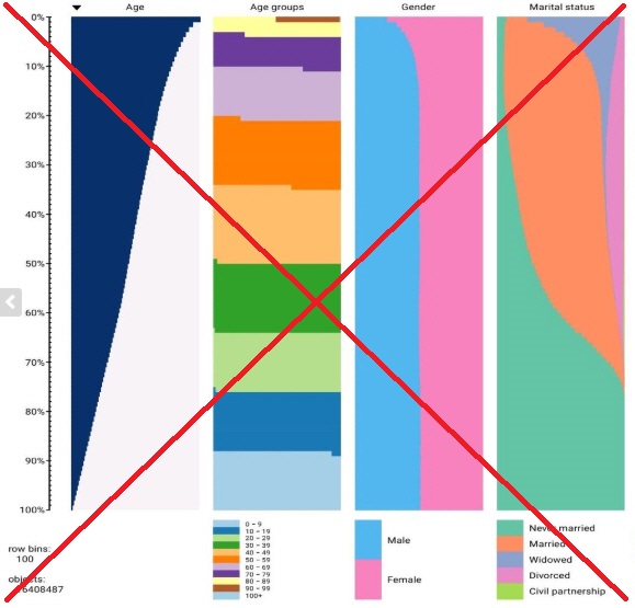
User SuzanneDorinski responded with some SAS code she had used to plot the 2015 American Community Survey (ACS) 1-year Public Use Microdata Sample (PUMS). She used Proc Rank to calculate the centiles (plotted along the left axis), Proc SGplot to draw the graphs, and ODS PDF with the columns=3 option to plot her three graphs side-by-side. Here's a screen capture of her output - pretty cool stuff!
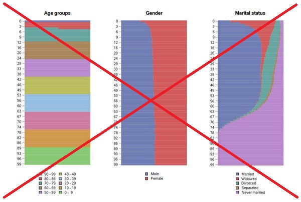
But after I studied the two tableplots (above), I decided they didn't really suit the way my brain thinks. Binning the data by centiles (100 groups with an equal number of observations, sorted by age, in each group) didn't really make sense to me. My brain kept wanting to treat the centiles as if they were ages ... but they weren't. What ages are actually in 'centile 27'? ... Who knows! Centiles might be useful for people doing certain kinds of studies, but they just didn't seem useful to me, for this particular data.
So I decided to create an alternate plot...
I downloaded the data zip file, extracted the SAS datasets out of it, and combined the psam_pusa and psam_pusb datasets - this produced a dataset with 3,147,005 observations which is a little over 2GB in size. I combined all the over-90 ages into a 90+ age group (because your graph has to end somewhere), and set up a few user-defined-formats so the numeric codes in the data would show up in the legend as useful/descriptive text. Here's an example of one of the user-defined-formats:
proc format;
value $marital
'1'='Married'
'2'='Widowed'
'3'='Divorced'
'4'='Separated'
'5'='Never married';
run;
Plot by Age (rather than Centiles)
I then created three plots with Proc GChart, using the g100 option to scale each year's stacked bars to 100%. And my bar midpoint axis is just the simple/straightforward age (rather than centiles). I used ODS tagsets.htmlpanel to position the charts side-by-side ... but since each chart is independent, they each allocated a different amount of space for the legend. And with the different legend sizes, the bar chart axes don't line up exactly the same, making it difficult to compare the charts.
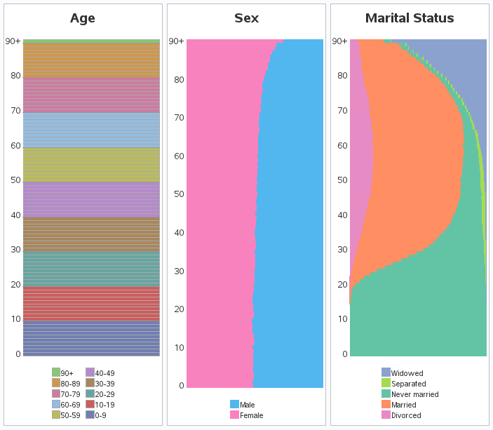
Uniform Axis Size
So I used a little trick to improve the graphs ... I added a 'blank' label with a height of 10pct to the bottom axis, producing a uniform amount of white space below the graphs. I then used the legend mode=share option to have the legend share the graph's space, rather than pushing the graph out of the way - this way the legend gets printed in the white space below the graph. Pretty slick, eh!
Add Reference Lines
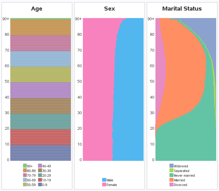
Now that I had a nice intuitive graph that my brain understood (above), I decided to try to answer a question about the data ... are there more men, or women, at certain ages? Looking at the Sex (male/female) graph above, the amount of pink & blue looks about 50/50 until you get up into the older ages (because women usually outlive men).
But could I really trust my eyes to judge the amount of pink and blue? Was it really split 50/50 for the lower ages? I needed some kind of reference point to assist my eyes. So I added a simple gray reference line at 50%. Now I can tell easily tell whether the blue and pink meet in the middle ... or not. With the help of the reference line, it looks like until about age 25 there are actually more males than females - interesting!

So, what other data would be interesting to plot this way? (Feel free to discuss in the comments!)


7 Comments
For centiles or other situations where the categorical variable is ordinal and has many categories, I have shown how to construct a band plot rather than a stacked bar chart with 100 bars:
https://blogs.sas.com/content/iml/2018/01/31/create-stacked-band-plot-sas.html
thank you very much!!!
Hi Robert - the graphs are very cool! Do you mind sharing the SAS codes?
Here ya go! http://robslink.com/SAS/democd98/tableplot_acs_info.htm
I think that this is an interesting and useful visual tool, but, if you were to deliver the tableplot(s) via HTML, can you provide mouseover text to provide the precise value of the number and percent of whole for, say, males of your age and marital status? And the total number of males of your age? Estimating is never a substitute for precise data, and estimating between curved lines is an effort with an even more unreliable outcome. Thanks.
LeRoy
LeRoy Bessler PhD
Visual Data Insights™
Le_Roy_Bessler@wi.rr.com
Yep - HTML mouse-over text could be added!
Nice to see the SAS/GRAPH version!