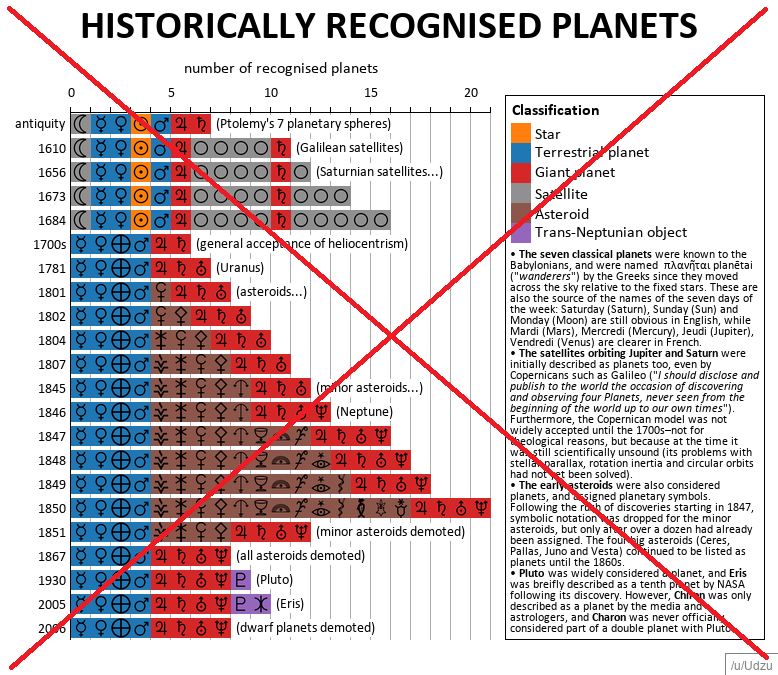
How many planets are there in our solar system? The answer hasn't always been 9 ... er, I mean 8 (sorry Pluto!). The count has changed throughout history as we got a better understanding of astronomy, discovered new planets, and redefined what a 'planet' is. Wouldn't it be helpful to have a graph showing what were considered planets at different points in history?
One such graph was recently posted on Reddit by user Udzu. It caught my attention, and I learned a lot from it. But I found it somewhat difficult to read, and there were several improvements I wanted to try.
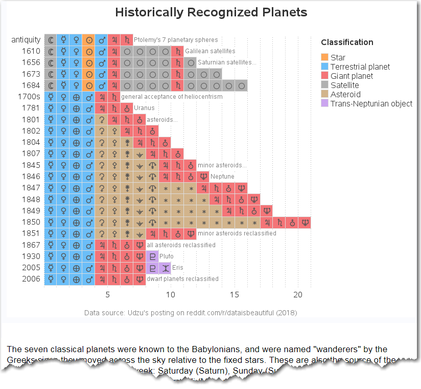
So I created my own version (with SAS software), and made the following changes:
- I used lighter colors for the bar segments, so they're easier on the eyes, and it's also easier to see the symbols on the bar segments.
- I added mouse-over text so you could see the planet names, without having to know what the symbols mean (I thought about adding a legend for the symbols, but there were too many symbols to make that practical - therefore I went with the mouse-over text instead.)
- I added drill down links to each planet, so you can click their bar segments to launch a Google search and learn more.
- I leave off the symbols for some of the moons and asteroids, to reduce visual clutter.
- I moved the long text blurbs below the graph, and made them HTML text (rather than part of the image). This way they don't clutter the graph, they are readable by screen-reading software (used by the visually impaired), users can copy-n-paste the text, and the keywords can be properly found by web-crawlers and searches.
- I used the US spelling of Recognized in the title, rather than Recognised.
- And I changed the word demoted to reclassified (which is the least I could do for Pluto!)
Here's a screen-capture of my new version of the graph. Click it to see the interactive version, with the HTML mouse-over text and drilldowns.
Technical Details
How'd he do that, you might be asking? Basically it's just a typical GChart stacked bar chart, where each planet has a unique subgroup value. I assigned the subgroup values such that the bar segments would stack in the desired order (alpha-numerically). On the year axis, I used the axis statement to hard-code two of the values so they would print as the desired text rather than the numeric year. I found a free font containing the planet symbols, and used Proc Fontreg to register the font so I could use it in SAS, and I then annotated the symbols on the bar segments.
So, did you learn anything? Now you know when the Moon was considered a planet (... and actually it might be considered a planet again, if certain scientists have their way!) And what about all those asteroids being counted as planets? And the cool planet symbols? Feel free to share this blog with your friends - who knows, it might help them on Trivia Night!


2 Comments
Apart from Eath. is there enough evidence of life in other planets?
I'm glad you recognized and fixed the error in the title.