I started my computer career as a Unix system administrator, and when I began using SAS almost 30 years ago it was only natural that I used it on Unix computers (they were the most powerful/capable computers I had access to at the time). I've picked up a lot of "SAS-on-Unix" tricks over the years, and I would like to share some of that knowledge with you. And if you're a PC SAS user, don't feel left out - these techniques will work for you too!
Before we get started, here are a few photos from my friends (Jason, Jennifer, Eva, and Angela) to give you a hint about what data we'll be using.


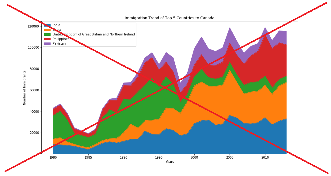
If you guessed "Canadian immigration data" you are correct! I recently saw the following immigration graph on reddit. It caught my eye, but the more I looked at it, the more things I wanted to change. For example, I'm not really a fan of stacked area graphs, and I found the text and titles too small to read.
My PC SAS license just happened to expire on the day I was creating my version of this graph, so I decided to be lazy and use SAS on our Unix servers (where someone else installs & maintains it), rather than re-installing or extending the SAS license on my PC.
Importing Excel Data with Unix SAS
I was pleased to find the reddit author posted a link to the data they had used in their graph. I downloaded the file, and just my Unix-luck ... it was an xlsx Excel spreadsheet. Spreadsheets are a great way to store and share data, and if you're using PC SAS it's a trivial matter to import the data. But if you've been using SAS on Unix for many years, you probably remember that it's traditionally been a bit harder to handle there. Here are some alternative ways I've used over the years, to get the Excel data into Unix SAS (listed in a somewhat chronological order, of when that functionality was available in SAS).
- Export the Excel data to a text/csv file, and then import that text file into Unix SAS.
- Import the Excel data into PC SAS, and use Proc Cport to create a transport file, and then use Proc Cimport to import the transport file into Unix SAS.
- Import the Excel data into PC SAS, and save the dataset as a .sas7bdat dataset, and then use that PC dataset on Unix SAS via CEDA (Cross-Environment Data Access). It's a little slower than having the file in native Unix SAS dataset, but speed is not really an issue with this small dataset.
- Use SAS/Connect on Unix, and a PC running Windows as a server to access the Excel files.
- Use a PC to re-save the .xlsx spreadsheet as a .xls file on a PC, and then use Proc Import with dbms=xls on Unix SAS to import it.
- Or, using the most recent versions of SAS, just simply use Proc Import with dbms=xlsx to import the spreadsheet, with no changes necessary, and no hoops to jump through! :-)
Of course, since I'm using a recent version of SAS (9.4m5) I was able to use the last (and most convenient) of the techniques in the list above. Here's the code I used - note that this exact same code will work on both Unix SAS and PC SAS!
PROC IMPORT OUT=my_data DATAFILE="canada_immigration.xlsx" DBMS=XLSX REPLACE;
RANGE="Canada by Citizenship$A21:AQ217";
GETNAMES=YES;
RUN;
Nice-looking Fonts with Unix SAS
Now that I have my data imported into Unix SAS, I'm ready to start working on my graph. As a long-time SAS/Graph user on Unix, I know that getting the text to look good in graphs has traditionally been harder on Unix than on PCs. Here are several text options I've used over the years.
- Use the SAS/Graph software fonts, such as 'swiss' and 'swissb'. These are always available in SAS/Graph, no matter what operating system you're on (PC, Unix, etc). But they look a little blocky (ie, the edges are not smooth/anti-aliased).
- Use a font that's in your X-server. You first have to make sure you have a Unix X-server running, and allowing your SAS session to use it as the DISPLAY. Then you have to run the Unix "xlsfonts" command to get the names of the fonts available in your X-server (xlsfonts currently returns a list of 8,034 fonts, for the X-server I'm currently using). You then go through a bit of trial-and-error to see which font looks good, choose one, and hard-code it in your SAS code. And when you run this job in the future, you have to make sure you have an X-server allowing you to display on it, and also that the X-server has the font you chose. Oh - and if you want to run the code on a PC, then you'll have to change the font in your code, because the PC probably won't have that same font.
- Or, if you've got a modern version of SAS, you can use the 'Albany amt' font, which we ship with SAS, and which gets rendered with smooth/anti-aliased edges. Also, you don't need to have an X-server - you can even run your SAS job in batch, with no X DISPLAY environment variable set.
Of course I used the last option! And since the 'Albany amt' font ships with SAS on all platforms, the exact same SAS code will work on Unix SAS and PC SAS. This is so much easier than it used to be! :-)
The Rest of the Graph (not Unix-specific)
The rest of the graph tricks aren't Unix- or PC-specific ... but good tricks nonetheless!
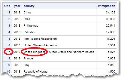
The spreadsheet had the number of immigrants to Canada from a lot of countries, and I needed to figure out how they picked the "top 5" for their original graph. I first checked to see if maybe they picked the top five countries with the most immigrants from the most recent year. I used the following bit of SAS SQL code to quickly produce a list of the immigrants from each country in 2013, sorted by the number if immigrants. The UK was in their graph, but wasn't in the top 5 of this list, so apparently that wasn't the way they calculated it.
proc sql noprint;
create table foo as select unique year, country, immigration
from tran_data
where year=2013
order by immigration desc;
quit; run;
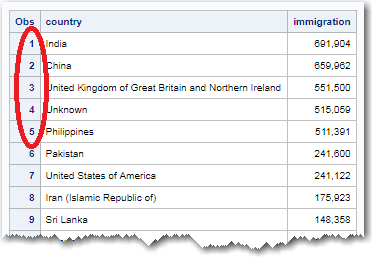
So I wrote another SQL query to sum up all the immigrants from each country over all the years in the table (1980-2013). Now the top 5 countries matched the ones that were in the original reddit graph. So I intuited this was probably the way they selected them.
proc sql noprint;
create table foo as select unique country, sum(immigration) format=comma10.0 as immigration
from tran_data
group by country
order by immigration desc;
quit; run;
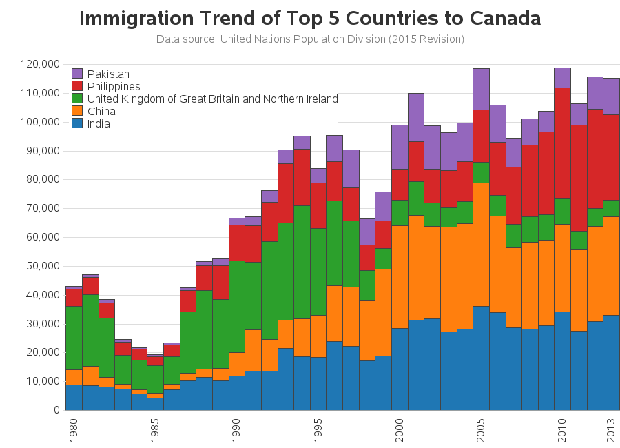
So I created a chart with those top 5 countries (see below). Here are a few details about how I created the graph:
- I used a stacked bar chart (rather than a stacked line/area plot).
- I used pattern statements to specify the exact same colors as the original graph.
- I made the text larger (especially the title).
- I added a footnote/title explaining where the data came from.
- I removed the labels from the axes.
- And I added light gray reference lines behind the bars.
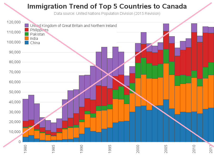
It was close to the new/improved version of the chart I was aiming for ... but the colored bar segments weren't stacked in the same order as the original graph's stacked line/areas - mine were in the default/alphabetical order. At first I couldn't figure out what they were using to control the stacking order in the original chart, but after a bit of studying I saw it - they were using the total immigration numbers! The country with the largest total immigration (across all years) into Canada was drawn first (at the bottom), and the country with the smallest total immigration into Canada was at the top. Therefore I assigned a numeric 'rank' to each country based on their total immigration number, and used that as my subgroup= in Proc GChart. I then created a data-driven SAS user-defined-format so the rank numbers would print as the country names. Now the colors (countries) in my chart are stacked in the same order as the original chart!
But wait - there's more!
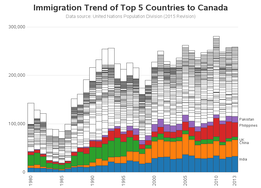
As I was working with this chart, one question kept popping into my mind ... what about immigration from all those other countries? In the SQL summary tables, it certainly seemed like there were other countries quite close to the "Top 5" numbers, so why cut it off at 5? I thought it would be interesting to see the Top 5 in the context of immigration from all the other countries. So I tweaked the code a bit to show all the countries, keeping the colors of the Top 5, and making all the others white (by using a large repeat= on the final/white pattern statement). Note that the large bar segment at the top of some years (such as 1990s) was country='Unknown' ... I intentionally tweaked the rank numbers so those would show up at the end of the stacked bars.
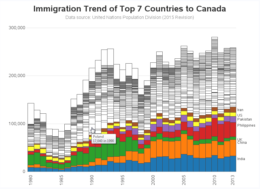
Looking at that graph (especially the 2013 bar), it just felt like I should be showing the Top 7 rather than just the Top 5. So I tweaked my code again, and created a graph with the Top 7. Hey - now it even shows immigration from the US! And all those white/non-colored bar segments ... if you want to know what country they are from, you can click here to see the interactive version with HTML mouse-over text (see the mouse-over for Poland in the image below).
Hopefully you've learned that it's now (just about) as easy to use SAS on Unix, as it is on a PC. And in the process of learning those SAS-on-Unix tricks, you might have even picked up some cool data- and graphics-tricks along the way! (Here's a link to the full code for the graphs above.)


2 Comments
Hey Robert,
Great job as always! What drew me to the blog was the access method. I've been working with a student here and the concept of running SAS Enterprise Guide to read data (from the PC) but that it's running a workspace server on Unix was quite confusing to him!
I'll poke the bear a bit here... I'm not sure a stacked bar is the best representation of this information. I think I'd prefer individual lines so I can see if UK immigration is following the same trends as Pakistan. In other words, it's hard comparing bar segment slices to see if they are trending the same as the general immigration pattern of if one nationality is increasing or decreasing over time.
Just a thought!
Good point! ... The choice of graph depends on what questions you're wanting it to answer!