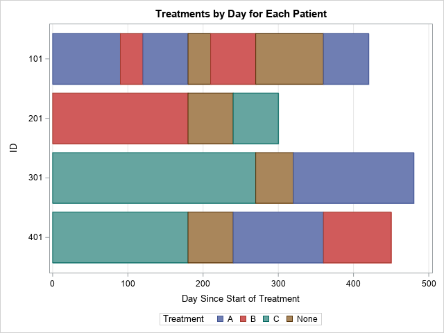
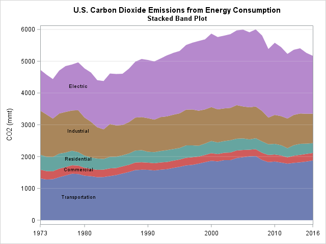
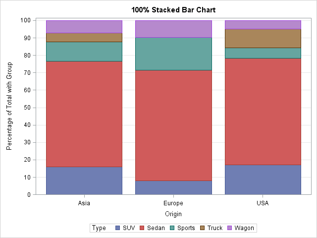
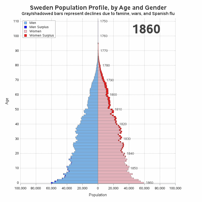
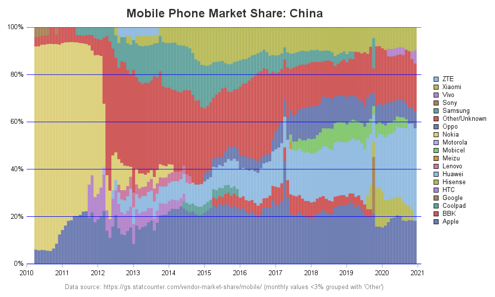
I recently had a discussion with a friend, and we were wondering about Apple's market share. This led me to look into the actual data ... finding the online charts lacking, and then designing my own charts. Follow along if you're curious about the process of improving the charts, or
Search Results: stacked (138)
The HighLow plot often enables you to create many custom plots without resorting to annotation. Although it is designed to create a candlestick chart for stocks, it is incredibly versatile. Recently, a SAS programmer wanted to create a patient-profile graph that looked like a stacked bar chart but had repeated
This article shows how to construct a "stacked band plot" in SAS, as shown to the right. (Click to enlarge.) You are probably familiar with a stacked bar chart in which the cumulative amount of some quantity is displayed by stacking the contributions of several groups. A canonical example is
Ensemble methods are commonly used to boost predictive accuracy by combining the predictions of multiple machine learning models. The traditional wisdom has been to combine so-called “weak” learners. However, a more modern approach is to create an ensemble of a well-chosen collection of strong yet diverse models. Building powerful ensemble models
Last week a user expressed the need to create a graph like the one shown on the right using SAS. This seems eminently doable using GTL and I thought I would undertake making this graph using SAS 9.3. The source data required to create this graph is only the
I enjoy reading the Graphically Speaking blog because it teaches me a lot about ODS statistical graphics, especially features of the SGPLOT procedure and the Graph Template Language (GTL). Yesterday Sanjay blogged about how to construct a stacked bar chart of percentages so that each bar represents 100%. His chart
A couple of weeks back we had a question on how to make a bar chart with stacked and clustered groups. User also wanted to display the value for each stacked segment below the bars. The article Bar Charts with Stacked and Cluster Groups shows how to create such a
Creating bar charts with group classification is very easy using the SG procedures. When using a group variable, the group values for each category are stacked by default. Using the sashelp.prdsale data set and default STAT of SUM, here is the graph and the code. SGPLOT code: proc sgplot data=sashelp.prdsale;
At the end of the Indiana Jones classic Raiders of the Lost Ark, an older man struggles to push a cart carrying a large wooden box down a warehouse hallway. This iconic scene takes place in an enormous space filled with other large wooden boxes stacked to the sky. The
Do you have a love-hate relationship with cookies, chocolate, potato chips, fill-in-the-blank? It’s important to know that there is nothing inherently wrong with you if you crave these foods. In fact, there’s plenty of science that explains why we reach for sweet, salty or savory foods over and over, but
Colorful fruits and vegetables paint beautiful images of health and wellness. The compounds that give each color its rich hue contain a unique blend of nutrients that protect us from certain diseases and keep our body’s working in tip-top shape. Throughout the day, aim to eat a rainbow of colors
A SAS programmer was trying to understand how PROC SGPLOT orders categories and segments in a stacked bar chart. As with all problems, it is often useful to start with a simpler version of the problem. After you understand the simpler situation, you can apply that understanding to the more
The SGPLOT procedure supports a wide variety of plot types that you can use directly or combine together to create more complex graphs. Even with this flexibility, there might be times you run across a graph that you cannot create using one of the standard plot types. An "area" bar
These days, many countries are moving away from coal, and towards natural gas, hydro, wind, and solar as ways to meet their electricity needs. I had heard that some countries still use a lot of coal (especially those countries with large coal deposits), and I was curious which countries use
A genetic algorithm (GA) is a heuristic optimization technique. The method tries to mimic natural selection and evolution by starting with a population of random candidates. Candidates are evaluated for "fitness" by plugging them into the objective function. The characteristics of the better candidates are combined to create a new
Recently, the news has been all abuzz about William Shatner traveling into space. This was a cool event because he's the oldest person who has traveled into space (at 90 years old) ... and he was also the iconic Captain Kirk from the original Star Trek television series. This got
Many cities have Open Data pages. But once you download this data, what can you do with it? I'm going to download several datasets from Cary, NC's open data page, and try to give you a few ideas to get you started on your own data exploration! And what data
You've probably seen a population pyramid, such as this one I showed in a previous blog post. But let's scrutinize population pyramids a bit deeper, with an eye on special features that can make them even more useful! I was inspired to give population trees a second look by this
Most introductory statistics courses introduce the bar chart as a way to visualize the frequency (counts) for a categorical variable. A vertical bar chart places the categories along the horizontal (X) axis and shows the counts (or percentages) on the vertical (Y) axis. The vertical bar chart is a precursor
An UpSet plot is used to visualize intersections of sets. In this post, we will illustrate techniques to create this plot using the Graph Template Language (GTL). We assume that you are familiar with GTL. From the point of view of construction, we leverage the LATTICE layout available in GTL
Como integrar modelos hierárquicos de séries temporais desenvolvidos em R ao SAS Visual Forecasting analisando as diferentes estratégias? O objetivo deste artigo é apresentar como podemos executar modelos de séries temporais, que foram desenvolvidos no R, no SAS Visual Forecasting, podendo, assim, paralelizar e acelerar o processamento do código R.
Flash back to 4 years ago: 2016. I thought that THAT year was going to be one of the hardest years of my life. We decided to sell our house while living in it with 2 little boys (ages 2 & 5 at the time) and a dog and buy
A staggering number of Americans have been bitten by the cardio bug at some point in their lives. Even for those who do not particularly enjoy endurance exercise often rely heavily on cardio as an exercise staple. This is not necessarily a bad thing. Easily accessible from a space and
Assessing a company from the outside can be tricky business – but it shouldn’t be. That’s why we’re pulling back the curtain on the #saslife. From our values to our vision for the future, we’re giving a transparent look at what it’s really like to work here. At SAS, it’s
I recently saw in several social media posts that sales of vinyl records are forecast to be higher than sales of CDs this year (2019) for the first time since 1986. Two questions came to mind - 1) Is this true? and 2) Is this a big deal? Let's analyze
With all this sitting at a desk writing code, I have to do something to keep in shape. And for me, that something is paddling boats ... as fast as I can - and occasionally trying to race them. This past weekend I entered the race at Hunting Island, SC.
In response to a recent article about how to compute the cosine similarity of observations, a reader asked whether it is practical (or even possible) to perform these types of computations on data sets that have many thousands of observations. The problem is that the cosine similarity matrix is an
You've probably heard of the stupid 'challenges' where people usually end up hurting themselves (cinnamon challenge, Carolina reaper pepper challenge, etc). I thought it might be more helpful to society to have a challenge that could actually help people, rather than hurting them! Therefore I came up with the Halloween
The SAS Championship golf tournament is happening this week, here in Cary, North Carolina! If you're following along and watching the scores, you might wonder how they're doing compared to past years, and what kind of scores it generally takes to win. Follow along as I plot the data from
In this blog, I use data from the U. S. Department of State Trafficking in Persons (TIP) reports for the years 2013-2017 to accomplish these objectives: 1) To determine what are the main themes in TIP reports, and 2) to show how to work with ASTORE code to deploy models using SAS Viya 3.4 Visual Text Analytics 8.4.