Learn about the latest tips, tutorials, upcoming events and certifications

12 blog posts from 2024 that deserve a second look

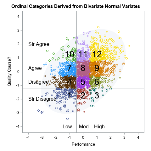
In a previous article, I presented some of the most popular blog posts from The DO Loop in 2024. In general, popular articles deal with elementary topics that have broad appeal. However, I also write technical articles about advanced topics, which typically do not make it onto a Top 10