Previously, I have written articles on how we could display more subject response data along with the traditional WaterFall graph showing the best "Change from Baseline". This is in response to the desire to see data like treatment duration for each subject in the same graph. Otherwise, investigators have to view different graphs to see all the data, some of which may be sorted in different ways.
One popular proposal is to display the best "Change from Baseline" along the front face of a 3D graph, with "Duration of Treatment" for each subject displayed along the horizontal plane through the baseline. This is proposed in the paper "3D waterfall plots: a better graphical representation of tumor response in oncology" by E. Castanon Alvarez, Et. Al.
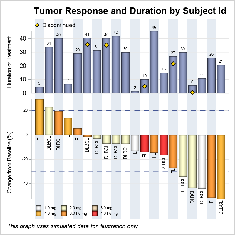
Since the data is really 2D, with one independent variable and multiple responses, a simpler way to display this data in a 2D figure is shown below. The information is very easy to understand, and additional information can be displayed such as actual duration of treatment for each subject above the bar, and the 20% to -30% band. Full GTL program for this graph is included in the link at the bottom.
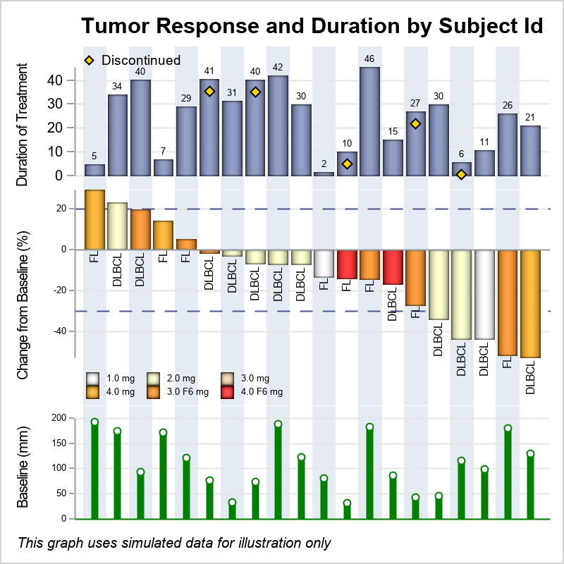
Another request was made to include more response data such as the "Baseline Tumor Load" for each subject. This too can be easily accommodated in the 2D graph as shown below. The baseline tumor load is shown in the bottom cell with needles.
The benefit of using a 2D graph is the simplicity of the display, and also its extensibility. Full GTL code for the graph is included below. The program uses a Discrete Attributes Map to color the bars by treatment. I presented these graphs at the 2018 PhUse conference in Frankfurt last week.
In this example, I start from the data for a traditional WaterFall graph, and add the column for "Duration of Treatment", "Baseline Tumor Load", Treatment, Discontinued flag and Lesion type. The data set is shown below. The data is simulated.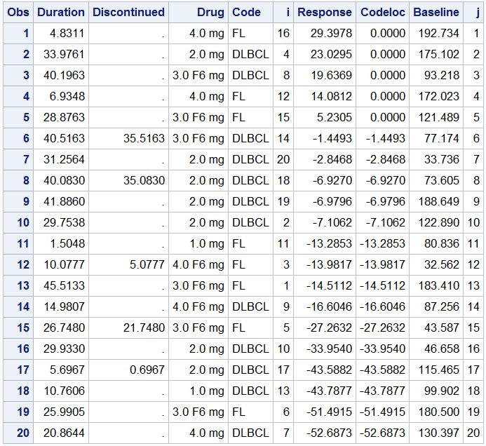
I also presented an alternate method where we can start with the data for a "Swimmer Plot" and add the columns needed for displaying the "Best Tumor Change from Baseline". I will write about that in a follow up article soon.
Full SAS 9.4 GTL program: WaterFallPlus