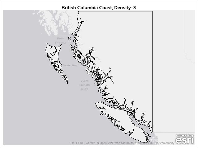
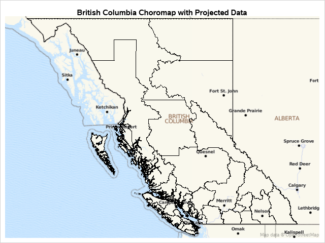
Tips and Tricks
This post provides examples of DRAW statement syntax and links to the documentation.
Tips and Tricks
This post provides examples of DRAW statement syntax and links to the documentation.
DRAW statements provide to GTL what SG annotation provides to the SG procedures--a way to add text, shapes, lines, and arrows to graphs.
A few months ago, a user inquired about a chart that showed tumor response and treatment duration for each subject on 2 different planes of a 3D view. The data was really 2D, with one independent variable (the subject id) and two or more response values. I had provided an
PROC SGPLOT looks at the PROC statements, it looks at the data, and it writes a template that might depend on the data. If you want to understand how the graph is created, you need to look at the PROC SGPLOT code, the graph template and data objects that it constructs, and the final graph.
Usually, you use axis tables when there is a clear link between the rows of the axis table and the graph. I'll show how to use an axis table to create a table that is independent of the graph. This post also uses discrete attribute maps.
This post shows you how to run PROC SGPLOT, create smooth curves by using penalized B-splines, use ODS OUTPUT to create an output data set from PROC SGPLOT, and process it to display drop lines.
This is the 9th installment of the "Getting Started" series, and the audience is the user who is new to the SG Procedures. It is quite possible that an experienced users may also find some useful nuggets here. In this article, we will cover the basics of the BUBBLE plot.
This post shows ways to display the upper or lower triangle of a correlation matrix. You can also use colors to show the magnitude of the correlations.
The POSITION= option in the TEXT statement provides you with a way to position text in a variety of locations relative to a point. You can use this option to fine tune label placement in a plot primarily created by using the SCATTER statement and the DATALABEL= option.
This post shows you how to animate text to create a message that appears one character at a time.
In my previous post, I described a new options to control the widths of the caps for Whiskers, Error and Limit bars. This topic could have been titled "Little things go a long way", as such details really make for a good graph. In a similar manner, another detail issue
The SG procedures and GTL statements do a lot of work for us to display the data using the specified statements. This includes setting many details such as arrow heads, line patterns etc, including caps. Often, such details have a fixed design according to what seems reasonable for most use
We'll take a deeper dive into understanding item stores--the files in which compiled templates are stored--and ways in which you can access them. At the end, I will show you one of my new examples: displaying percentages in the Kaplan-Meier failure plot.
In the previous post, I discussed creating a 2D grid of spark lines by Year and Claim Type. This graph was presented in the SESUG conference held last week on SAS campus in the paper ""Methods for creating Sparklines using SAS" by Rick Andrews. This grid of sparklines was actually the
The 25th annual SESUG conference was held at in the SAS campus this week. I had the opportunity to meet and chat with many users and attend many excellent presentations. I will write about those that stood out (graphically) in my view. One excellent presentation was on "Methods for creating
The South East SAS Users Group meeting wound up yesterday. The 25th anniversary conference was held on SAS Campus and it provided a great opportunity to meet with many enthusiastic SAS users and attend many informative presentations. More on this in a follow-up article. During one of these presentations, Mary
You can modify all of the components of the graphs that analytical procedures produce: the data object, graph template, and the dynamic variables. This post takes a closer look at dynamic variables (which you can see by using PROC DOCUMENT) and data objects and explores graphs that are constructed from more than one data object.
Once in a while you run into a pesky situation that is hard to overcome without resorting to major surgery. Such a situation occurs when you have a stacked bar chart with a discrete legend positioned vertically on the side of the graph. A simple example is shown below. title
When a plot is classified by one or more variables, the different classes values are displayed in the graph either by position or by using different plot attributes such as color, marker shape or line pattern. For plots that display the visual by a filled area (bar, bin, band, bubble,
Plot statements included in the graph definition can contribute to the legend(s). This can happen automatically, or can be customized using the KEYLEGEND statement. For plot statements that are classified by a group variable, all of the unique group values are displayed in the legend, along with their graphical representation
Curve labels in series plots can be positioned inside or outside the graph. Date variables can be specified as TYPE=LINEAR with a date format or more commonly as TYPE=DATE. Sometimes external curve labels might appear below or above the graph, particularly with TYPE=DATE axes. This post shows you ways to move them to the right of the graph.
Last year, a user asked about creating a "Turnip Plot" as used in this study of Caesarian Section Rates. Primarily, this is similar to a histogram on the y-axis for each unique value on the y-axis. A marker is drawn for each occurrence, starting from the center. Back then, I
I hope everyone has noticed some new shortcuts in Graphically Speaking. As you scroll down and look to the right, there are shortcuts for Sanjay's getting started and clinical graphs posts and one for my advanced blogs. When Sanjay asked me to make an icon for my advanced blogs, at
Axis tables can use the SUM= option to summarize data and display means, medians, sums, and percentages. They can instead be used to display data, text, and statistics without any summarization.
This post provides a general macro that enables you to easily display special characters (Unicode) in axis table columns.
SAS 9.4 maintenance release 5 was released on Sept 19, 2017. This release includes many new items including integration with SAS Viya and SAS Studio, a web application for SAS development. Also Included with this release are some cool new features in the graphics domain, some of which were requested
In PROC GLM and most other procedures that compute LS-means, mean comparisons are now displayed graphically. This makes comparisons between a large number of groups easier to interpret.
On a recent visit to an In-House Users Group meeting at a Pharmaceutical company, I presented a 1/2 day seminar on creating Clinical Graphs using SG Procedures. Polling the audience for their experience with these procedures indicated that many SAS users are not familiar with these new ways to create graphs. So,
This post shows how to use PROC SGPLOT together with PROC TRANSREG to fit monotonically increasing or decreasing functions through a scatter plot.
In the previous article on Getting Started with Vertical HighLow Plot, I described how we can use the HighLow plot to display the stock price by date. The HighLow plot is specifically designed for such use cases as shown below. The data is downloaded from the Nasdaq web site, and