This is the 9th installment of the "Getting Started" series, and the audience is the user who is new to the SG Procedures. It is quite possible that an experienced users may also find some useful nuggets here. In this article, we will cover the basics of the BUBBLE plot.
The BUBBLE plot is a convenient way to visualize two responses (Y and Size) by an independent (X) variable, or a size response by two (X, Y) variables. Here is a common example of a Bubble Plot, with code and resulting output.
title 'Frequency of Car Types (Relative)';
proc sgplot data=cars noborder;
bubble x=type y=origin size=count / fillattrs=graphdata1 bradiusmin=5px bradiusmax=35px
datalabel=count datalabelpos=center;
xaxis grid display=(noline noticks nolabel);
yaxis grid display=(noline noticks nolabel);
run;
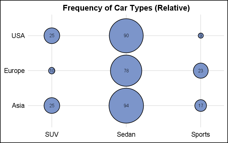
This graphs displays the number of cars for each category of Sedan, Sports and SUV by Origin. In this case, we have set the minimum and maximum radius for the bubbles that are mapped to the minimum and maximum response value of the SIZE variable. The response value is displayed in the center of each bubble.
 The smallest and largest response values are mapped to the smallest and largest AREA of the bubble. The default mapping is non-proportional. So, the bubble for 1/2 the maximum value may not be 1/2 of the area of the MAX bubble and the equation of the line for the mapping may not pass through zero. As you can see in the graph above, the area of the "9" bubble is not about half the area of the "17" bubble.
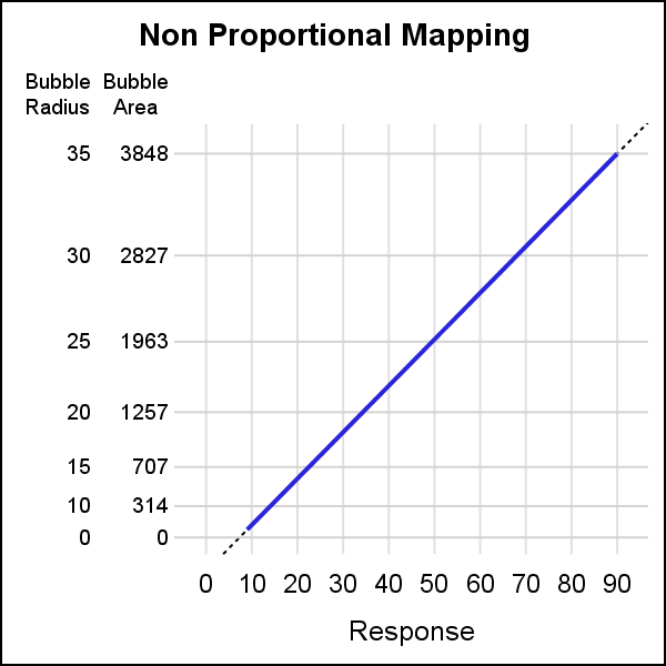
The graph on the right shows the mapping of the AREA of the bubbles to the response value in this specific case. The mapping is linear by area, and the line MAY NOT pass through (0, 0). Bubble area and radius are shown on the left.
Often, it is preferable to have a linear mapping of the response value to the bubble area, with the mapping line passing through (0, 0). This can be achieved by setting the PROPORTIONAL option as shown below. In this case, the mapping line of area to response value does pass through (0, 0). The upper point of the line represents the highest response and area of biggest bubble. In this case, the lower bubble radius is used as a cutoff for display of the bubble. So, in our case, the smallest bubble will be 5 pixel radius regardless of the response value.
bubble x=x y=y size=size / proportional;
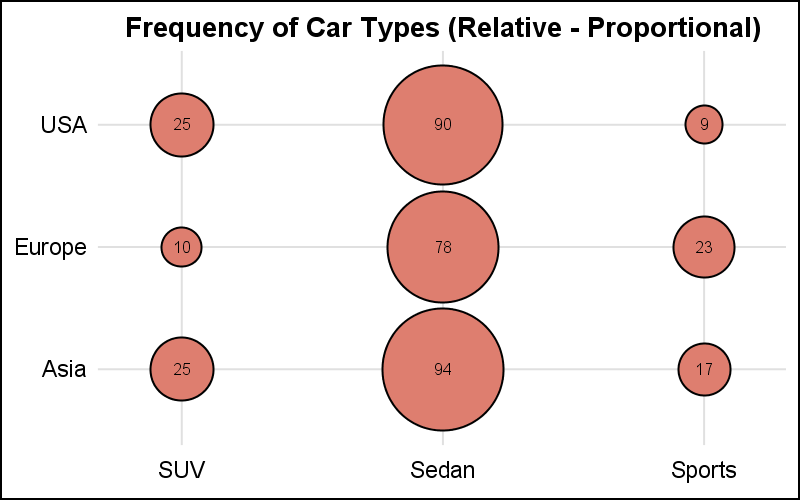
In the graph above, note the area of the "9" bubble is about half the area of the "17" bubble. All the other sizes are also proportional to the biggest size and value. We have also use the DATALABEL option to display the response value in the middle of the bubble using DATALABELPOS=CENTER.
The two graphs above show the RELATIVE mapping of the response value to the bubble size. Bubble size range is set by default, or can be set using the BRADIUSMIN and BRADIUSMAX options. While in the graphs above, the X and Y variables are discrete, these can also be numeric, with linear, log or time data. The bubble is always drawn at the (x, y) location with a size mapped to a value between BRADIUSMIN and BRADIUSMAX.
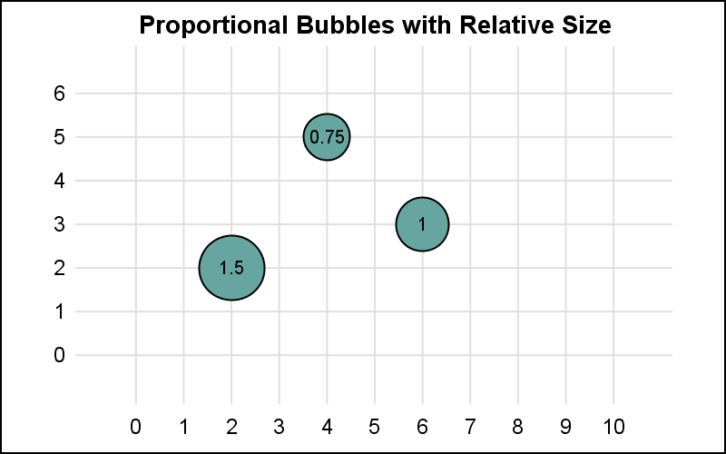
The example below shows a Relative Bubble Plot with linear axes, using ASPECT and axis ranges to depict an (sort of) equated case. The tiles created by the grid lines are about square.
title 'Proportional Bubbles with Relative Size';
proc sgplot data=bubble aspect=0.6 noborder;
bubble x=x y=y size=size / proportional datalabel=size datalabelpos=center;
xaxis values=(0 to 10 by 1) grid display=(noline noticks nolabel);
yaxis values=(0 to 6 by 1) grid display=(noline noticks nolabel);
run;
Another less known feature of the Bubble Plot is the ABSSCALE option. With this option, the values of the SIZE variable are interpreted in the same scale as the axes. So, if size value is 1, then the bubble has a radius of 1 along each axis. For equated axes we will get round bubbles.
title 'Equated Bubbles with Absolute Size';
proc sgplot data=bubble aspect=0.6 noborder;
bubble x=x y=y size=size / proportional absscale datalabel=size datalabelpos=center;
xaxis values=(0 to 10 by 1) grid display=(noline noticks nolabel);
yaxis values=(0 to 6 by 1) grid display=(noline noticks nolabel);
run;
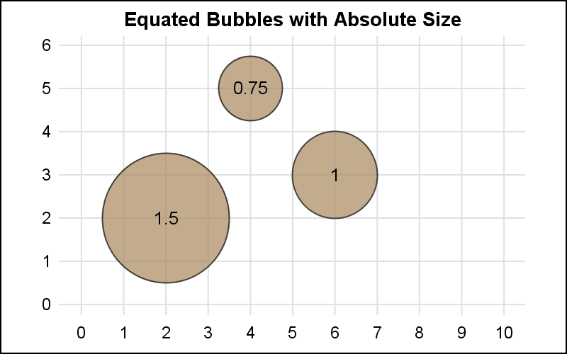
In the graph above, the response size is shown in each bubble. Now, using ABSSCALE, we get bubbles that have a size relative to the scale of the data on each axis. This case is very useful when showing coverage of something on a plan or a map. Spatial coverage can be seen, including any overlaps. This is often used to show a "Blast Radius" on a map, or the influence of large warehouse stores in a city.
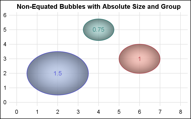
In the graph above, it is important to use equated axes, where each tile in the grid is about square. But, what if the axes are not equated? In that case, you get a graph as shown below. In this graph, each tile in the grid is slightly longer than it is tall. So, while the values are mapped to the axis correctly, now the the bubble is a bit wider than it is tall. The bubbles are not round since the axes are not equated.
Note: ABSSCALE may not produce correct results if the axes are not LINEAR. So, it is recommended to NOT use a LOG scale on the axes.
In this example, I have used a GROUP variable and also a DATASKIN for appearance. See the program linked below for the full code.
SGPLOT Code: Bubble
