Tips and Tricks
What you need to know about the graph template and data object in PROC SGPLOT

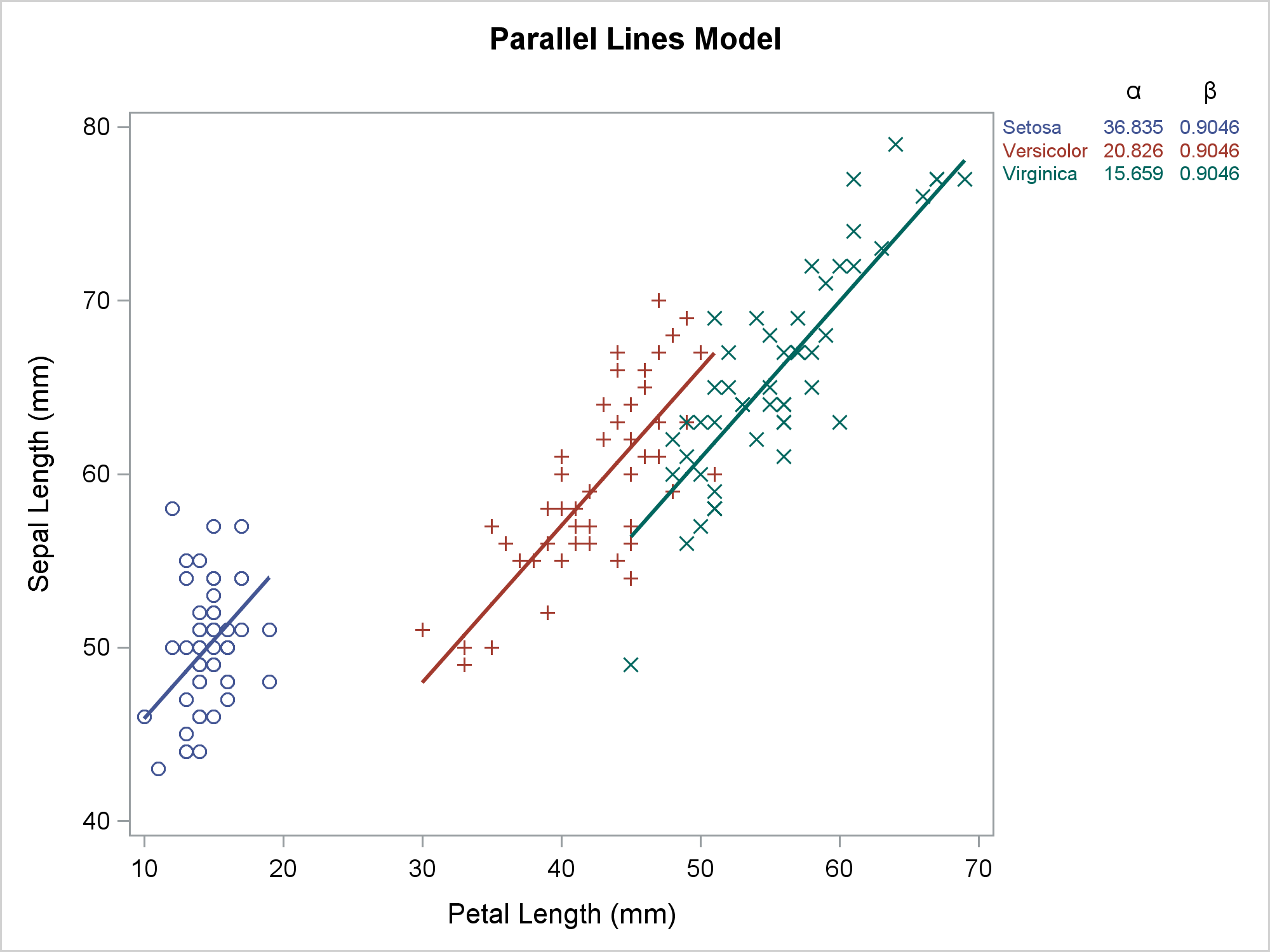
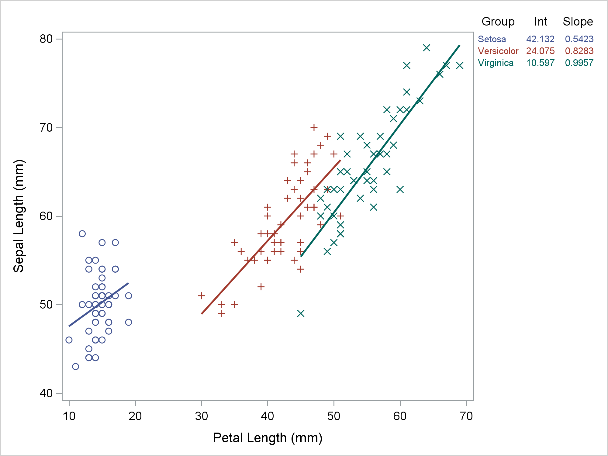
PROC SGPLOT looks at the PROC statements, it looks at the data, and it writes a template that might depend on the data. If you want to understand how the graph is created, you need to look at the PROC SGPLOT code, the graph template and data objects that it constructs, and the final graph.