The SG procedures and GTL statements do a lot of work for us to display the data using the specified statements. This includes setting many details such as arrow heads, line patterns etc, including caps. Often, such details have a fixed design according to what seems reasonable for most use cases. However, sometimes the default behaviors are not good enough, and users want to customize these based on their use case, requirements of various journals or their own aesthetic sense.
While the statements often provide options to customize items like marker size, bar width and other attributes, one element that did not allow customization was the width of the cap for a box plot, error bars or limit bars. Users have often asked for control of cap widths, and with SAS 9.40M5, new options are added to address just this need. Now, you can use CAPSCALE, ERRORCAPSCALE or LIMITCAPSCALE to adjust the width of these caps using a factor on the original width. Here are some examples.
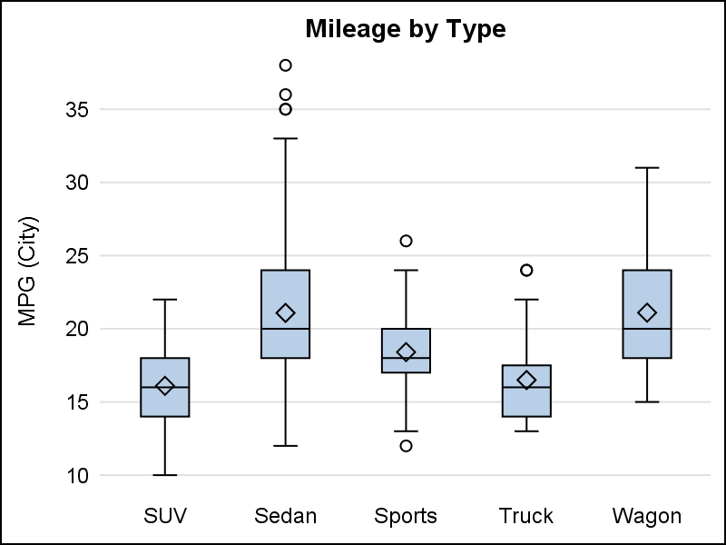
Box plot, with default cap width on left, and reduced cap width using CAPSCALE=0.5 on the right

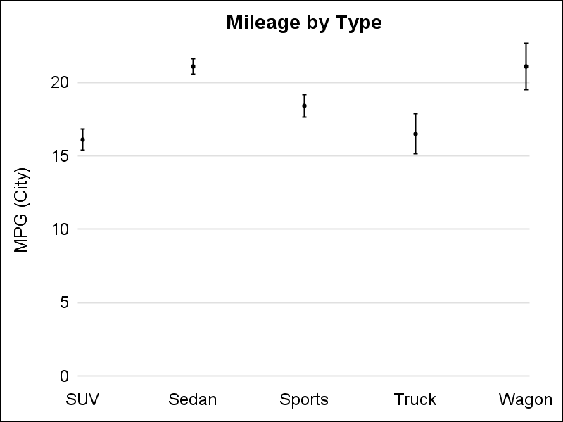
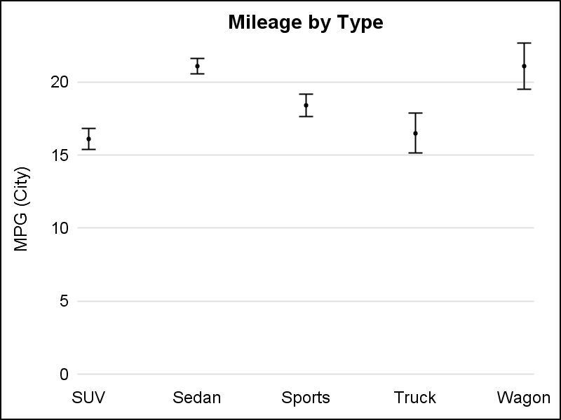
Scatter plot, with default error cap width on left, and reduced caps using ERRORCAPSCALE=0.3 on the right.
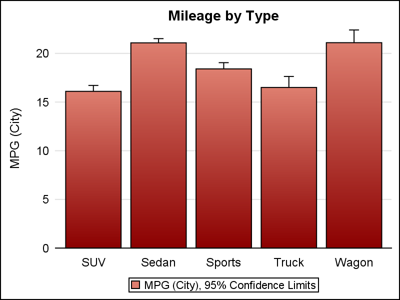
VBar, with default limit cap width on left, and increased caps using LIMITCAPSCALE=2.0 on the right.

Now, you can adjust the cap widths to get your graph just right.
See full code for details: Cap_Scale


2 Comments
Hi Sanjay,
I really love your book clinical graphs using SAS. However, I think there might be a bug or something in proc sgplot.
I computed pairwise comparison of a continuous variable of interest (ratio_value) using proc npar1way:
proc npar1way data=have wilcoxon DSCF;
class genetics;
var ratio_value;
ods output dscf=differences;
run;
This gives this the following p-values for each genetic type vs. the reference (genetics=0).
Analysis Variable : Wilcoxon
genetics N Obs value
0 (ref) 29904 .
1 29 0.0016000
2 5013 0.000900000
3 1 0.8568000
4 2 0.3871000
5 33 0.0973000
6 6 0.0020000
7 2 1.0000000
8 466 0
9 1 0.9549000
10 12 0.000100000
11 1 1.0000000
data want;
set differences;
if genetics=1 then Wilcoxon=.00163063069039;
if genetics=2 then Wilcoxon=.00087884170091;
if genetics=3 then Wilcoxon=.85684076242906;
if genetics=4 then Wilcoxon=.38708597916973;
if genetics=5 then Wilcoxon=.09732853900999;
if genetics=6 then Wilcoxon=.00195722508774;
if genetics=7 then Wilcoxon=.9999999999;
if genetics=8 then Wilcoxon=9.9997787827988E-13;
if genetics=9 then Wilcoxon=.95489175011943;
if genetics=10 then Wilcoxon=.00005365278869;
if genetics=11 then Wilcoxon=.99997002959414;
format Wilcoxon 9.4;
run;
and try to plot the values by gentic type and inset an xaxistable giving the pvalues.
proc sgplot data=want;
vbox ratio_value / DATASKIN=crisp nooutliers nomedian nomean category=genetics capscale=0.5
clusterwidth=0.5
boxwidth=0.8 meanattrs=(size=5)
outlierattrs=(size=5) name="series" displaystats=(min max median n);
xaxis display=(noline noticks nolabel) grid;
yaxis display=(noline noticks) values=(5 to 55 by 5) grid label='Plasma transhyretin (mg/dL)';
band lower=25.4264551 upper=32.3628397 x=genetics / transparency=.75 fillattrs=GraphConfidence2
legendlabel="25-75th percentile" name="band1";;
band lower=19.5358366 upper=38.6610055 x=genetics / transparency=.75 fillattrs=GraphConfidence
legendlabel="5-95 percentile" name="band2";;
REFLINE 29.0096394 / Axis=y LINEATTRS=(pattern=ThinDot color=Black THICKNESS=2);
xaxistable Wilcoxon / location=inside x=genetics valueattrs=(weight=bold);
run;
However, this produces a graphic where Wilcoxon P-value = (N Obs × Wilcoxon) rather than the Wilcoxon P-value itself.
Also, SAS uses Danish language (legends) in the plot when I use the displaystats=(min max median n);. I have never encountered this before and SAS is installed using English(US) as the installation language.
Any help would be greatly appreciated.
Thanks in advance.
Regards,
Anders
There are two possible way to handle this:
1) Since your axis table values are numeric, add STAT=MEAN to the XAXISTABLE statement, which should return the original input value (in your scenario).
2) Instead of attaching the P-value to every observation, create a dataset containing only the genetics values and the p-values (make sure the var names are different from the original dataset). Then, just merge the two datasets together, and use these variables on the XAXISTABLE statement.