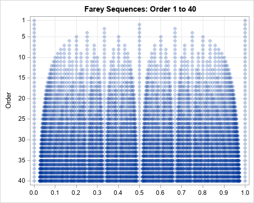
If you've been stuck at home a lot lately, and think you have run out of movies to watch -- think again! Here is a list of big-budget movies you might not have seen, because they flopped (lost lots of money). Follow along as I show you how I created
Search Results: sgplot (958)
For ordinary least squares (OLS) regression, you can use a basic bootstrap of the residuals (called residual resampling) to perform a bootstrap analysis of the parameter estimates. This is possible because an assumption of OLS regression is that the residuals are independent. Therefore, you can reshuffle the residuals to get
Last year, I wrote more than 100 posts for The DO Loop blog. In previous years, the most popular articles were about SAS programming tips, statistical analysis, and data visualization. But not in 2020. In 2020, when the world was ravaged by the coronavirus pandemic, the most-read articles were related
A segmented regression model is a piecewise regression model that has two or more sub-models, each defined on a separate domain for the explanatory variables. For simplicity, assume the model has one continuous explanatory variable, X. The simplest segmented regression model assumes that the response is modeled by one parametric
One purpose of principal component analysis (PCA) is to reduce the number of important variables in a data analysis. Thus, PCA is known as a dimension-reduction algorithm. I have written about four simple rules for deciding how many principal components (PCs) to keep. There are other methods for deciding how
"O Christmas tree, O Christmas tree, how lovely are your branches!" The idealized image of a Christmas tree is a perfectly straight conical tree with lush branches and no bare spots. Although this ideal exists only on Christmas cards, forest researchers are always trying to develop trees that approach the
A SAS customer asked a great question: "I have parameter estimates for a logistic regression model that I computed by using multiple imputations. How do I use these parameter estimates to score new observations and to visualize the model? PROC LOGISTIC can do the computation I want, but how do
I previously showed how to create a decile calibration plot for a logistic regression model in SAS. A decile calibration plot (or "decile plot," for short) is used in some fields to visualize agreement between the data and a regression model. It can be used to diagnose an incorrectly specified
To help visualize regression models, SAS provides the EFFECTPLOT statement in several regression procedures and in PROC PLM, which is a general-purpose procedure for post-fitting analysis of linear models. When scoring and visualizing a model, it is important to use reasonable combinations of the explanatory variables for the visualization. When
I have previously written about how to plot a discontinuous function in SAS. That article shows how to use the GROUP= option on the SERIES statement to graph a discontinuous function. An alternative approach is to place a missing value for the Y variable at the locations at which the
The skewness of a distribution indicates whether a distribution is symmetric or not. The Wikipedia article about skewness discusses two common definitions for the sample skewness, including the definition used by SAS. In the middle of the article, you will discover the following sentence: In general, the [estimators] are both
When it comes to plotting mortgage rate data, I often look to Len Kiefer for inspiration. He recently posted a retro-looking graph on twitter that caught my eye ... and of course I had to see if I could create something similar using SAS. For lack of a better term,
A fundamental principle of data analysis is that a statistic is an estimate of a parameter for the population. A statistic is calculated from a random sample. This leads to uncertainty in the estimate: a different random sample would have produced a different statistic. To quantify the uncertainty, SAS procedures
Here in the United States, we have our general election (where we elect the president) every four years - and 2020 happens to be one of those election years. This time we seem to have a lot more people voting early. I can't tell you the reason they're voting early
A previous article discusses the confidence band for the mean predicted value in a regression model. The article shows a "graded confidence band plot," which I saw in Claus O. Wilke's online book, Fundamentals of Data Visualization (Section 16.3). It communicates uncertainty in the predictions. A graded band plot is
You've probably seen many graphs that are similar to the one at the right. This plot shows a regression line overlaid on a scatter plot of some data. Given a value for the independent variable (x), the regression line gives the best prediction for the mean of the response variable
If you're a SAS programmer who now uses SAS Viya and CAS, it's worth your time to optimize your existing programs to take advantage of the new environment. This post is a continuation of my SAS Global Forum 2020 paper Best Practices for Converting SAS® Code to Leverage SAS® Cloud
When working with a probability distribution, it is useful to know how to compute four essential quantities: a random sample, the density function, the cumulative distribution function (CDF), and quantiles. I recently discussed the Poisson-binomial distribution and showed how to generate a random sample. This article shows how to compute
Now that we are many months into the COVID-19 pandemic, I've started going back and reexamining the data for lessons or trends (you might say hindsight is 20/20). This time, I want to explore how COVID-19 has been spreading around the US. I do this by using a graphical idea
The Poisson-binomial distribution is a generalization of the binomial distribution. For the binomial distribution, you carry out N independent and identical Bernoulli trials. Each trial has a probability, p, of success. The total number of successes, which can be between 0 and N, is a binomial random variable. The distribution
Learn how to use the SGPLOT procedure for graphical representation when you perform statistical analysis for a quadratic ANCOVA model with the GLM procedure.
The HighLow plot often enables you to create many custom plots without resorting to annotation. Although it is designed to create a candlestick chart for stocks, it is incredibly versatile. Recently, a SAS programmer wanted to create a patient-profile graph that looked like a stacked bar chart but had repeated
Finding the root (or zero) of a nonlinear function is an important computational task. In the case of a one-variable function, you can use the SOLVE function in PROC FCMP to find roots of nonlinear functions in the DATA step. This article shows how to use the SOLVE function to
I recently showed how to use simulation to estimate the power of a statistical hypothesis test. The example (a two-sample t test for the difference of means) is a simple SAS/IML module that is very fast. Fast is good because often you want to perform a sequence of simulations over
A previous article about standardizing data in groups shows how to simulate data from two groups. One sample (with n1=20 observations) is simulated from an N(15, 5) distribution whereas a second (with n2=30 observations) is simulated from an N(16, 5) distribution. The sample means of the two groups are close
Last month a SAS programmer asked how to fit a multivariate Gaussian mixture model in SAS. For univariate data, you can use the FMM Procedure, which fits a large variety of finite mixture models. If your company is using SAS Viya, you can use the MBC or GMM procedures, which
I recently showed how to compute within-group multivariate statistics by using the SAS/IML language. However, a principal of good software design is to encapsulate functionality and write self-contained functions that compute and return the results. What is the best way to return multiple statistics from a SAS/IML module? A convenient
The multivariate normal distribution is used frequently in multivariate statistics and machine learning. In many applications, you need to evaluate the log-likelihood function in order to compare how well different models fit the data. The log-likelihood for a vector x is the natural logarithm of the multivariate normal (MVN) density
During the 2020 Coronavirus pandemic, you've probably formed a great appreciation for good, informative graphics. Good graphics can help you get a handle on thousands of individual data values, see the geographical distribution, or look for trends. In February, I wrote a blog post about creating a coronavirus dashboard with
A previous article discusses the pooled variance for two or groups of univariate data. The pooled variance is often used during a t test of two independent samples. For multivariate data, the analogous concept is the pooled covariance matrix, which is an average of the sample covariance matrices of the