When it comes to plotting mortgage rate data, I often look to Len Kiefer for inspiration. He recently posted a retro-looking graph on twitter that caught my eye ... and of course I had to see if I could create something similar using SAS. For lack of a better term, let's call it a JoyPlot!
Album Cover Art
If you're somewhere near my age, you might remember Joy Division's album cover with the cool 3d(ish) graph. Everybody was trying to guess what the data was (it was actually pulsar data) ... and the cool kids even had the design on t-shirts. Here's what the album cover looked like - very simple, with no writing/explanation:

Mortgage Data Graph
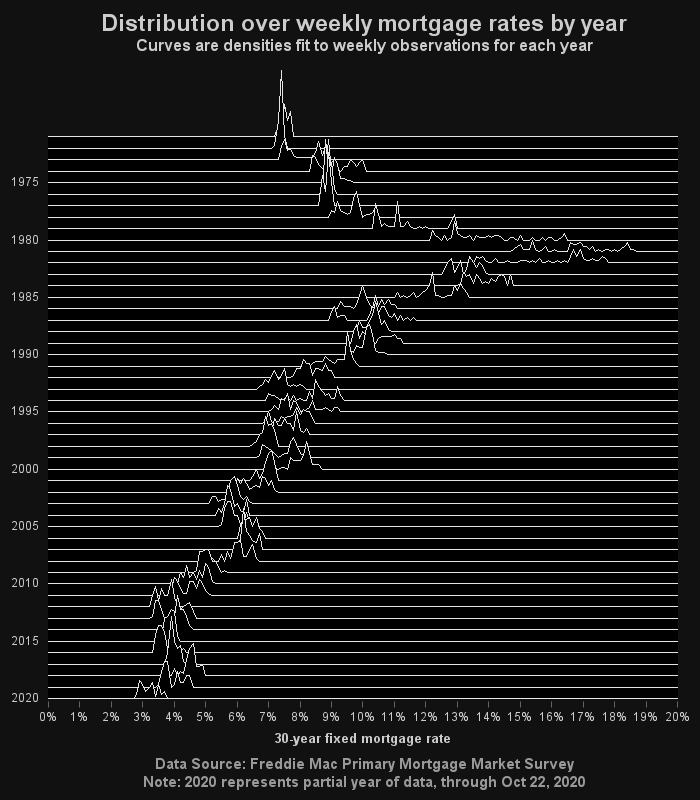
An album cover only needs to be cool - you want people to wonder about it, and perhaps that will increase the 'buzz' and get more people talking about it. But when you're analyzing mortgage data, you want it to be informative. Therefore I've added axis labels, titles, and footnotes to explain what's going on, and I scale the graph to use more of the available space. Basically, this graph tells you what mortgage rate(s) we tended to have each year. You might think of each raised section of the curve as a little histogram.
I guess my graph leans a little more towards cool than informative, but an occasional cool graph is probably OK, eh!?!
How'd he do that?
If you're a programmer (especially a SAS programmer), you might be interested in the technical details. If not, you can probably skip this section! (Here's a link to the complete SAS code I used.)
Data Preparation
I downloaded the data from the freddiemac web page, and imported the spreadsheet(s) into SAS using Proc Import. I used Proc SQL to create a summary/frequency count, of how many weeks (each data point is a weekly value) of each year were spent at each interest rate. I created a grid of every possible combination of year and interest rate (rounded to 1 decimal place), and then combined the grid with the actual data. The value of the plotted line is a combination of the year, and the summary count frequency, and then I use a scaling factor to get the line heights into a reasonable range that fits on the graph.
The Graph
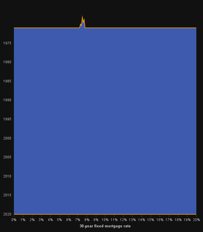
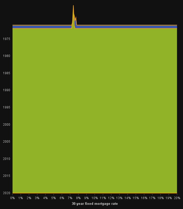
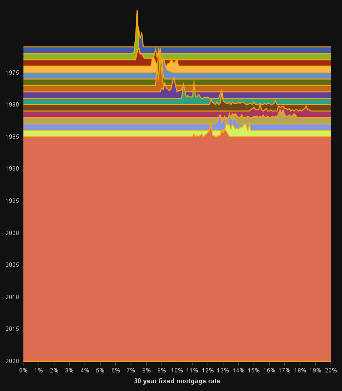
I used Proc SGplot's band plot to create the graph. Each year is a separate band, extending from the frequency count values at one end of the band, to the 2020 baseline at the other end of the band. I include three partial graphs below, using the default discrete fill colors, so you can better see how the bands are overlaid. The key take-home is that each band goes all the way from that year's line, to the bottom of the graph.
1971 Band Plot
1971 & 1972 Band Plots Overlaid
1971 - 1985 Band Plots Overlaid
Wrapping It Up
Did this example perhaps bring some 'Joy' to your day? Hopefully you've learned a little about mortgage rates, or creating custom graphs, or maybe a music group with a cool album cover. Feel free to leave a comment about any of the three!


8 Comments
Love seeing the Joy Division cover.
🙂
I really like this graph and its informative simplicity. Thank you!! Now I want to listen to some joy division. You have me wanting to give this a try with some other data. I like the rainbow version as well 🙂
Excellent! ... This means "my work here is done!" 😉
Really good graph Robert. Gave me some ideas with other data
Glad I could give you some ideas you might could re-use!
Thumbs up, Mr Allison. Thumbs way up!
Thank you! 🙂