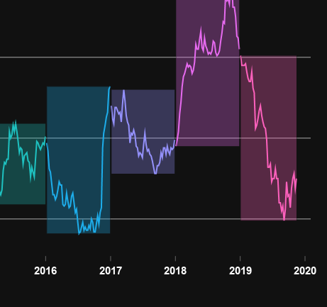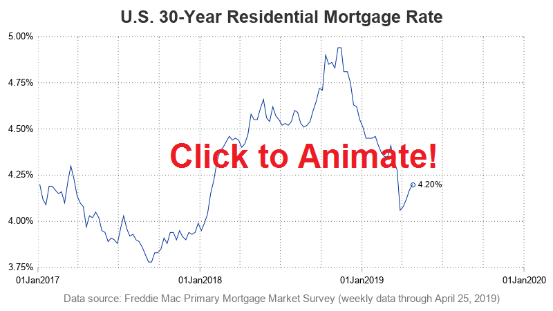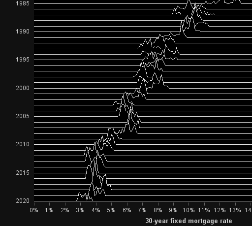
Do low mortgage rates bring you joy(plots)?

When it comes to plotting mortgage rate data, I often look to Len Kiefer for inspiration. He recently posted a retro-looking graph on twitter that caught my eye ... and of course I had to see if I could create something similar using SAS. For lack of a better term,