I always recommend looking at data in several different ways to get a more complete mental picture. And when the data is changing over time, one great way to view it is using an animation. Follow along for some tips & tricks to animate your own data over time. I'll be using the weekly mortgage rate.
And to get you into the mood for this topic, here's a picture of my old college buddy Chip (on the left). He's a realtor, and as you can see in this picture he's quite 'animated' (see how I tied that in, LOL!). The low interest rates, in combination with realtors like Chip, are making the Raleigh real estate market quite hot these days.

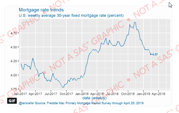
Original Graph
I first saw the original version of this animated graph on Leonard Kiefer's twitter page (he posts multiple different ways to view mortgage data, and does a really nice job of it!) Here's a non-animated screen-capture of his animated graph:
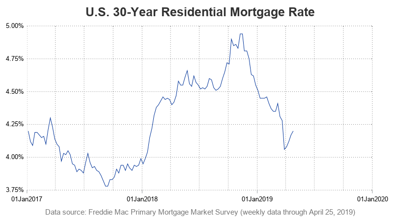
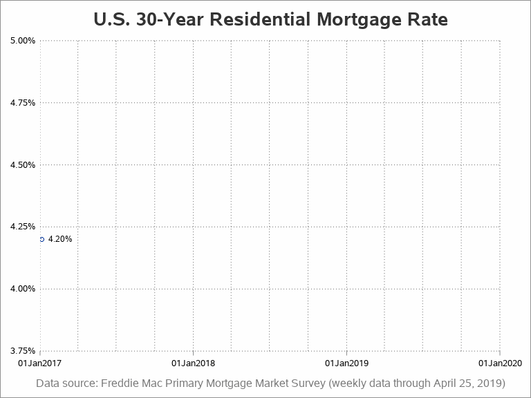
Basic Graph
I liked Leonard's graph enough that I wanted to create one similar (and perhaps make a few small improvements to an already nice graph). I downloaded the data from freddiemac.com, and then imported it into SAS. Then I started by creating a non-animated version of the graph. Here's some summarized code showing how I created the basic graph layout - it's just a basic series plot, with some dotted reference lines on specific dates (by quarter).
proc sgplot data=my_data;
series x=date y=rate;
yaxis /* some options */;
xaxis /* some options */ values=('01jan2017'd to '01jan2020'd by year);
refline
'01jan2017'd '01apr2017'd '01jul2017'd '01oct2017'd
'01jan2018'd '01apr2018'd '01jul2018'd '01oct2018'd
'01jan2019'd '01apr2019'd '01jul2019'd '01oct2019'd
'01jan2020'd
/ axis=x lineattrs=(pattern=dot color=gray66);
run;
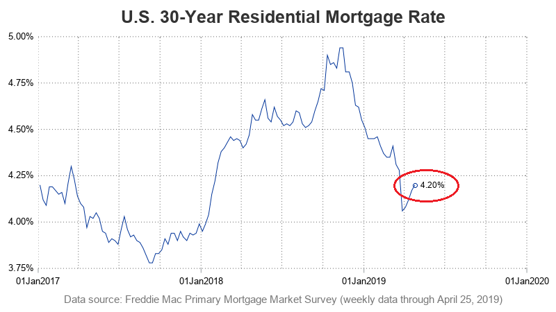
Adding Marker & Label
I was happy with the graph layout, and I even think I made a couple of improvements. For example, I added the 5% label at the top of the left axis (so there's no vagueness as to what the top value is), and I only label the yearly tick tick marks along the bottom of the graph (instead of labeling every quarter) - I think this makes it easier to read. But ... my graph is missing something - the 'dot' marker & text label on the data point at the end of the line!
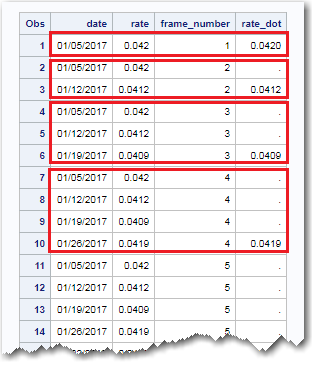
To implement that, I modify the dataset and add a variable called 'rate_dot' that only contains a value for the last data point of the line (see the screen-capture of the table, and explanation of the code, in the section below). I then seamlessly overlay the scatter plot marker and label by adding the following statement in my sgplot. That's really a strong point of sgplot - the ability to overlay graphs easily.
scatter x=date y=rate_dot / datalabel datalabelpos=right datalabelattrs=(size=9pt);
Preparing Data for Animation
Now that we've got the basic graph, how do we animate it? You basically have to create a separate graph for each 'frame_number' of the animation, and then tell SAS to knit all the frames together into a gif animation. I did this in several steps, basically adding a 'frame' variable to the data, and duplicating all the data points up to each date.
There are always many different ways to manipulate the data in SAS, but here's how I duplicated the data for each day, and added the frame_number in the data snapshot above. I just go step by step, and use brute force.
proc sort data=my_data out=anim_data;
by date;
run;
data anim_data; set anim_data;
obs_number=_n_;
run;
proc sort data=anim_data out=anim_data;
by descending date;
run;
data anim_data; set anim_data;
repeats=_n_;
run;
data anim_data (keep = frame_number date rate); set anim_data;
do loop = 1 to repeats;
frame_number=obs_number+(loop-1);
output;
end;
run;
And here is the code I used to add the 'rate_dot' for the marker and label to the last point along each line:
proc sort data=anim_data out=anim_data;
by frame_number date;
run;
data anim_data; set anim_data;
by frame_number;
if last.frame_number then rate_dot=rate;
run;
Animated Graph
Now, I can add a simple 'by' statement to the sgplot, and have it create a separate graph for each date, incrementally working its way through the weekly data. And with the right 'magic sauce' (commands), SAS will package all those frames up into a gif animation. Here's the magic sauce, and a summarized version of the sgplot (If you'd like to see the full code, click here).
options papersize=('8 in', '6 in') printerpath=gif animation=start
animduration=.10 animloop=yes noanimoverlay;
ods printer file="&name..gif";
ods graphics / width=8in height=6in imagefmt=gif;
options nodate nonumber nobyline;
ods listing select none;
proc sgplot data=anim_data;
by frame_number;
series x=date y=rate;
scatter x=date y=rate_dot;
run;
options printerpath=gif animation=stop;
ods printer close;
The gif animation is too big to upload into this blog article (3MB), but you can click here to see it.
So, what do you think about the animated graph? What about mortgage rates in general? Feel free to discuss in the comments section! And if you'd like to see some alternate approaches to plotting mortgage rates, click here.


4 Comments
Very cool, thank you for another great & informative post. I agree that the animation draws attention to the rate fluctuation, specially for a business audience that may suffer from 'another graph' fatigue.
Cool indeed! Thank you Robert.
Hello, Mr. Allison!
Great article. I have a scatter plot grouped by clusters and I would like to animate it by month. Is there a way to add a smooth transition between the frames directly in SAS?
Once more, great article. Thank you very much.
With the technique I use, the animation just goes from one graph to the next (no smooth transitions, or graph markers/lines smoothly 'morphing' from one graph to the next).