This is another in my series of blog posts where I take a deep dive into converting customized R graphs into SAS graphs. Today we'll be working on bar charts ...
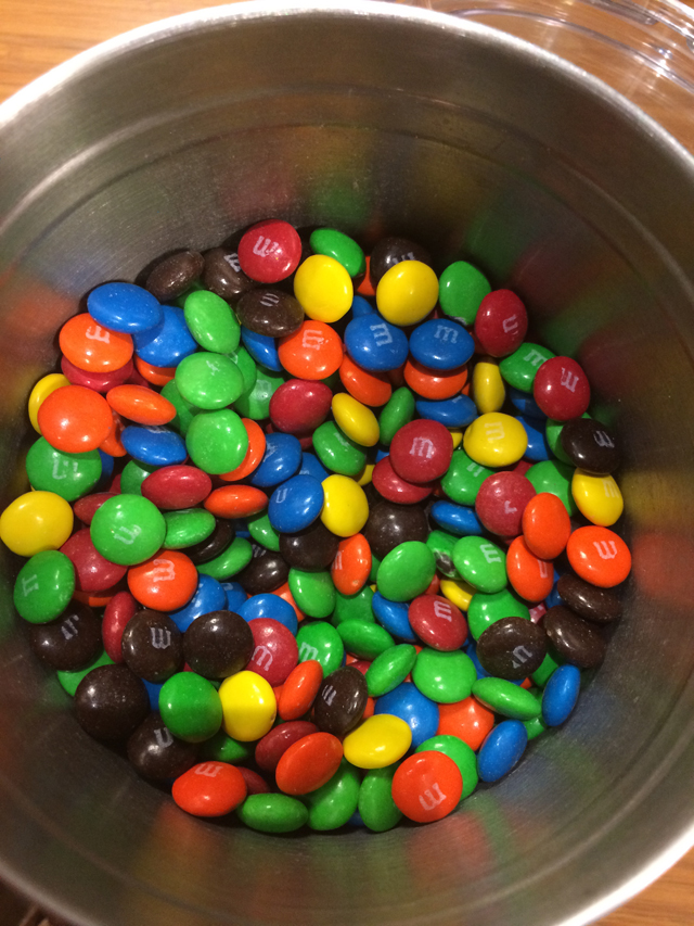
And to give you a hint about what data I'll be using this time, here's a picture from a SAS break room, that my buddy John took. Yes, we have free M&Ms in the break room - the rumor is true! But, they only restock them once a week, and if the co-workers on your floor like M&Ms, then they're gone by the end of the day (which is probably for the best - otherwise there would be a lot of overweight people at SAS, LOL).
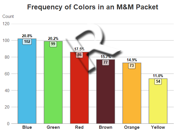
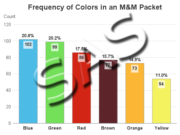
Sometimes when you're teaching a graphing technique, it's best to use some simple (fun) data. Therefore, this time I've decided to use the frequency counts of the various colors in a packet of M&Ms. Here are the R and SAS bar charts of the data, followed by an explanation and comparison of the R and SAS code:
R Bar Chart
SAS Bar Chart
My Approach
I will be showing the R code (in blue) first, and then the equivalent SAS code (in red) that I used to create both of the bar charts. Note that there are many different ways to accomplish the same things in both R and SAS - and the code I show here isn't the only (and probably not even the 'best') way to do things. If you know of a better/simpler way to code it, feel free to share your suggestion in the comments!
Also, I don't include every bit of code here in the blog post (in particular, things I've already covered in my previous posts). I include links to the full R and SAS programs at the bottom.
The Data
Since this example uses a very small amount of pre-summarized data, I just include it in the code. Here's how I did it in R. Note that the data is in 'random' order (neither alphabetical, nor ascending/descending numeric order).
my_data<-read.table(header=TRUE,text="
mnm_color count
Green 99
Red 86
Blue 102
Orange 73
Yellow 54
Brown 77
")
And here's how I did it in SAS:
data my_data;
length mnm_color $10;
input mnm_color Count;
datalines;
Green 99
Red 86
Blue 102
Orange 73
Yellow 54
Brown 77
;
run;
Sorted Bar Chart
Depending on the nature of the data, and the answers you want to get from the graph, you might want to order the bars alphabetically, in ascending/descending numeric order, or a special custom order. In this case, I'd like the bars in descending numeric order.
In R, I use ggplot and the geom_bar() function to draw the bar chart, and the reorder() function to sort bars on-the-fly based on the values in the count variable. The negative sign before count tells it to sort them in descending order.
my_plot <- ggplot(my_data, aes(x=reorder(mnm_color,-count),y=count,
fill=mnm_color,label=count,text=calculated_percent)) +
geom_bar(color="#777777",width=.7,stat="identity") +
In SAS, I use Proc Sort to sort the data by descending count, and then Proc SGplot's vbarparm to draw the bar chart (it draws the bars in data-order).
proc sort data=my_data out=my_data;
by descending count;
run;
proc sgplot data=my_data noborder noautolegend;
vbarparm category=mnm_color response=count / group=mnm_color
groupdisplay=cluster barwidth=0.80;
Coloring the Bars
In some graphs, the colors don't really matter - as long as they look good together, and are easily distinguishable. But in this case, I want the bar colors to represent the M&M colors ... therefore I can't leave things to chance. In both R and SAS, I could hard-code a color list, and specify the colors in a specific order such that each bar will get the desired color ... but if I ever want to re-run this code with slightly different data, then that hard-coded color-mapping might not be in the necessary order with the new/different data. Therefore I want to specify the colors in such a way that the blue M&M count is always guaranteed to get the blue color, and so on.
In R, I set up a color palette called 'pal', and then told the scale_fill_manual() function to use that palette to color the bars.
pal <- c(
"Blue" = "#4cbbe6",
"Green" = "#74e059",
"Red" = "#d22515",
"Orange" = "#fbb635",
"Yellow" = "#f4f25f",
"Brown" = "#5d242a"
)
scale_fill_manual(values=pal,limits=names(pal)) +
In SAS, I create an attribute map dataset, and specify the fillcolor for each of the M&M text values. And then in Proc SGplot, I use the dattrmap option to point to that dataset. And then in the vbarparm, I tell it which attribute id to use (in this case there's only one id in the dataset, but you could have multiple ones to control various different aspects of the graph).
data myattrs;
length value linecolor markercolor $100;
id="someid";
linecolor="gray99";
fillcolor="cx4cbbe6"; value="Blue"; output;
fillcolor="cx74e059"; value="Green"; output;
fillcolor="cxd22515"; value="Red"; output;
fillcolor="cxfbb635"; value="Orange"; output;
fillcolor="cxf4f25f"; value="Yellow"; output;
fillcolor="cx5d242a"; value="Brown"; output;
run;
proc sgplot data=my_data noborder noautolegend dattrmap=myattrs;
vbarparm category=mnm_color response=count / group=mnm_color attrid=someid
groupdisplay=cluster barwidth=0.80;
Values on Bars
When there's only a small amount of data in a graph, I often like to show the data values (numbers) right there on the graph. That way the user doesn't have to work too hard, and visually guess/interpolate the values, based on the axes and gridlines. In this case, I want to show the frequency count inside the bar, and the percent (which I'll have to calculate) outside the bar. This will help the user more easily answer questions such as "What percent of the M&Ms were green?"
In R I use the mutate function() to calculate the percent values:
my_data <- my_data %>% mutate(calculated_percent = count/sum(count))
And then the following two lines add the text to the bars. Note that the geom_label (text labels inside the bar) allows me to specify a fill color behind the text, and an alpha transparency for that fill. The fill helps guarantee that the label will be easy to read, and the transparency helps it 'blend' in with the graph.
geom_label(size=3.2,vjust=1.0,fontface="bold",fill=alpha(c("white"),0.7)) +
geom_text(size=3.2,vjust=-.50,fontface="bold",aes(label=percent(calculated_percent,.1))) +
In SAS, I use Proc SQL to calculate the percent values, and then a data step to calculate a custom position value. I could have done both in the SQL, but I think the code is easier to follow this way.
proc sql noprint;
create table my_data as
select unique *, count/sum(count) format=percent7.1 as calculated_percent
from my_data;
quit; run;
data my_data; set my_data;
adjusted_position=count-3;
run;
I then use vbarparm's datalabel option to add the percent values above the bars, and the text command to add the count inside the bar at the 'adjusted_position' I calculated earlier.
vbarparm category=mnm_color response=count / group=mnm_color attrid=someid
datalabel=calculated_percent datalabelattrs=(size=11pt color=gray33 weight=bold)
groupdisplay=cluster barwidth=0.80;
text x=mnm_color y=adjusted_position text=count /
strip position=bottom backfill fillattrs=(color=white transparency=.3)
textattrs=(size=11pt color=gray33 weight=bold);
Final Clean Up
In most default graphs, I find the axes a bit too 'busy' and crowded. I like to customize my graphs to de-emphasize (or eliminate) the things that aren't important, and emphasize the things that are important.
In R's geom_bar() chart, there's a tick mark centered under each bar, and a vertical grid line going from that tick mark to the top of the graph. Why does a bar chart need that?!? Why is it the default? I get rid of the tick mark and grid line with the following commands.
theme(axis.ticks=element_blank()) +
theme(panel.grid.major.x=element_blank()) +
Let's also get rid of the default gray color behind the graph, and also eliminate the legend and the minor tick marks:
theme_bw() +
theme(legend.position="none") +
theme(panel.grid.minor=element_blank()) +
In a graph like this with a very short label on the Y axis, I like to position the label at the top of the axis, rather than in the side/margin area - this saves more space for the 'data' part of the graph. I don't think R lets me move the Y axis label into this exact position (I can move it to the top, but it's still in the left margin area). Therefore I get rid of the axis label altogether, and use a left-justified 'subtitle' to fake a Y axis label in the desired position:
labs(x=NULL,y=NULL) +
labs(subtitle="Count") +
theme(plot.subtitle=element_text(color="#555555",face="plain",hjust=-.06,size=11,margin=margin(0,0,12,0))) +
In SAS, I get rid of the tick marks with the xaxis noticks options:
xaxis display=(nolabel noticks);
I use the noautolegend option to get rid of the legend:
proc sgplot data=my_data noborder noautolegend dattrmap=myattrs;
And the SAS yaxis has a simple built-in labelpos=top to get the legend label in the exact position I like:
yaxis display=(noticks noline) labelpos=top grid gridattrs=(color=graydd);
Candy Break!
If you made it through all that, I think you deserve to treat yourself to a handful of M&Ms! 🙂
My Code
Here is a link to my complete R program that produced the R bar chart.
Here is a link to my complete SAS program that produced the SAS bar chart.
If you have any comments, suggestions, corrections, or observations - I'd be happy to hear them in the comments section!