I recently learned about a new feature in PROC QUANTREG that was added in SAS/STAT 15.1 (part of SAS 9.4M6). Recall that PROC QUANTREG enables you to perform quantile regression in SAS. (If you are not familiar with quantile regression, see an earlier article that describes quantile regression and provides introductory references.) Whereas ordinary least-squares regression predicts the conditional mean of a continuous response variable, quantile regression predicts one or more conditional quantiles, such as the median or deciles.
The CONDDIST statement in PROC QUANTREG enables you to estimate and visualize the conditional distribution of a response variable at any X value in regression data. Furthermore, it enables you to compare the conditional distribution to the "unconditional" distribution of the response (that is, to the marginal distribution). This article shows how to use the CONDDIST statement in PROC QUANTREG.
The main idea
Before discussing quantile regression, let's recall what we mean by a conditional and marginal distribution. The following SAS DATA step simulates 250 observations in a regression model where the response variable (Y) depends on an explanatory variable (X) and random noise. A scatter plot shows the data and overlays three sets of reference lines that will be used later in this article.
data Have; call streaminit(123); subj=1; x=2; y=12; output; subj=2; x=8; y=30; output; do subj = 3 to 250; x = rand ('uniform', 1, 10); /* x in interval (1, 10) */ err = rand ('normal', 0, 2+log(3*x)); y = 1 + 4 * x + err; /* Y = response variable */ output; end; run; proc sql; select mean(x) into :xavg from Have; quit; %let xavg = %sysfunc(round(&xavg,0.1)); /* round to nearest tenth */ %put &=xavg; title "Joint Distribution of X and Y"; proc sgplot data=Have; scatter x=x y=y; refline 2 &xavg 8 / axis=X lineattrs=(thickness=2) label; xaxis grid; yaxis grid; run; |
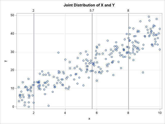
The scatter plot shows that the conditional mean of Y at any value X is close to 1 + 4*X, which is the form of the underlying model. The data are simulated, so we know that the exact conditional distributions are normal distributions, but notice that the simulation uses a heterogeneous error term. In a subsequent section, we will use the CONDDIST statement in PROC QUANTREG to estimate the conditional distribution at X=2, X=8, and at the average X value, which is X=5.7. We will compare those distributions to the overall (marginal) distribution of Y.
The graph overlays three sets of drop lines to guide the discussion of conditional distributions. The following are visual estimates:
- From the line at X=2, it looks like the conditional distribution of Y is centered near Y=9 and most of the probability density is on the interval [2, 18].
- From the line at X=5.7, it looks like the conditional distribution of Y is centered near Y=24 and most of the probability density is on [13, 33].
- From the line at X=8, it looks like the conditional distribution of Y is centered near Y=33 and most of the probability density is on [23, 43].
Empirical estimates for the marginal and conditional distributions
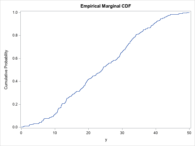
Before using PROC QUANTREG to estimate the marginal (unconditional) and conditional densities, let's estimate by using a simpler method. The marginal distribution of Y is easy to estimate: Use the CDFPLOT statement in PROC UNIVARIATE to obtain the empirical cumulative distribution function (ECDF). You can use the HISTOGRAM statement and the KERNEL option to estimate the marginal density function (PDF).
/* The marginal distribution of Y does not consider values of X */ proc univariate data=Have; var y; cdfplot y / vscale=proportion odstitle="Empirical Marginal CDF"; histogram y / kernel outkernel=K odstitle="Empirical Marginal PDF"; ods select CDFPlot Histogram; run; |
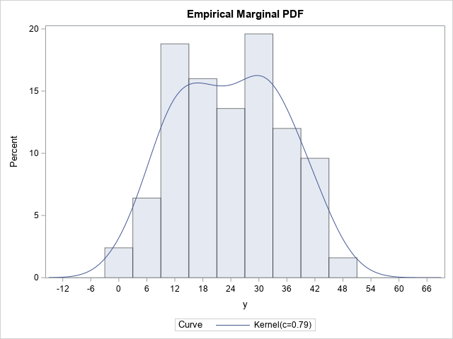
These graphs estimate the PDF and CDF of the Y variable by using the observed data, so they are empirical estimates. The kernel density estimate shows two small humps in the density near X=15 and X=30. The OUTKERNEL= option creates a SAS data set (K) that contains the kernel density estimate.
It is more difficult to estimate the conditional distribution of Y at some value of X. For definiteness, suppose we want to estimate the conditional distribution of Y at the mean of X, which is X=5.7. The simplest estimate is to choose all observations that are close to 5.7. There is no precise definition for "close to." In the following procedure, the WHERE clause limits the data to observations for which X is within 0.5 units of 5.7. I call this the "poor man's" estimation procedure because it doesn't use any analytics. As shown in the next section, quantile regression provides a more elegant estimate.
%let Threshold = 0.5; proc univariate data=Have; WHERE abs(x-&xavg) < &Threshold; var y; cdfplot y / vscale=proportion odstitle="Empirical Conditional CDF at X=5.7"; histogram y / kernel outkernel=KAvg odstitle="Empirical Conditional PDF at X=5.7" ; ods select CDFPlot Histogram; run; |
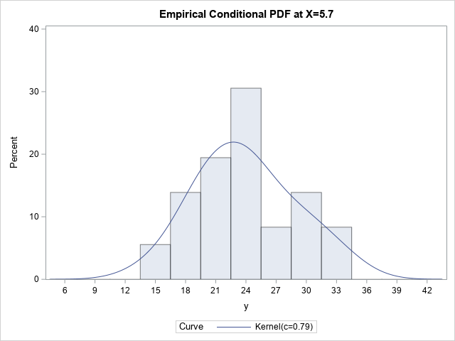
Only the PDF is shown because it is easier to interpret. According to the "poor man's" estimate, the conditional distribution at X=5.7 looks approximately normal but perhaps with some positive skewness. The peak is near Y=23 and it looks like the ±3σ range is [13, 36]. These values are very close to the estimates that we guessed based on the scatter plot in the previous section.
Compare the conditional and marginal distributions
I used the OUTKERNEL= option to output the kernel density estimates to SAS data sets. To compare the marginal and conditional distributions, you can combine those data sets and overlay the estimates on a single graph, as follows:
/* Compare the marginal distribution of Y to the distribution of Y|(x is near average) */ data All; label Dist = "Distribution"; set k(in=marginal) kAvg; if marginal then Dist = "Marginal "; else Dist = "Conditional"; run; title "Empirical Marginal and ""Poor-Man's"" Conditional Distributions"; title2 "Approximation to the Conditional Distribution at x=&xavg"; proc sgplot data=All; series x=_Value_ y=_Density_ / group=Dist; xaxis grid; yaxis grid; run; |
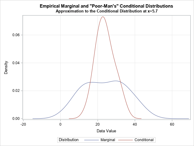
This graph enables you to compare the overall distribution of the Y values (in blue) to the conditional distribution of the Y values near X=5.7 (in red). You can see that the conditional distribution is narrower and approximately normal.
To obtain this graph, I ran PROC UNIVARIATE twice, merged the outputs, and called PROC SGPLOT to overlay the curves. By using the CONDDIST statement in PROC QUANTREG, you can create a similar graph with one line of SAS code.
Estimate the conditional distribution at the mean of the explanatory variables
So far, the analyses have been empirical and heuristic. This section uses quantile regression to create a model of the conditional quantiles. The CONDDIST statement fits a quantile regression model for many quantiles You can invert the quantile estimates to obtain a model-based estimate of the conditional quantiles.
Let's start by visualizing several quantile regression models for these data. The following call to PROC QUANTREG fits nine models to the data. The models are for the quantiles 0.1, 0.2, ..., 0.9. The PLOT=FITPLOT option displays the nine quantile regression curves on a scatter plot of the data.
/* Quantile regression models */ proc quantreg data=Have ci=none; model y = x / plot=fitplot quantile=(0.1 to 0.9 by 0.1); run; |
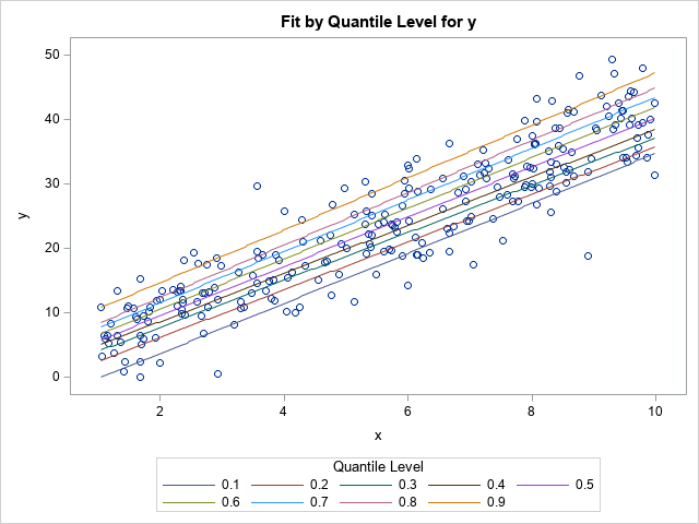
The graph shows the nine quantile models. If you draw a vertical line at any X value (such as X=5.7) the places where the vertical line crosses the regression curves are the conditional quantiles for Y at X. You can think about plotting those Y values against the quantile values (0.1, 0.2, ..., 0.9) to obtain a model-based cumulative distribution curve.
But why stop at nine quantile models? Why not fit 100 models for the quantiles 0.005, 0.015, ..., 0.995? Then the scatter plot has 100 regression curves overlaid on it. If you draw a vertical line at X=5.7, that line will intersect the 100 regression lines. If the ordered pairs of the intersection points are (y1,0.005), (y2,0.015), ..., (y100, 0.995), then those 100 points estimate a model-based conditional distribution of Y at X=5.7.
That is essentially what the CONDDIST statement in PROC QUANTREG does. The documentation for the QUANTREG procedure contains a more mathematical description. The following call to the QUANTREG procedure uses the SHOWAVG option on the CONDDIST statement to create a CDF plot and a PDF plot. Each plot overlays the observed marginal distribution of Y and the conditional distribution at the average of the explanatory variables, which is X=5.7. To make the comparison easier, the marginal distribution is evaluated at the same quantiles as the conditional distribution.
/* The conditional distribution of response at the average of X is created automatically by using the CONDIST statement in PROC QUANTREG. The SHOWAVG option displays the conditional distribution of Y at the mean of X. */ %let HideAll = HideDropLines HideDropNumbers HideObsDots HideObsLabels; proc quantreg data=Have ci=none; model y = x; conddist plot(&HideAll ShowGrids)=(cdfplot pdfplot) showavg; run; |
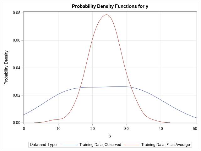
The CONDDIST statement creates two plots, but only the PDF plot is shown here. Notice the similarity to the earlier graph that compared the kernel density estimates from PROC UNIVARIATE. In both graphs, the blue curve represents the marginal density estimate for Y. The red curve estimates the conditional density at X=5.7. In the previous graph, the estimate was crude and was obtained by throwing out a lot of the data and using only observations near X=5.7. In the current graph, the model-based estimate is formed by using all the data and by fitting 100 different quantile regression models. In both graphs, the conditional PDF has a peak near Y=23, is approximately normal, and the bulk of the density is supported on [13, 36].
Estimate the conditional distribution at a data value
The SHOWAVG option to the CONDDIST statement estimates the conditional distribution of Y at the average value of the explanatory variables. However, you can use the OBS= option to specify values in the data at which to estimate the conditional distribution. When I created the simulated data for this example, I intentionally hard-coded the first two observations as (2,9) and (8, 33). The following call to PROC QUANTREG estimates the conditional distribution at X=2 and X=8:
/* The conditional distribution of response at the average of X is created automatically by using the CONDDIST stastement in PROC QUANTREG */ proc quantreg data=Have ci=none; model y = x; conddist plot(ShowGrids)=(pdfplot) obs=(1 2) ; run; |
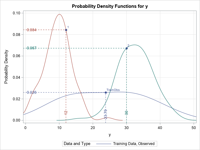
Again, the marginal distribution of Y is overlaid as a comparison. To help interpret the curves, PROC QUANTSELECT adds drop lines to the graph (by default). The vertical drop line specifies the Y value for the observation (or the mean of the Ys for the marginal density, which is shown in blue).
- The estimate of the conditional distribution at X=2 is shown in red. The Y value of the data point is Y=12, which is larger than the most likely value (which is approximately Y=10). The distribution appears to be normally distributed with the bulk of the density on [0,18].
- The estimate of the conditional distribution at X=8 is shown in green. The Y value of the data point is Y=30, which is smaller than the most likely value (which is approximately Y=34). The distribution appears to approximately normal, but maybe there is some positive skewness? The bulk of the density is on [20,46].
Why is this useful?
Why is this useful? Suppose you are measuring blood pressure of patients. Some of the patients are overweight and others are not. If you set Y=BloodPressure and X=BMI (body-mass index), then a graph like this enables you to compare the distribution of blood pressures for all patients (the marginal distribution), for healthy-weight individuals (BMI=20), and for obese individuals (BMI=30). In fact, for ANY value of the BMI, you can compare the conditional distribution to the marginal distribution and/or to other conditional distributions.
And although I have presented an example with only one continuous variable, you can do the same thing for models that contain multiple explanatory variables, both continuous and CLASS variables.
I have left out a lot of details, but I hope I have whetted your appetite to learn more about the CONDDIST statement in PROC QUANTREG. The documentation for the QUANTREG procedure has additional information and additional examples. It also shows how you can fit the regression on one set of data (the training data) and apply the models to estimate "counterfactual" distributions for new data (the test data).
