In a previous article, I showed how to generate random points uniformly inside a d-dimensional sphere. In that article, I stated the following fact:
If Y is drawn from the uncorrelated multivariate normal distribution, then S = Y / ||Y|| has the uniform distribution on the unit sphere.
I was reminded of this fact recently when I wrote about how to simulate a random walk in high dimensions. Each step of a random walk needs to generate a random direction and a random step length. For a 2-D random walk, it is easy to generate a random direction as an angle, θ, chosen from the uniform distribution on the interval [0,2π). However, for higher-dimensional random walks, I do not suggest using random angles to determine directions. Although it is mathematically possible to use spherical coordinates in d-dimensions, computations in a spherical coordinate system are extremely messy.
A better alternative is to use random unit vectors to determine a direction for each step in a random walk. (In fact, a unit vector is sometimes called a direction vector.) Since a unit vector is a vector from the origin to a point on the unit sphere, this article shows how to generate random points uniformly on the unit sphere. I show the computation twice: once by using the SAS/IML matrix language and again by using the SAS DATA step. In order to visualize the data, I show how to create a contour plot of ungridded data in SAS.
Random points on a circle
For simplicity, let's see how to generate random points on the unit circle in 2-D. The following SAS/IML program simulates N=1000 points from d=2 independent normal distributions. The notation X[ ,##] is a subscript reduction operator that returns a row vector that contains the sum of the squared elements of each row of X. Thus the expression sqrt(X[,##]) gives the Euclidean distance of each row to the origin. If you divide the coordinates by the distance, you obtain a point on the unit circle:
%let N = 1000; /* number of steps in random walk */ %let d = 2; /* S^{d-1} sphere embedded in R^d */ %let r = 1; /* radius of sphere */ proc iml; call randseed(12345); r = &r; d = &d; x = randfun(&N // d, "Normal"); /* N points from MVN(0, I(d)) */ norm = sqrt( x[,##] ); /* Euclidean distance to origin */ x = r * x / norm; /* scale point so that distance to origin is r */ title "&n Random Points on Circle"; call scatter(x[,1], x[,2]) grid={x y} procopt="aspect=1" option="transparency=0.8"; QUIT; |
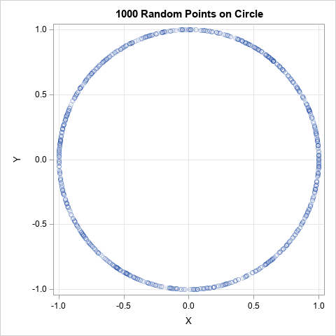
As promised, the resulting points are on the circle of radius r=1. Recall that uniformly at random does not mean evenly spaced. Point patterns that are generated by a uniform process will typically have gaps and clusters.
Random points on a sphere
You can also use the SAS DATA step to generate the random points on a sphere. You can generate each coordinate independently from a normal distribution and use the EUCLID function in Base SAS to compute the Euclidean distance from a point to the origin. You can then scale the coordinates so that the point is on the sphere of radius r. The following DATA step generates d-dimensional points for any d:
%let N = 2000; /* number of steps in random walk */ %let d = 3; /* S^{d-1} sphere embedded in R^d */ %let r = 1; /* radius of sphere */ data RandSphere; array x[&d]; call streaminit(12345); do i = 1 to &N; do j = 1 to &d; x[j] = rand("Normal"); /* random point from MVN(0, I(d)) */ end; norm = Euclid( of x[*] ); /* Euclidean distance to origin */ do j = 1 to &d; x[j] = &r * x[j] / norm; /* scale point so that distance to origin is r */ end; output; end; drop j norm; run; |
How can we visualize the points to assure ourselves that the program is running correctly? One way is to plot the first two coordinates and use colors to represent the value of the points in the third coordinate direction. For example, the following call to PROC SGPLOT creates a scatter plot of (x1,x2) and uses the COLORRESPONSE=x3 option to color the markers. The default color ramp is the ThreeAltColor ramp, which (for my ODS style) is a blue-black-red color ramp. That means that points near the "south pole" (x3 = -1) will be colored blue, points near the equator will be colored black, and points near the "north pole" (x3 = 1) will be colored red. I have also used the TRANSPARENCY= option so that the density of the points is shown.
title "&n Random Points on a Sphere"; proc sgplot data=RandSphere aspect=1; scatter x=x1 y=x2 / colorresponse=x3 transparency=0.5 markerattrs=(symbol=CircleFilled); xaxis grid; yaxis grid; run; |
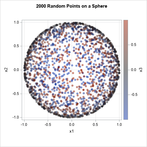
Switching to (x,y,z) instead of (x1,x2,x3) notation, the graph shows that observations near the (x,y)-plane (for which x2 + y2 &asymp 1) have a dark color because the z-value is close 1 zero. In contrast, observations near for which x2 + y2 &asymp 0 have either a pure blue or pure red color since those observations are near one of the poles.
A contour plot of ungridded data
Another way to visualize the data would be to construct a contour plot of the points in the upper hemisphere of the sphere. The exact contours of the upper hemisphere are concentric circles (lines of constant latitude) centered at (x,y)=(0,0). For these simulated data, a contour plot should display contours that are approximately concentric circles.
In a previous article, I showed how to use PROC TEMPLATE and PROC SGRENDER in SAS to create a contour plot. However, in that article the data were aligned on an evenly spaced grid in the (x,y) plane. The data in this article have random positions. Consequently, on the CONTOURPLOTPARM statement in PROC TEMPLATE, you must use the GRIDDED=FALSE option so that the plot interpolates the data onto a rectangular grid. The following Graph Template Language (GTL) defines a contour plot for irregularly spaced data and creates the contour plot for the random point on the upper hemisphere:
/* Set GRIDDED=FALSE if the points are not arranged on a regular grid */ proc template; define statgraph ContourPlotParmNoGrid; dynamic _X _Y _Z _TITLE; begingraph; entrytitle _TITLE; layout overlay; contourplotparm x=_X y=_Y z=_Z / GRIDDED=FALSE /* for irregular data */ contourtype=fill nhint=12 colormodel=twocolorramp name="Contour"; continuouslegend "Contour" / title=_Z; endlayout; endgraph; end; run; ods graphics / width=480px height=480px; proc sgrender data=RandSphere template=ContourPlotParmNoGrid; where x3 >= 0; dynamic _TITLE="Contour Plot of &n Random Points on Upper Hemisphere" _X="x1" _Y="x2" _Z="x3"; run; |
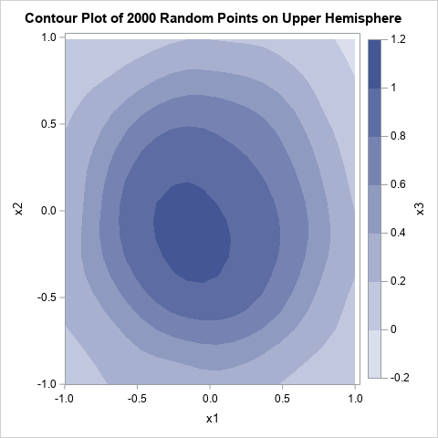
The data are first interpolated onto an evenly spaced grid and then the contours are estimated. The contours are approximately concentric circles. From the contour plot, you can conclude that the data form a dome or hemisphere above the (x,y) plane.
Summary
This article shows how to use SAS to generate random points on the sphere in any dimension. You can use this technique to generate random directions for a random walk. In addition, the article shows how to use the GRIDDED=FALSE option on the CONTOURPLOTPARM statement in GTL to create a contour plot from irregularly spaced ("ungridded") data in SAS.

2 Comments
Awesome Rick
Pingback: Generate random uniform points on an ellipse - The DO Loop