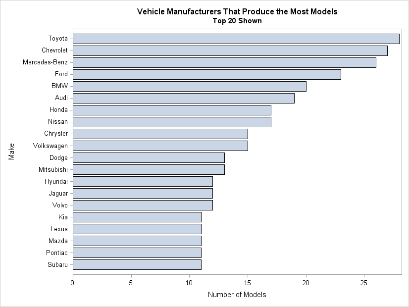
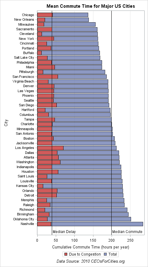
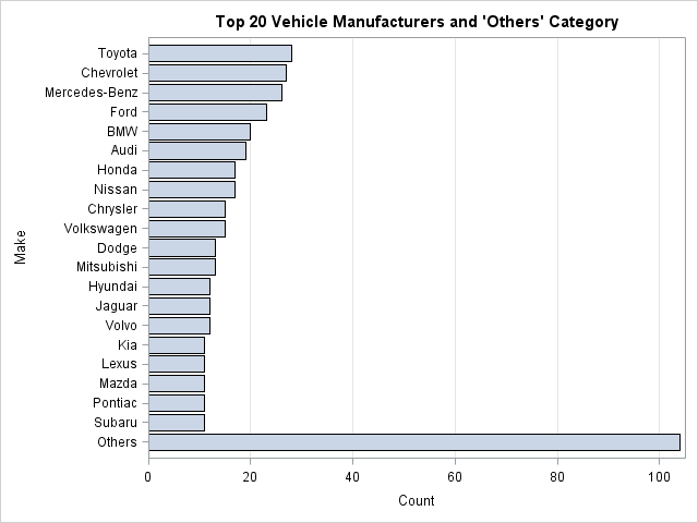
Search Results: sgplot (958)

Rick Wicklin 0
Generate uniform data in a simplex

It is easy to simulate data that is uniformly distributed in the unit cube for any dimension. However, it is less obvious how to generate data in the unit simplex. The simplex is the set of points (x1,x2,...,xd) such that Σi xi = 1 and 0 ≤ xi ≤ 1

Data Visualization
Sanjay Matange 0
Forest Plot with Subgroups

During SAS Global Forum 2012, I had conversations with many SAS users who wanted to create Forest Plots.  However, there was one new twist.  The study names were subgrouped by categories like 'Age', 'Sex', etc., with multiple entries under each subgroup.  The name of each study within the subgrouped was indented

Rick Wicklin 0
Visualizing US commute times and congestion

Robert Allison posted a map that shows the average commute times for major US cities, along with the proportion of the commute that is attributed to traffic jams and other congestion. The data are from a CEOs for Cities report (Driven Apart, 2010, p. 45). Robert use SAS/GRAPH software to

Data Visualization
Sanjay Matange 0
Doing more with nbsp

A few weeks ago I wrote an article on using the non breaking space character to prevent stripping of leading and trailing blanks in a string.   Since then, I have discovered a few more instances where the nbsp can be a useful tool for creating graphs. One such instance came up last week

Data Visualization
Sanjay Matange 0
How about some pie?

Pie charts have been the subject of some criticism when they are used to compare measures across multiple categories.  It is generally accepted that comparison of magnitudes represented as angular measures from varying baselines is not effective. However here are some use cases where a pie chart does quite well. When it comes

Data Visualization
Sanjay Matange 0
Non-breaking space

Forest plots come in many flavors.   An example of a Forest plot using GTL is available on the SAS support web site.  Simple forest plots can also be created using SGPLOT procedure by using the SCATTER statement with MARKERCHAR to display data aligned with the plot by study names. One issue

Data Visualization
Sanjay Matange 0
Extended Bands

In the Clinical Research domain, there is often the need to display lab values by treatment or test and it is often useful to view this data along with reference lines showing the normal ranges.  The obvious way is to use reference lines to denote the normal ranges. SGPLOT Code: proc sgplot data=band; scatter x=x y=y

Rick Wicklin 0
How to get data values out of ODS graphics

Many SAS procedures can produce ODS statistical graphics as naturally as they produce tables. Did you know that it is possible to obtain the numbers underlying an ODS statistical graph? This post shows how. Suppose that a SAS procedure creates a graph that displays a curve and that you want

Data Visualization
Sanjay Matange 0
Butterfly plots

When comparing results by category and group,  putting the items to be compared close together usually leads to a graph that is easier to decode.  Take the case of the data (simulated) shown below. Here we have population by age group and sex.  To compare the population by sex, it is

Data Visualization
Sanjay Matange 0
Spark lines made easy

Spark lines, made popular by Edward Tufte, provide a way to visualize trends in a concise space, often inline with the rest of the narrative or data. Previously, I posted an article on Spark Plots in which I created different plot types, some of which included multiple graphs and data in each row.  For such

Rick Wicklin 0
Create a contour plot in SAS

When I need to graph a function of two variables, I often choose to use a contour plot. A surface plot is probably easier for many people to understand, but it has several disadvantages when compared to a contour plot. For example, the following statements in SAS/IML Studio displays a

Data Visualization
Sanjay Matange 0
Bar chart with response sort

A graph in a recent article in Fortune magazine caught my eye.  The graph shows the cost of hosting the Summer Olympics over the past eight events.  Here is what I termed the "Medal" graph. Now, practitioners of the art of Effective Graphics would likely find some shortcomings in the graph.  Clearly

Data Visualization
Sanjay Matange 0
PharmaSUG 2012 update

PharmaSUG 2012 conference drew to a close today, concluding two and a half days packed with papers, presentations, posters, hands-on demos and super demos by SAS staff.  While the weather outside was a bit chilly from time to time, the conference what hopping with many user papers on how to

Rick Wicklin 0
The curious case of random eigenvalues

I've been a fan of statistical simulation and other kinds of computer experimentation for many years. For me, simulation is a good way to understand how the world of statistics works, and to formulate and test conjectures. Last week, while investigating the efficiency of the power method for finding dominant

Data Visualization
Sanjay Matange 0
Axis values and hint

Getting the axis values just right generally requires some work, and the values you want can change from case to case.  One such example was discussed by Dan Heath in his post on custom axis values.  Here Dan shows the usage of non uniform axis values using the VALUES option on

Data Visualization
Sanjay Matange 0
Bar chart on interval axis

Recently, a user asked about creating a Bar Chart of Value by Date, where the dates are displayed on a scaled interval axis.   Consider this simulated data set of value by date and treatment shown below.  This data set only has one value for each date and treatment combination. We can use the VBAR statement

Rick Wicklin 0
The Poissonness plot: A goodness-of-fit diagnostic

Last week I discussed how to fit a Poisson distribution to data. The technique, which involves using the GENMOD procedure, produces a table of some goodness-of-fit statistics, but I find it useful to also produce a graph that indicates the goodness of fit. For continuous distributions, the quantile-quantile (Q-Q) plot

Data Visualization
Sanjay Matange 0
Simpler is better

A recent article in the SAS and R blog was about current winter temperatures in Albany, NY.  The temperature data for the recent winter (Dec 2011 - Mar 2012) was plotted on a polar graph. Robert Allison posted an article on displaying the same data as a Polar Graph using SAS/GRAPH .  Here is his

1 27 28 29 30 31 32