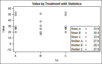
Statistical graphs often include display of derived statistics along with the raw data. Often these statistics are presented in a tabular format inside the graph. With SGPLOT procedure, a table of statistics can be added to the graph as an inset table, as shown below.
Using a Stat Table:
SGPLOT code:
title 'Value by Treatment with Statistics'; proc sgplot data=Stat noautolegend; scatter x = trt y = value / markerattrs=(size=9 symbol=circle color=black); inset ("Mean A"="= &mean1" "Mean B"="= &mean2" "Mean C"="= &mean3" "Median A"="= &median1" "Median B"="= &median2" "Median C"="= &median3" ) / position=bottomright border; xaxis min=0.5 max=3.5 values=(1 to 3 by 1) label='Trt' offsetmax=0.4; yaxis values=(-10 to 60 by 10) label="Value" ; run; |
In this case, we are displaying the derived statistics for each treatment. We used x axis OffsetMax to make room for the inset table. This is a simple example, and there may be other ways to show the table inside or outside the graph.
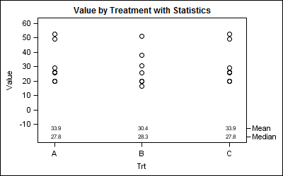
A better way would be to display the derived statistics at the bottom of the plot aligned by treatment as shown below. This reduces clutter and makes it easier to associate the values.
Display statistics using an axis aligned table:
SGPLOT Code:
title 'Value by Treatment with Statistics'; proc sgplot data=table noautolegend; scatter x = trt y = value / markerattrs=(size=9 symbol=circle color=black); scatter x=trt y=stat / markerchar=sval y2axis; xaxis min=0.5 max=3.5 values=(1 to 3 by 1) label='Trt'; yaxis values=(-10 to 60 by 10) label="Value" offsetmin=0.15; y2axis offsetmax=0.89 display=(nolabel); run; |
In the above case, we have plotted the scatter markers against the Y axis, setting the Y axis OffsetMin=0.15, thus leaving room at the bottom for the statistics. Then, we have plotted the mean and median values using markerchar, associated with the Y2 axis with a OffsetMax=0.9.
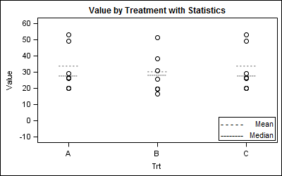
While this works well, often it is desirable to display the derived statistics graphically along with the rest of the data. This was the question recently posed by a couple of users on the Communities page. The data used here was contributed by the user.
One solution is to merge the derived statistics into the data, and use the MarkerChar option on the scatter plot statement as shown below.
Graphical display of statistics using MarkerChar option:
SGPLOT code:
title 'Value by Treatment with Statistics'; proc sgplot data=MarkerChars noautolegend; scatter x = trt y = value / markerattrs=(size=9 symbol=circle color=black); scatter x = trt y = stat / MARKERCHAR=bar; inset ("--------" = "Mean" "- - - - -"="Median") / position=bottomright border; xaxis values=(1 to 3 by 1) label='Trt' ; yaxis values=(-10 to 60 by 10) label="Value" ; run; |
In this graph, we have used a scatterplot statement with MarkerChar option that uses the "bar" variable in the data. This bar variable contains the two character strings "--------" and "- - - - -", and these are shown at the right location in the graph.
One question arises on how to display these in the legend. A scatter plot with MarkerChar can be added to the legend, but what you see is a color swatch for each group. Since we have no groups, you will see a black square color swatch representing the color of the strings.
The way around it is to simply use an INSET statement to show the character strings and the text as we did above.
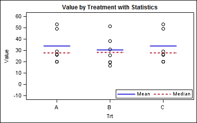
Another way is to use a VECTOR plot to draw the derived statistics. Here, for each treatment value (which are numeric), we create a line segment with X1, Y1, X2, Y2 values. X1 and X2 are 0.25 to left and right of each treatment. Y1 and Y2 are the same as the value of the median or mean. Then, we can use the vector plot to draw the stats. We can also include the vector plot in the legend.
Graphical display of statistics using Vector Plot:
SGPLOT code:
%modstyle(name=pattern, parent=listing, type=CLM, linestyles=solid shortdash); ods listing style=pattern; |
title 'Value by Treatment with Statistics'; proc sgplot data=Vector noautolegend nocycleattrs; scatter x = trt y = value / markerattrs=(size=9 symbol=circle color=black); vector x=x2 y=y / xorigin=x1 yorigin=y group=stat noarrowheads nomissinggroup name='v'; keylegend 'v' / location=inside position=bottomright; xaxis min=0.5 max=3.5 values=(1 to 3 by 1) valueshint label='Trt' ; yaxis values=(-10 to 60 by 10) label="Value" ; run; |
Using a Vector Plot allows us more flexibility in setting its attributes and we can include it in the legend. Here we made the line thicker. Note the use of the MODSTYLE Macro to set the line styles used for the graph.
Full SAS program: SAS92_Code


2 Comments
Is it possible to use the INSET statement to display a stat table with more than one data column? For example, if I wanted to adjust your very first example by having treatment as the row labels (A, B, and C) and have "Mean" and "Median" be the headers for the two data columns, would that be possible? In other words, not counting labels, you have a 6x1 data table. Is it possible to have a 3X2 or some other dimension?
Yes, it is, but now you have to use GTL. SG only supports simple 2 column table. You could do it by using the non column format, and putting the values in yourself, but it will not create the table look automatically.
proc format;
value trt
1='A'
2='B'
3='C'
other=' ';
run;
data try;
input trt numb value mean median run;
format trt trt.;
cards;
1 101 26.5 33.9 27.8 7
1 102 29 33.9 27.8 7
1 103 49.1 33.9 27.8 7
1 104 26 33.9 27.8 7
1 105 52.8 33.9 27.8 7
1 106 19.9 33.9 27.8 7
2 201 25.8 30.4 28.3 8
2 202 16.7 30.4 28.3 8
2 203 38.1 30.4 28.3 8
2 204 30.7 30.4 28.3 8
2 205 51.3 30.4 28.3 8
2 206 19.8 30.4 28.3 8
3 301 26.5 33.9 27.8 9
3 302 29 33.9 27.8 9
3 303 49.1 33.9 27.8 9
3 304 26 33.9 27.8 9
3 305 52.8 33.9 27.8 9
3 306 19.9 33.9 27.8 9
;
run;
/*--Create data set with stat--*/
data Stat;
set try end=last;
by trt;
if last.trt then do;
if trt eq 1 then do;
call symput ("Mean1", mean);
call symput ("Median1", median);
end;
else if trt eq 2 then do;
call symput ("Mean2", mean);
call symput ("Median2", median);
end;
else do;
call symput ("Mean3", mean);
call symput ("Median3", median);
end;
end;
run;
/*--GTL scatter plot--*/
proc template;
define statgraph Stat_Table;
begingraph;
entrytitle 'Weight by Height for all Students';
layout overlay / xaxisopts=(display=(ticks tickvalues)
linearopts=(viewmin=0.5 viewmax=3.5 integer=true)
offsetmax=0.4);
scatterplot x = trt y = value / name='a'
markerattrs=(size=9 symbol=circle color=black);
layout gridded / columns=3 halign=right valign=bottom border=true;
entry " "; entry "Mean"; entry "Median";
entry "A"; entry "&mean1"; entry "&median1";
entry "B"; entry "&mean2"; entry "&median2";
entry "C"; entry "&mean3"; entry "&median3";
endlayout;
endlayout;
endgraph;
end;
run;
/*--GTL scatter plot--*/
ods graphics / reset width=4in height=2.5in imagename='Stat_Table_GTL';
proc sgrender data=Stat template=Stat_Table;
run;