A few weeks ago I wrote an article on using the non breaking space character to prevent stripping of leading and trailing blanks in a string. Since then, I have discovered a few more instances where the nbsp can be a useful tool for creating graphs.
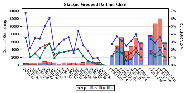
One such instance came up last week when a user posted a question on the SAS Communities page about creating a Bar Chart with gaps on the category (X) axis. Here is the graph.
The data is read from an Excel file and as you can see has some gaps on the X axis for the category variable. In the original spreadsheet, the values for each bar segment and series plot are in a separate column. To create the stacked bar chart, we need the data in a "group" format, so I reshaped the data using a group variable with values of A, B and C, and response values for bar and line. Now, drawing the plot using SGPLOT procedure is straightforward - except for the gaps in the X axis.
The gaps are intended to provide a separation between the weekly, quarterly and semi-annual data. Providing a blank for the gap values works if there is only one. But putting two blank values, they get treated as one category value, resulting in one gap. Putting strings with multiple blanks does not work either, as leading and trailing blanks are stripped, resulting in a single blank, or missing. We need another blank character that is invisible.
NBSP to the rescue again. As we discussed last time, an nbsp is an invisible blank space that does not get stripped from the label. So, here we use two strings, one with one nbsp, and one with two nbsps. This can be extended for however many you need.
One other trick I used to make the task a bit easier to see, is the following. I actually added a "." and a ".." to the xaxis column in the spread sheet. This is so I can see the string. Now, I used the TRANSLATE function to convert each "." in the string into an nbsp, or 'A0'x:
xaxis=translate(xaxis, 'A0'x, '.'); |
SGPLOT code:
title 'Stacked Grouped BarLine Chart'; proc sgplot data=groupedData; format linevalue percent.; vbar xaxis / response=BarValue group=Group url=url; vline xaxis / response=LineValue group=Group missing y2axis break markers markerattrs=(symbol=circlefilled size=9) lineattrs=(pattern=solid thickness=2); xaxis display=(noticks nolabel) discreteorder=data; yaxis offsetmin=0 values=(0 to 14000 by 2000) grid; y2axis offsetmin=0 values=(0 to 0.07 by 0.01); run; |
Full SAS 9.2 Code: Stacked_Bar_Line
Excel Spread Sheet: StackedBarLineData2
Next week, I will be in Long Beach, Ca. for WUSS 2012. I am presenting the following:
- Hands-On-Workshop: Quick Results with SAS ODS Graphics Designer.
- Paper: Now You Can Annotate Your SG Procedure Graphs (Dan Heath, SASGF 2011).
- Half-day seminar: Clinical Graphs using SG Procedures.
If you are attending, please come by the SAS demo area. I would love to get your feedback on some new features we are adding to GTL, SG Procedures and ODS Graphics Designer for SAS 9.4. Yes, I realize SAS 9.4 seems like the distant future! But we have to get the features into the product now so you can use them when you are ready.


