Pie charts have been the subject of some criticism when they are used to compare measures across multiple categories. It is generally accepted that comparison of magnitudes represented as angular measures from varying baselines is not effective.
However here are some use cases where a pie chart does quite well.
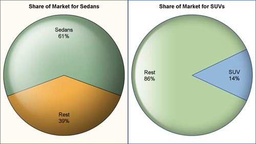
When it comes to comparing one category to the whole population, IMHO, a pie chart does a good job for a part-to-whole comparison. In the examples above, even without the numbers one can see that Sedans have a little over 50% of the market, while SUV's have a smaller fraction.
Note: It helps if the centerline of the two slices has a vertical or horizontal orientation.
The SGPLOT procedure does not support pie charts, and most users are just fine with that. However SAS 9.3 GTL (Graph Template Language) that forms the underpinnings of the procedure does support pie charts. So, we could write a macro to create some pie charts.
I started with a simple macro, but soon the scope began to expand. So, I decided to stop and publish what I had. Once again, it is not bullet proof, nor tested, but a start.
Given the data set name, the category variable, and optionally a response or group variable and a few other options, this macro will output a nice pie chart to the open ODS destination(s).
The macro invocation for the left graph above is as follows:
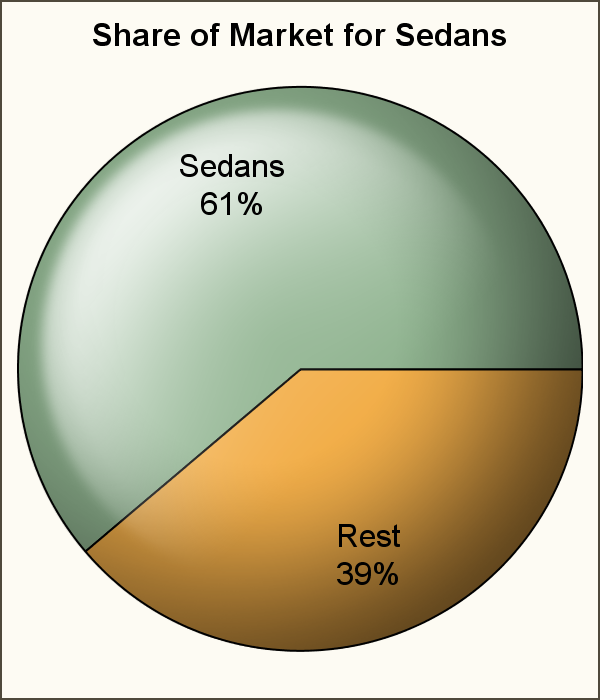
%GTLPieChartMacro(data=GTL_Sedans, category=type, response=count, title=Share of Market for Sedans, startangle=340, DataLabelFontSize=12, responselabel=true, percentlabel=false); |
By default, pie slices are drawn counterclockwise starting from the 3 o'clock position . For the pie charts shown above, we have used the startangle option to re-orient the pie. Such alignment clearly helps in decoding the information. I like the vertical alignment better than the horizontal, maybe because it is closer to the clock dial.
Here is the same pie chart with the default start angle. Not as satisfactory as the one above, I think.
When the pie has more than two slices, things get murky. Here are some examples using the macro. As the number of pie slices increase, or we add other features like groups, the effectiveness of the Pie Chart decreases.
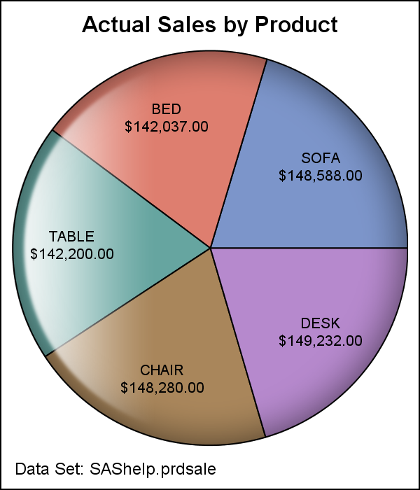
%GTLPieChartMacro(data=sashelp.prdsale, category=product, response=actual, dataskin=gloss, title=Actual Sales by Product, footnote=Data Set: SAShelp.prdsale, footnotefontsize=6); |
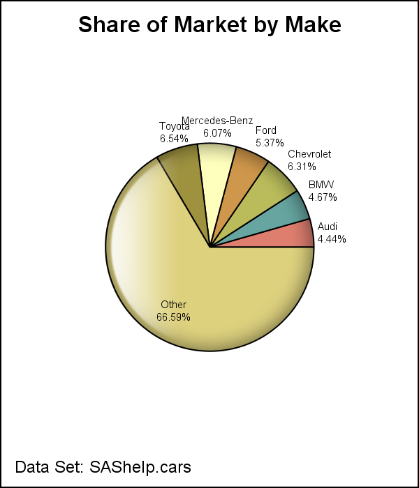
The "Other" slice kicks in by defalt to limit the number of slices as shown above.
%GTLPieChartMacro(data=sashelp.cars, category=make, dataskin=gloss, title=Share of Market by Make, footnote=Data Set: SAShelp.cars, responselabel=false, percentlabel=true, footnotefontsize=9, datalabelfontsize=6); |
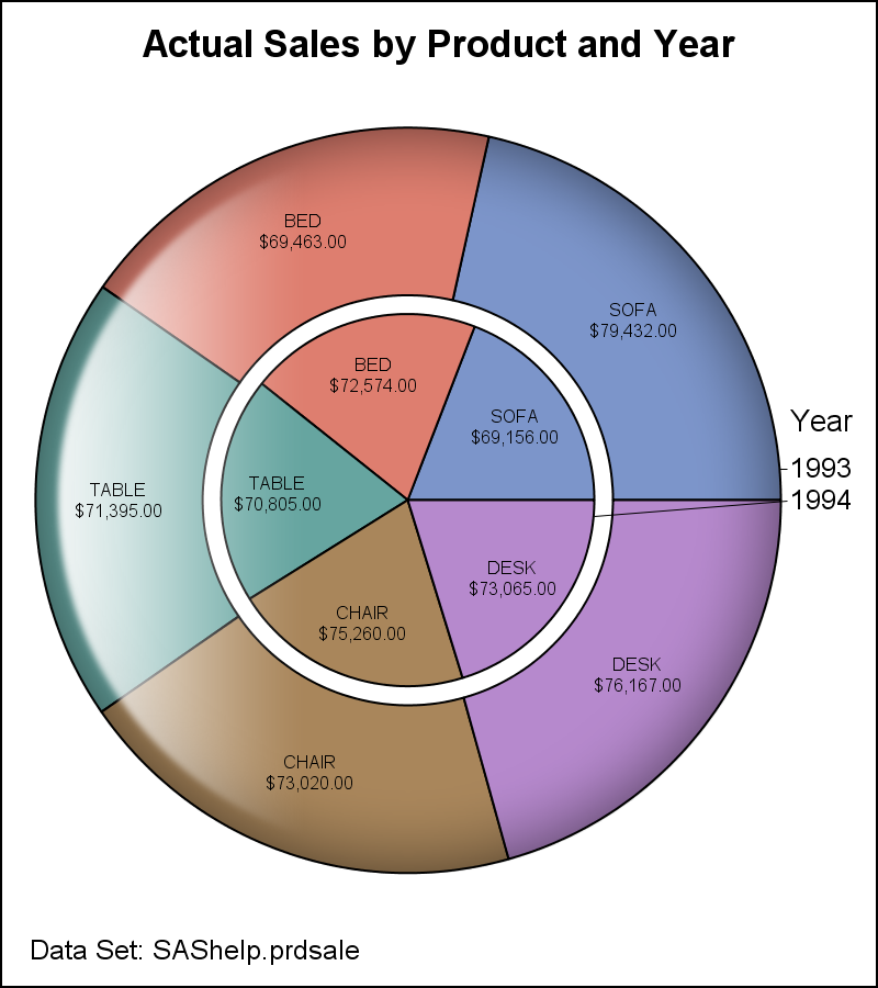
%GTLPieChartMacro(data=sashelp.prdsale, category=product, response=actual, group=year, dataskin=gloss, groupgap=10, title=Actual Sales by Product and Year, footnote=Data Set: SAShelp.prdsale, footnotefontsize=9, datalabelfontsize=6); |
When the Pie chart has only two slices, I believe the default orientation of the centerline of the slices should be vertical. With some more coding, this can be added to the macro. Also for GTL, we intend to make this the default orientation at some point in the future. Your opinions are welcome.
Your turn: Do you find Pie Charts useful in your work, and have you tried the SAS 9.3 GTL Pie Chart?
SAS 9.3 GTL PieChartMacro: GTLPieChartMacro


24 Comments
Nice work. In the last example is there and easy way to make the two pies appear side by side insted one within the other?
TIA Rune
Yes, you can use a Layout Lattice, and populate a Pie in each cell. You will have to break out the group values into independent columns yourself. Or, you can use the IFN funcion.
Pingback: Analyzing the first 10 million digits of pi: Randomness within structure - The DO Loop
It's very eye-catching pie chart. Is there any way to border line disappear(e.g. noborder in the goptions statement in SAS graph.)? Say I'd like to insert the pie chart without border lines into my PPT slide.
Ethan
You can remove the border around the whole graph using the NOBORDER option on the ODS GRAPHICS statement. GOPTIONS are not applicable in this case.
Great job Sanjae ! This works veeeeery fine, thanks alot 🙂
By the way, is there any way to manage colors in classic gchart pie ?
thanks again !
Have you find a way to manage colors in this pie chart yet? If yes, would you please share your code? Thanks a lot!
Pie chart assigns the color based on the 12 group colors. You can set the group colors within the syntax by using the DATACOLORS option in the GTL BEGINGRAPH statement.
Hi again, just a precision please : is there a way to avoid the automatic 'other' grouping ? I tried to search within ODS GRAPHICS options with no success (not implemented in your macro).
I need a pie chart that corresponds exactly to my data...
Yes. Use the NoMissingGroup option.
Thanks for everything ! I've been using your macro for a while and it works just fine.
I had a just little issue dealing with long category names, they won't fit inside the parts (had to play beetween font and graph sizes) but no big deal...
I got another question for you : Is there a way, in a group pie, to increase the size of the Group's name and category fonts ? I tried to increase GroupLabelFontSize but it doesn't seem to have any effect...
Thanks in advance !
I had the same problem. The macro value 'grouplabelfontsize' isn't actually used anywhere in the macro, so you have to put it the right place in the code in order to work. Include this line in the 'layout region' section of the 'define statgraph GTLPieChart' statement:
GROUPLABELOPTS=(VALUEATTRS=(size=&grouplabelfontsize) LABELATTRS=(size=&grouplabelfontsize));This makes both the group label and all group value labels have the requested size. If you want to have different sizes for both, you either have to add another macro variable or set a default value instead of getting the value of &grouplabelfontsize. I hope this helps!
The 'layout region' section now looks like this in my code:
Nice macro, Sanjay!
Thanks Kirk. I hope you can put it to good use in your BI reporting tool.
Hi Sanjay!
I have several pies in a lattice and want the datalabels outside of the slices. Problem is that GTL resizes the pies to fit the labels so they're all different sizes depending on the size of the slices/location of the labels. Like if I have a long label for a slice to the left, GTL compresses the pie into nothing. Another pie that has that same slice at the bottom is a lot bigger. I've tried experimenting with padding but to no avail.
Is there no way to specify the size of the circle?
Only way I can think is to display a legend with the values, and turn off the pie labels.
Ok, Sanjay. Thanks for the suggestion.
Is it an easy way to make a donut chart using your macro - like your last example, but just the outside part.
Donut charts are not directly supported by GTL.
Hi Sanjay,
Is it possible to have two statistics on the same pie chart? I'd like to show the frequency and the percentage together. thanks,
If you pre-summarize your data to get the frequency, you should be able to set PercentLabel=true in the macro to have both values appears.
Is it possible to attribute specific colors to each slice in %GTLPieChartMacro? When I use discreteattrmap, the response and percent labels are lost..
So that everyone is aware, we introduced PROC SGPIE in SAS 9.4m6. @James, the procedure has the ability to do attrmaps, but the macro does not appear to have that ability.