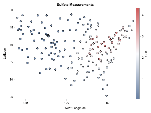
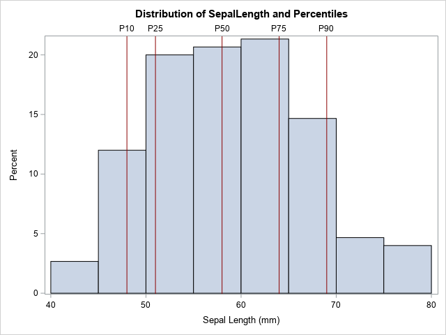
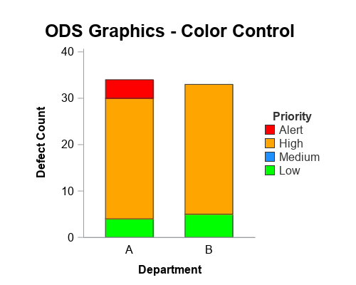
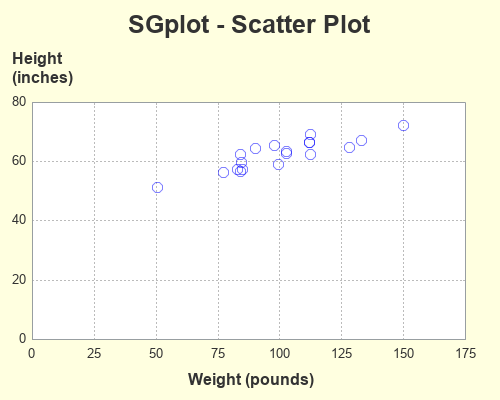
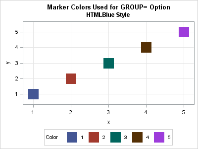
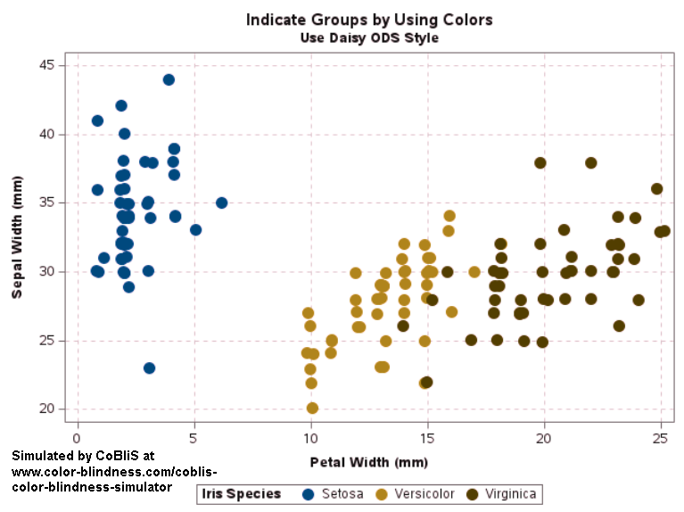
Suppose you create a scatter plot in SAS with PROC SGPLOT. What color does PROC SGPLOT use for the markers? If you specify the GROUP= option so that markers are colored by a grouping variable, what colors are used to represent the various groups? The following scatter plot shows the
Search Results: sgplot color (526)
Many users of ODS Graphics will be excited to learn that, beginning with SAS® 9.4 TS1M3, SG procedures are able to recognize formatted values that contain Unicode values. One benefit of this is that it allows you to include, without using annotation, special symbols such as greater-than-or-equal-to signs or Greek
I sometimes see analysts overuse colors in statistical graphics. My rule of thumb is that you do not need to use color to represent a variable that is already represented in a graph. For example, it is redundant to use a continuous color ramp to represent the lengths of bars
Did you know that about 8% of the world's men are colorblind? (More correctly, 8% of men are "color vision deficient," since they see colors, but not all colors.) Because of the "birthday paradox," in a room that contains eight men, the probability is 50% that at least one is
A SAS programmer was trying to understand how PROC SGPLOT orders categories and segments in a stacked bar chart. As with all problems, it is often useful to start with a simpler version of the problem. After you understand the simpler situation, you can apply that understanding to the more
The SGPLOT procedure supports a wide variety of plot types that you can use directly or combine together to create more complex graphs. Even with this flexibility, there might be times you run across a graph that you cannot create using one of the standard plot types. An "area" bar
Oh, no! Your boss just told you to change the way that SAS displays certain features in graphs, such as missing values. But you have a library of hundreds of SAS programs! Do you need to modify all of your previous programs? Fortunately, the answer is no. SAS provides ODS
In an article about how to visualize missing data in a heat map, I noted that the SAS SG procedures (such as PROC SGPLOT) use the GraphMissing style element to color a bar or tile that represents a missing value. In the HTMLBlue ODS style, the color for missing values
In a previous article, I visualized seven Christmas-themed palettes of colors, as shown to the right. You can see that the palettes include many red, green, and golden colors. Clearly, the colors in the Christmas palettes are not a random sample from the space of RGB colors. Rather, they represent
In data visualization, colors can represent the values of a variable in a choropleth map, a heatmap, or a scatter plot. But how do you visualize a palette of colors from the RGB or hexadecimal values of the colors? One way is to use the HEATMAPDISC subroutine in SAS/IML, which
This article shows how to use PROC SGPLOT in SAS to create the scatter plot shown to the right. The scatter plot has the following features: The colors of markers are determined by the value of a third variable. The outline of each marker is the same color (such as
The REFLINE statement in PROC SGPLOT is one of my favorite ways to augment statistical graphics such as scatter plots, series plots, and histograms. The REFLINE statement overlays a vertical or horizontal reference line on a graph. You can specify the location of the reference lines on the REFLINE statement.
As we continue to process and understand the ongoing effects of the novel coronavirus, many of us have grown used to viewing COVID-19 dashboards and visualizations, including this popular coronavirus dashboard from SAS. If you are more accustomed to building graphs and visualizations using the SGPLOT and SGPANEL procedures, this
Ridgeline plots are useful for visualizing changes in the shapes of distribution over multiple groups or time periods. Let us look at an example of how we can create this plot using the SGPLOT procedure that is part of the ODS Graphics Procedures. For this example, we will plot the
A few years ago Mandelbrot sets and fractals were all the rage! (Am I showing my age? Hahaha!) I thought creating some plots of this type of data would be a good way to sharpen my SAS programming skills, and it would make a nice/interesting example to help teach people
Heat maps have many uses. You can use a heat map to visualize correlation matrices, to visualize longitudinal data ("lasagna plots"), and to visualize counts in any two-dimensional table. As of SAS 9.4m3, you can create heat maps in SAS by using the HEATMAP and HEATMAPPARM statements in PROC SGPLOT.
In this 'Rosetta Graph' example, I demonstrate how to control bar chart colors in Gchart and SGplot. But first, here's a little diversion... some artwork in my office here at SAS. There's a *lot* of artwork hanging around at SAS, but this particular painting wasn't created by the SAS artists
You've probably heard of the famous Rosetta Stone. It had the same decree written on it in both ancient Egyptian and Greek, and was an essential key to help modern historians decipher and translate the ancient Egyptian hieroglyphs. To help the 'old timers' (like me) shift from using SAS/Graph to the
You've probably heard of the famous Rosetta Stone. It had the same decree written on it in both ancient Egyptian and Greek, and was an essential key to help modern historians decipher and translate the ancient Egyptian hieroglyphs. To help the 'old timers' (like me) shift from using SAS/Graph to
A few years ago Sanjay showed how to create a polar graph by creating a gtl template, and then plotting it using Proc SGRender. These days, Proc SGPlot has all the functionality you need to create this graph, therefore I've rewritten the example to just use SGPlot. And while I
Plotting just your data often helps you gain insight into how it has changed over time. But what if you want to know why it changed? Although correlation does not always imply causation, it is often useful to graph multiple things together, that might logically be related. For example, recessions
You might have noticed I've been trying out SAS ODS Graphics lately, whereas in the past I mainly used SAS/Graph for my samples. In this blog post I step you through my latest fancy SGplot graph - hopefully you'll learn some tips & techniques, as you follow along. (I don't
When a graph includes several markers or line styles, it is often useful to create a legend that explains the relationship between the data and the symbols, color, and line styles in the graph. The SGPLOT procedure does a good job of automatically creating and placing a legend for most
The SGPLOT procedure enables you to use the value of a response variable to color markers or areas in a graph. For example, you can use the COLORRESPONSE= option to define a variable whose values will be used to color markers in a scatter plot or cells in a heat
A useful feature in PROC SGPLOT is the ability to easily visualize subgroups of data. Most statements in the SGPLOT procedure support a GROUP= option that enables you to overlay plots of subgroups. When you use the GROUP= option, observations are assigned attributes (colors, line patterns, symbols, ...) that indicate
The STYLEATTRS statement in PROC SGPLOT enables you to override colors, markers, line patterns, fill patterns, and axis break patterns in ODS styles, without requiring you to change the ODS style template.
Some say that opposites attract. Others say that birds of a feather flock together. Which is it? Phillip N. Cohen, a professor of sociology at the University of Maryland, recently posted an interesting visualization that indicates that married couples who are college graduates tend to be birds of a feather.
The LOESS statement in PROC SGPLOT finds a fit function while making no assumptions about the parametric form of the regression function.
The REG statement fits linear regression models, displays the fit functions, and optionally displays the data values. You can fit a line or a polynomial curve. You can fit a single function or when you have a group variable, fit multiple functions.
Survival plots are automatically created by the LIFETEST procedure. These graphs are most often customized to fit the needs of SAS users. One way to create the customized survival plot is to save the generated data from the LIFETEST procedure, and then use the SGPLOT procedure to create your custom