Author

Dan Heath
RSS
Principal Systems Developer

Dan Heath is a principal systems developer at SAS Institute. A SAS user for more than 28 years, Dan specializes in SAS/GRAPH software, ODS Graphics, and related graphing technologies. Dan has been a speaker at a number of regional and local users' group meetings, including SAS Global Forum, PharmaSUG, and WUSS. He received a BS degree in computer science from North Carolina State University.

Data Visualization
Dan Heath 0
The Power of Stacking

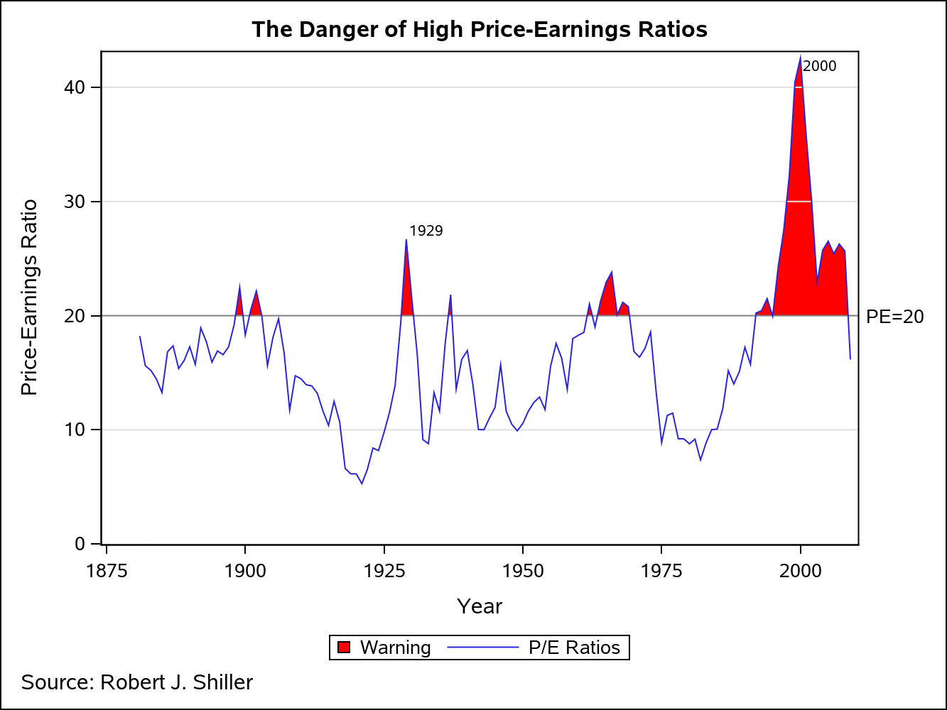
Amazing things can be created when you start with small pieces and stack them together. Just ask Bryan Berg. He is the current world record holder for the tallest house of cards. This same principle can be applied to the SGPLOT and SGPANEL procedures. You can take the individual plot

Data Visualization
Dan Heath 0
Area Bar Charts using SGPLOT

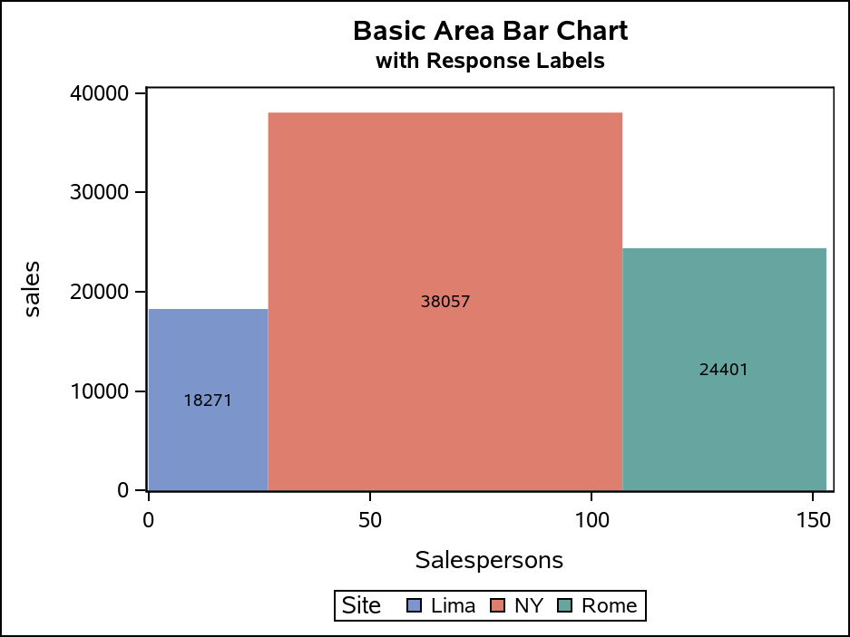
The SGPLOT procedure supports a wide variety of plot types that you can use directly or combine together to create more complex graphs. Even with this flexibility, there might be times you run across a graph that you cannot create using one of the standard plot types. An "area" bar

Data Visualization
Dan Heath 0
Optimizing bar label placement

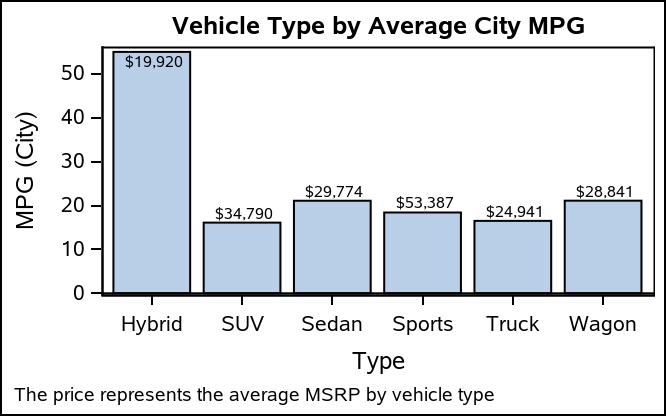
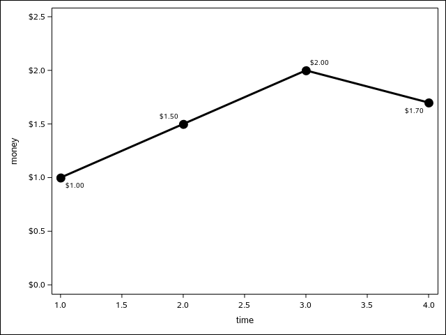
When creating bar charts, it is very common to display labels with the bars to make it easier to determine the bar values or to provide additional information in the chart. However, these labels can take away valuable data space, particularly if you generate a smaller-sized graph. As you see

Data Visualization
Dan Heath 0
Drillable Titles and Footnotes

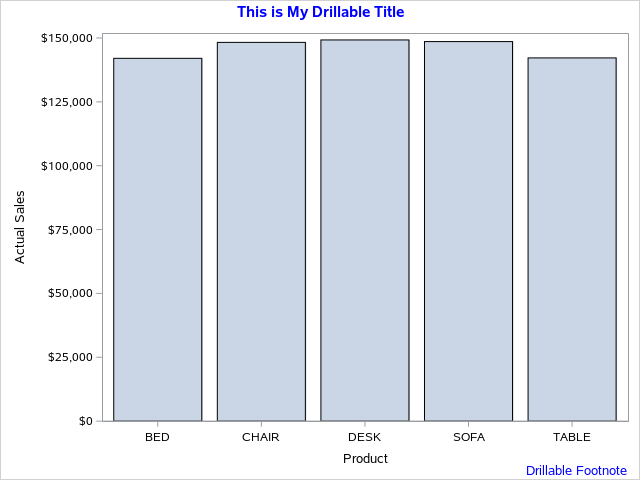
Tool tip and drill-down functionality is commonly used to explore plot data in a graph, particularly on the web. Occasionally, you might even have the need to add this drill-down functionality to your titles or footnotes, possibly to reference more details or source information. The TITLE and FOOTNOTE statements in

Data Visualization
Dan Heath 0
Roses are red, violets are blue...

This classic start to a romantic poem assumes that the correct colors are always assigned to the correct flowers; but, for those who create graphs for reports, consistent color assignment can be more of a challenge than an assumption. This challenge is particularly true for the display of group values.

Data Visualization
Dan Heath 0
A (tool)tip for band plots

Recently, I had a discussion with a user concerning the volume of imagemap data generated for an interactive,  web-based visual contain a large number of graphs. The large amount of imagemap data was causing problems with the current version of their web browser. The graphs consisted of either bar charts

Data Visualization
Dan Heath 0
They go where you put them

An issue that SAS/GRAPH users have wrestled with in the past has been how to put tick marks at irregular intervals on their axes. In PROC GPLOT, if you specify irregular intervals using the ORDER option on the AXIS statement, the procedure’s axis kicks into a “discrete” mode, where the

Data Visualization
Dan Heath 0
The Power of Unicode

The Unicode character table contains a vast array of  characters and symbols that can be quite useful for making your text more descriptive in your graph. These characters can be inserted into any viewable string that you can define in the GTL or SG procedure syntax. These strings include titles,