Survival plots are automatically created by the LIFETEST procedure. These graphs are most often customized to fit the needs of SAS users. One way to create the customized survival plot is to save the generated data from the LIFETEST procedure, and then use the SGPLOT procedure to create your custom graph. First, we use the ODS Output statement to save the data to the SurvivalPlotData SAS data set. Then we use the SGPLOT procedure code shown below to create the graph. See the full code in the link at the bottom of this article for the step to create and save the data.
title 'Product-Limit Survival Estimates';
title2 h=0.8 'With Number of Subjects at Risk';
footnote j=l h=6pt italic 'This visual is for discussion of graph features only.'
' The actual details should be customized by user to suit their application.';
proc sgplot data=SurvivalPlotData noborder;
step x=time y=survival / group=stratum name='s';
scatter x=time y=censored / markerattrs=(symbol=plus) name='c';
scatter x=time y=censored / markerattrs=(symbol=plus) GROUP=stratum;
xaxistable atrisk / x=tatrisk class=stratum colorgroup=stratum valueattrs=(weight=bold);
keylegend 'c' / location=inside position=topright;
keylegend 's' / linelength=20;
run;
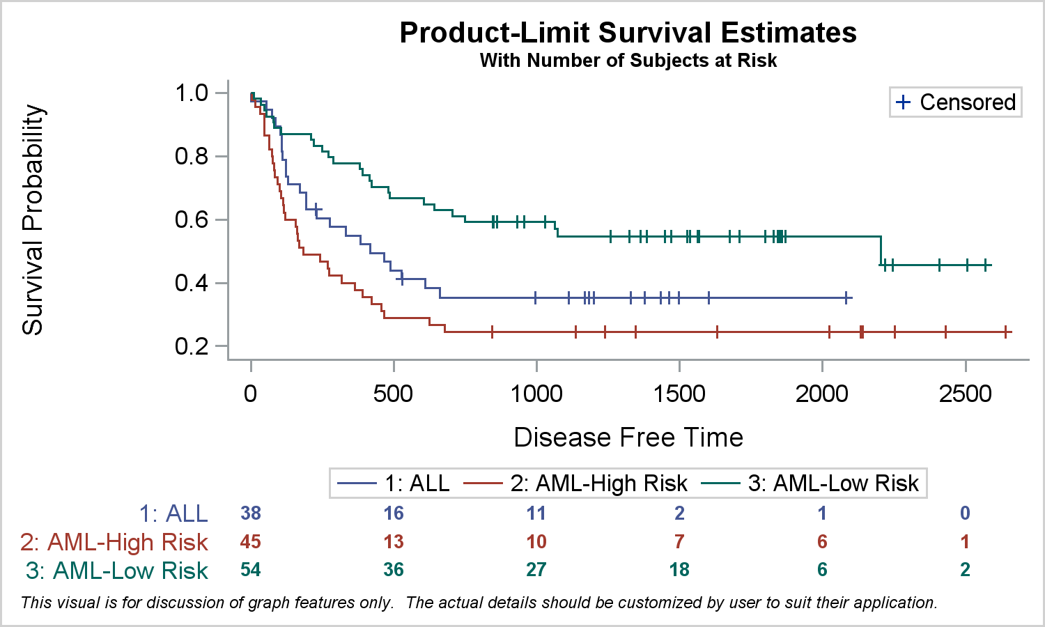
In this program, we use a SERIES plot to display the survival probability by time and stratum. We use SCATTER plot to display the censored observations, and we use the XAXISTABLE to display the table of subjects at risk at the bottom of the graph by time and stratum.
Recently, there have been a few requests to further customize the graph to remove the offset on the left side of the "0" value on the x-axis . Note, the offset is generated to accommodate the "0", and also the text in the first column of the Subjects at Risk table at the bottom without clipping. Without this offset, long values in the table may get clipped.
The offset can be removed by setting XAXIS offsetmin=0. You can try this easily, but you will see that the first column of at risk values are clipped, and only half the text if visible. One way to fix this would with the usage of annotation. This can get complicated. However, some customization can be achieved without any annotation by using some additional statements and options. While a user may get different mileage from the results, this exercise will show you how you can use such statements and options creatively to get different results.
In the first case, we remove the "appearance" of the offset on the left of the "0" on the x-axis. Here is the code and the results.
title 'Product-Limit Survival Estimates';
title2 h=0.8 'With Number of Subjects at Risk';
footnote j=l h=6pt italic 'This visual is for discussion of graph features only.'
' The actual details should be customized by user to suit their application.';
proc sgplot data=SurvivalPlotData noborder;
styleattrs axisextent=data;
dropline x=0 y=0.2 / dropto=y;
dropline x=0 y=0.4 / dropto=y;
dropline x=0 y=0.6 / dropto=y;
dropline x=0 y=0.8 / dropto=y;
dropline x=0 y=1.0 / dropto=y;
step x=time y=survival / group=stratum name='s';
scatter x=time y=censored / markerattrs=(symbol=plus) name='c';
scatter x=time y=censored / markerattrs=(symbol=plus) GROUP=stratum;
xaxistable atrisk / x=tatrisk class=stratum colorgroup=stratum valueattrs=(weight=bold);
keylegend 'c' / location=inside position=topright;
keylegend 's' / linelength=20;
yaxis display=(noline noticks);
run;
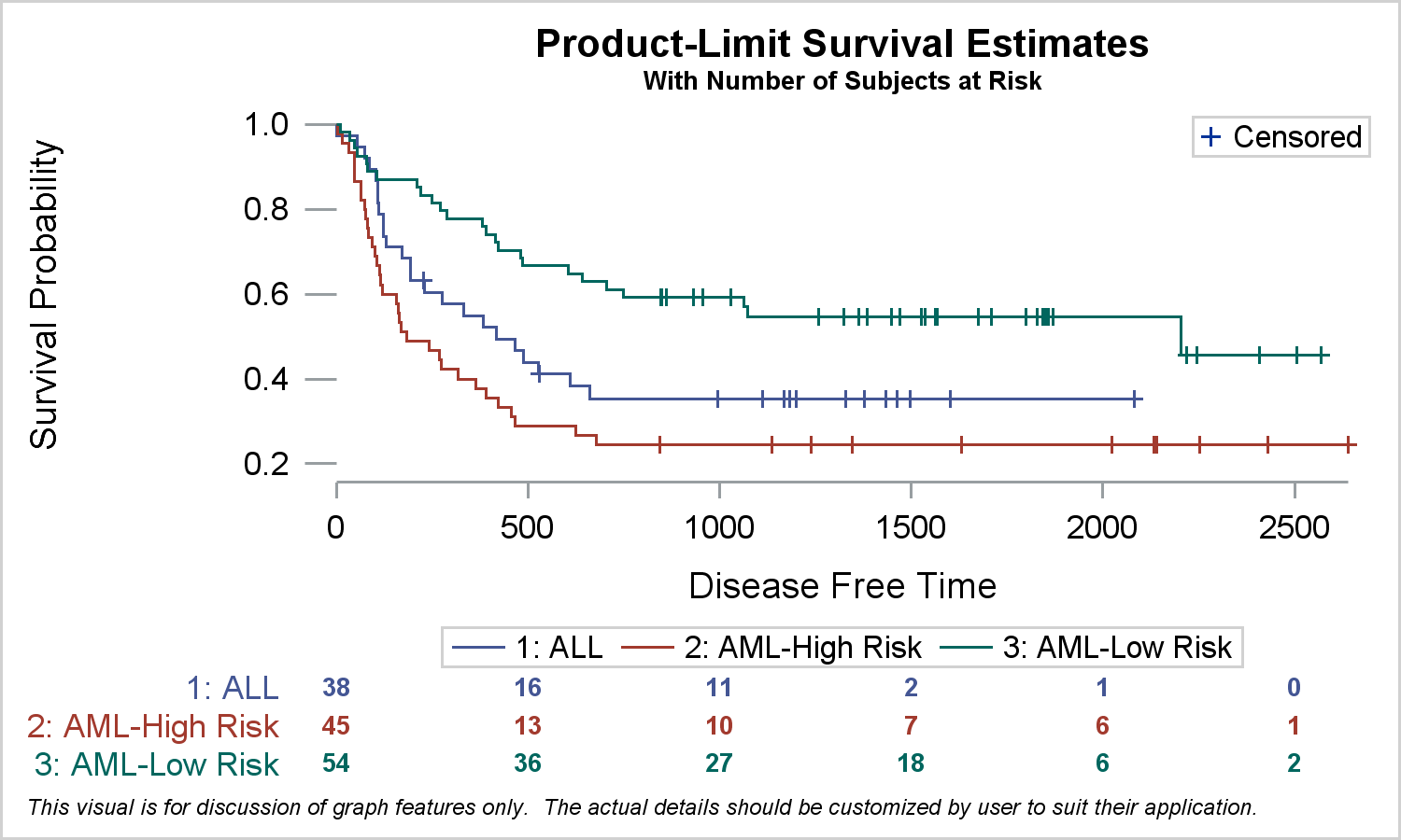
Note the following changes in the graph:
- The y-axis line and ticks are removed.
- Longer y-axis tick marks are created at each value using multiple DROPLINE statements.
- The x-axis line is drawn only to the extent of the data using AXISEXTENT=Data.
- The changed syntax is highlighted in the code.
Another request that comes up is about the distance of the y-axis label from the y-axis tick values. This happens because the XAXISTABLE is placed in a separate cell below the graph in a GTL LAYOUT LATTICE. This is done for you by the SGPLOT procedure. This causes the axis labels for the two cells to line up, pushing the y-axis label outside the longer class values of the xAxisTable.
One way to fix this is to place the Subjects at Risk table closer to the survival curves. Code and graph are shown below.
title 'Product-Limit Survival Estimates';
title2 h=0.8 'With Number of Subjects at Risk';
footnote j=l h=6pt italic 'This visual is for discussion of graph features only.'
' The actual details should be customized by user to suit their application.';
proc sgplot data=SurvivalPlotData2 noborder;
styleattrs axisextent=data;
dropline x=dropx y=dropy / dropto=y;
refline 0 / axis=x;
step x=time y=survival / group=stratum lineattrs=(pattern=solid) name='s';
scatter x=time y=censored / markerattrs=(symbol=plus) name='c';
scatter x=time y=censored / markerattrs=(symbol=plus) GROUP=stratum;
xaxistable atrisk / x=tatrisk location=inside class=stratum colorgroup=stratum
valueattrs=(size=7 weight=bold) labelattrs=(size=8) nomissingclass;
keylegend 'c' / location=inside position=topright;
keylegend 's' / linelength=20;
yaxis display=(noline noticks);
run;
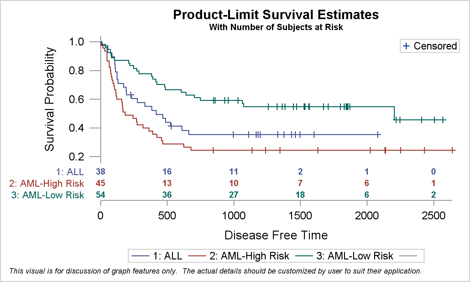
In this graph, note the following details.
- The y-axis line and ticks are removed.
- Longer y-axis tick marks are created at each value using a single DROPLINE statement with data from columns that is added to the data set. See the full code in the link below.
- A vertical reference line is drawn at x=0. This line does not draw through the axis table values.
- The x-axis line is drawn only to the extent of the data using AXISEXTENT=Data.
- The Subjects at Risk table is shown closer to the survival curves using the LOCATION=INSIDE option. The xAxisTable is placed in the INNERMARGIN of the GTL LAYOUT OVERLAY by the SGPLOT procedure.
- Since there is no LAYOUT LATTICE used, the y-axis label is now closer to the y-axis values.
- The changed syntax is highlighted in the code.
The examples above will give you some insight in how various statements and options can be used to achieve custom results.
SGPLOT code for Survival Graph: SG_Survival_Plot


4 Comments
Hi Sanjay,
Thank you for such a useful information about survival curve.
I want to remove the frame of the survival curve in the topright corner.
how should i set the parameters? noborder?
Thanks!
On the ODS GRAPHICS statement, use the NOBORDER option:
ods graphics / noborder;
Hope this helps!
Dan
Hello,
Do you have suggestions on how to truncate the Kaplan-Meier curve when the number of subjects at risk are below some threshold value? I've seen research journals that require truncating the Kaplan-Meier curve when there are <10 subjects at-risk.
I think the best thing to do would be to use a where clause on the procedure, where atrisk > 10.