A few years ago Sanjay showed how to create a polar graph by creating a gtl template, and then plotting it using Proc SGRender. These days, Proc SGPlot has all the functionality you need to create this graph, therefore I've rewritten the example to just use SGPlot. And while I was at it, I converted it from the polar-coordinates (where 0 degrees is to the right, and the angles go counter-clockwise) to more of a compass-direction-based layout (where 0 degrees is at the top, and angles go clockwise). I figure if you're going to label your graph with North/South/East/West labels, then it should be laid out like a compass.
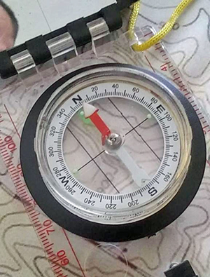
If you're a little rusty on how a compass is laid out, here's a picture of a compass from my friend Gene-Paul. Traditionally, North is at the top, and represents 0 degrees. East is to the right, and represents 90 degrees, and so on. Gene-Paul fights forest fires, and knowing how to read a compass has probably saved his life a time or two!
Sample Data
I use the same simulated sample data as Sanjay, but I change the names of the variables to make it a little easier to mentally follow. I use variables called wind_speed, wind_direction (with direction being a compass direction, 0-360 degrees), and BCC (for black carbon concentration):
data my_data;
pi=constant("pi");
conv=pi/180.0;
do wind_speed=0 to &max_wind by .5;
do wind_direction=0 to 360 by 2;
BCC=15 +
10*cos((wind_direction+wind_speed*5)*conv) +
5*cos((2*wind_direction+wind_speed*5)*conv);
output;
end;
end;
run;
Checking the Data
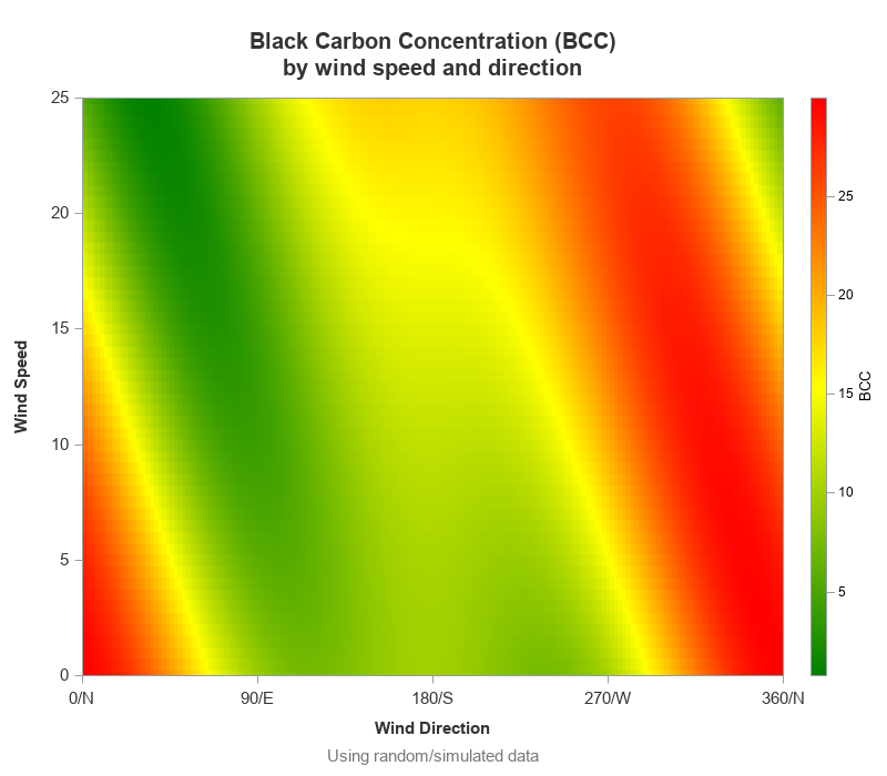
As a sanity check, let's plot the data in a regular rectangular graph. This is similar to Sanjay's graph, but notice that I also added the N/S/E/W (north, south, east, west) compass letters to the wind direction axis - I think this helps get the user oriented.
proc sgplot data=my_data;
scatter y=wind_speed x=wind_direction /
colorresponse=bcc markerattrs=(symbol=squarefilled size=11)
colormodel=(green yellow red);
xaxis values=(0 to 360 by 90)
valuesdisplay=('0/N' '90/E' '180/S' '270/W' '360/N');
run;
Plotting the Data
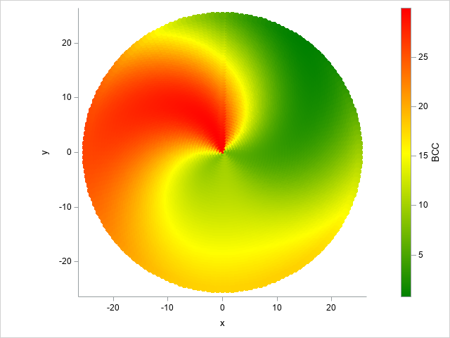
Next, I convert the angle (direction) and wind speed to x & y variables:
data my_data; set my_data;
radius=wind_speed;
angle_degrees=(360-wind_direction)+90;
angle_radians=((2*pi)/360 )*(angle_degrees);
y=radius*sin(angle_radians);
x=radius*cos(angle_radians);
run;
Here's an intermediate plot, just to show you how things are laid out:
sgplot data=my_data aspect=1.0 noborder;
scatter x=x y=y / colorresponse=bcc
markerattrs=(symbol=circlefilled size=11)
colormodel=(green yellow red);
run;
Customizing the Graph
Next we create a dataset to add a bunch of things to the plot, using several different x & y variables (x1/y1, x2/y2, and so on). This technique is sometimes referred to as 'overloading' the plot dataset. An alternative might be to annotate these things, but since Sanjay's plot used the overloading technique, I'll stick with that. Note that the code below is slightly summarized to make it easier to follow - click here to see the full code.
data customize;
/*--Generate radial axes--*/
x1=0; y1=0; x2= &max_wind*1.10; y2= 0; output;
x1=0; y1=0; x2=-&max_wind*1.10; y2= 0; output;
x1=0; y1=0; x2= 0; y2= &max_wind*1.10; output;
x1=0; y1=0; x2= 0; y2=-&max_wind*1.10; output;
/*--Generate radial axes labels--*/
x3= &max_wind*1.15; y3=0; label='E'; output;
x3=-&max_wind*1.15; y3=0; label='W'; output;
x3=0; y3= &max_wind*1.15; label='N'; output;
x3=0; y3=-&max_wind*1.15; label='S'; output;
/*--Generate circular axes--*/
do wind_ring=5 to &max_wind by 5;
output;
end;
/*--Generate circular axes text labels--*/
do wind_ring=5 to &max_wind by 5;
x4=wind_ring; y4=0;
length label_circle $5;
label_circle=trim(left(wind_ring));
output;
end;
/*--'wind speed circles' text title--*/
x5=&max_wind/2; y5=-1;
title_circle='Wind Speed Circles'; output;
/* footnote (to save space) */
x6=&max_wind*1.05;
y6=&max_wind*1.15*-1;
foot_text='Using random/simulated data';
output;
run;
data my_data; set my_data customize;
run;
You can then add a vector statement to the sgplot to draw the north/south/east/west arrows, ellipseparm statement to draw the rings, and various text statements to label the vectors and rings, and add a footnote.
/* north, south, east, west arrows */
vector x=x2 y=y2 / xorigin=x1 yorigin=y1 arrowheadshape=filled;
text x=x3 y=y3 text=label / textattrs=(color=gray33 size=10 weight=bold);
/* circlular axes */
ellipseparm semimajor=wind_ring semiminor=wind_ring /
xorigin=0 yorigin=0 lineattrs=(color=gray33);
text x=x4 y=y4 text=label_circle / textattrs=(color=gray33 size=10 weight=bold)
position=topleft contributeoffsets=none;
text x=x5 y=y5 text=title_circle / textattrs=(color=gray33 size=11 weight=bold)
position=bottom contributeoffsets=none;
/* footnote in the graph space (to save space) */
text x=x6 y=y6 text=foot_text / textattrs=(color=gray77 size=11 weight=normal)
position=left contributeoffsets=none;
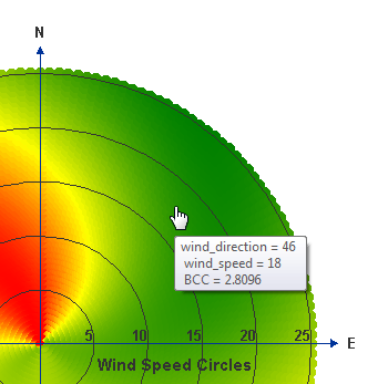
The end result is the following nice graph:
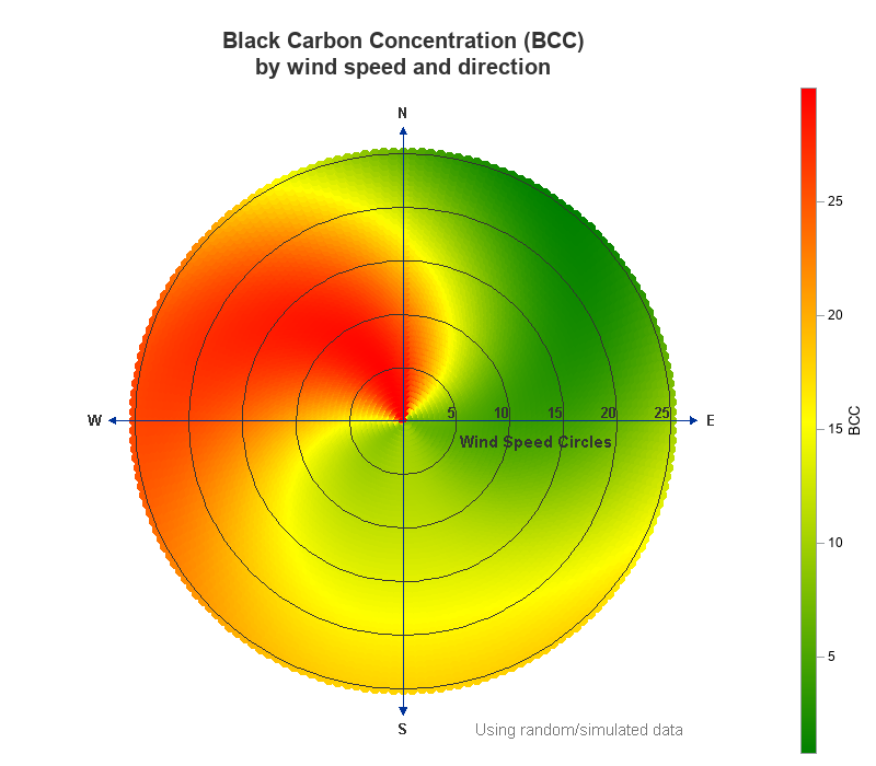
Other Enhancements
Here are a few other changes and enhancements in my version:
- I label the rings (wind speed circles), and the legend (BCC), so people will know what they represent.
- I used a macro variable for the max_wind value (25), rather than hard-coding the value throughout the code.
- For the vectors and text labels that extend beyond the max_wind value, I used calculated values (such as &max_wind*1.10), rather than hard-coding values.
- I add a footnote so people will know this is 'simulated' data ... rather than using a traditional footnote statement (which places the footnote below the graph) I used the sgplot text statement which lets me place it inside the graph space, making better use of the white space.
- And I added HTML mouse-over text, so you can mouse around the graph and spot-check the values (see screen-capture below).
Here's the full code for this example, if you'd like to download it and experiment.


4 Comments
Holy trigonometry Batman! That's an impressive graph!
Hi Robert, thanks for your sharing! What is the difference between sgplot and sgrender? Ask grant instruction. Thank!
PROC SGRENDER is for rendering Graph Template Language (GTL) definitions using your data. The PROC SGPLOT procedure (as well os other "SG" procedures) give you the ability to specify various forms of graphics directly in the procedure using a more compact specification. Both approaches use the same underlying rendering system. GTL is the most powerful and flexible system, but the SG procedures do have some built-in capabilities and conveniences that would require more work using GTL. You'll probably find that you can do most of your graphing needs just using the SG procedures.
Hi Dan, Thank you very much for your quick reply! I was going to talk about this at this year's PharmaSUG, and your answer gives me a sense of direction. Thank you again for your reply!
Yan