There are many situations where it is beneficial to display the data using a polar graph. Often your data may contain directional information. Or, the data may be cyclic in nature, with information over time by weeks, or years. The simple solution is to display the directional or time data on the X axis of a XY plot as shown further down in the article. But the information may not very easy to understand in such a graph. Such a graph was recently discussed on the SAS Communities page.
 The same information can be better understood using a polar graph. The graph on the right shows the (simulated) BC concentration by Wind Direction and Wind Speed. The data for this graph was simulated by me using some random and trigonometric functions. There is no real sampled or measured information in the data.
The data has the concentration of BC by wind direction and Wind speed. In this graph I have transformed the data so that the direction (0-360 degrees) is mapped to a point around the circle, and the speed (0-25 mph) is mapped along the radius. The BC concentration is displayed by a colored marker, and the gradient legend is displayed on the right to decode the values.
The directions are displayed using the N-S-E-W arrows, so understanding the information is easier. Note, I have not yet added the indicators for the Wind Speed in this graph.
Here is the SAS 9.40 SGPLOT program for the graph.
title 'BC Concentration by Wind Speed and Direction';
proc sgplot data=wind aspect=1.0 noborder;
scatter x=x y=y / colorresponse=bc markerattrs=(symbol=circlefilled)
colormodel=(green yellow red) name='a';
vector x=x2 y=y2 / xorigin=x1 yorigin=y1 arrowheadshape=barbed;
text x=xl y=yl text=label / textattrs=(size=9);
gradlegend 'a' / title='';
xaxis display=none;
yaxis display=none;
run;
In the data step for the graph, x and y are computed from R and Theta using the following formula. You can see all the details in the program code linked below.
x=r*cos(theta * PI / 180);
y=r*sin(theta * PI / 180);
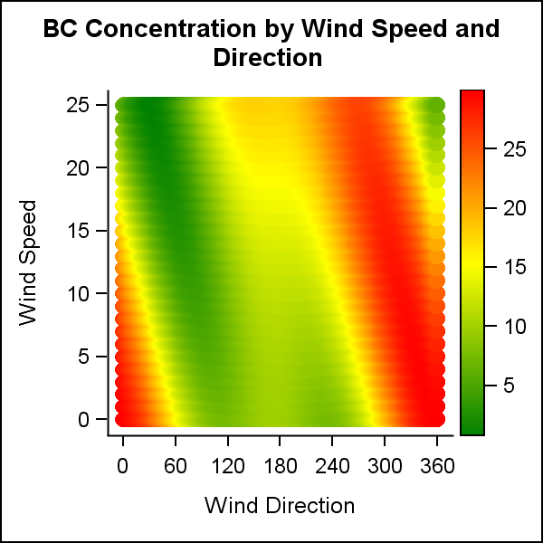 A simpler method would be to just plot the Wind Speed and and Wind Direction on the Y and X axes of a rectangular XY plot as suggested at the start of the article. The result is shown on the right. The data is exactly the same, but now we have plotted speed (R) on the Y axis and direction (Theta) on the X axis of the scatter plot. See linked code below.
I would say the data is not as easy to understand in this presentation. The feel for direction is lost, and also a discontinuity is created between 0 and 360. A polar presentation is clearly more intuitive.
Note in the polar graph on top, I did not plot the indicators for the Wind Speed. The SGPLOT procedure does not support a simple plot statement to draw circles to display the values for the speed along the radius. Yes, we could plot the values along one axis, but that would not be so intuitive. The circular grid lines can be drawn using the SGANNOTATE "oval" function and that exercise is left to the motivated reader.
 Instead, we can also make the same graph using GTL, which does support the ELLIPSEPARM statement that can be used to draw the circular grids. Now, the circles provide the grid lines for the Wind Speed, and the values are displayed along one of the directional arrows. Click on the graph for a higher resolution image.
Note, I have used the option ASPECT=1.0 to ensure that the display area is circular regardless of the size or aspect of the graph itself.
Full SAS 9.40 SGPLOT and GTL code: Wind_Graph
Earlier, I had posted a similar method to Visualize the Temperature Data over Time.


4 Comments
Very pretty. A few comments:
1) In real data the graph will look more like a scatter plot with overplotting. For example, a north wind at 5 mph might occur several times during the monitoring period, and the same (direction, speed) combination might have multiple BC concentrations. You can use partial transparency to reduce overplotting.
2) You can plot the circles in SGPLOT by using the POLYGON statement, which is available in SAS 9.4M1. An example is shown on my blog, or use the code below. You can merge the circles with the data and call SGPLOT on the resulting data set:
Pingback: Polar Graph - Wind Rose - Graphically Speaking
Pingback: Polar graph remix - using sgplot (no gtl/sgrender!) - Graphically Speaking
Thank you for this post.
I tried to use it to plot data in clinical study.
Before to plot polar graph I realize Bland-Altman analysis and plot 4-quadrant graph.
But to realize polar plot I don't understand how to use my data to get it.
In your case i understand the logical to have wind direction, but to illustrate trending ability between 2 methods I am lost...
I wonder if you have any advice for me please ?
an eg of what i want :
https://europepmc.org/articles/PMC5536626/bin/10.1177_0300060516635383-fig3.jpg