Last week I posted an article on displaying polar graph using SAS. When the measured data (R, Theta) are in the polar coordinates as radius and angle, then this data can be easily transformed into the XY space using the simple transform shown below.
x=r*cos(theta * PI / 180);
y=r*sin(theta * PI / 180);
Then, we can plot the graph using a scatter plot statement. Setting Aspect=1 ensures the graph retains its shape, and we add the radial grid lines using Vector plot statement. With GTL, we can use the Ellipseparm statement to display the circular grids. With SGPLOT, we can use either a Polygon plot or SGAnnotate to draw the circular grids.
 In this article, we will discuss another popular polar graph called the Wind Rose Graph. This graph was developed to depict the wind speed and direction, and can be useful to present any directional information, or information that is cyclical in nature.
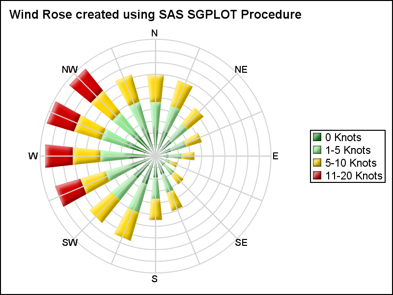
The Wind Rose graph on the right is created using the SGPLOT procedure. Here I have simulated wind data by direction and speed category. The data was generated using some trigonometric and random functions and does not represent real or sampled data.
Note, this visualization does not use a scatter plot, as was the case with the polar graph in the previous article. Here, we have used a "Bar" to represent the wind from each direction. This needs a bit more work to create.
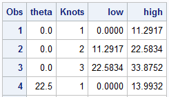 I start with generating the data in (R, Theta) coordinates, as shown on the right. For 16 values around the circle, I generate the wind percentages by 4 "Knots" categories. These can be seen in the legend in the graph above. I have generated Low and High values for each segment in the table on the right. This is done for ease of transformation later into the polar graph. For simplicity, each group has equal number of percentages. Values with total > 80 has 4 groups.
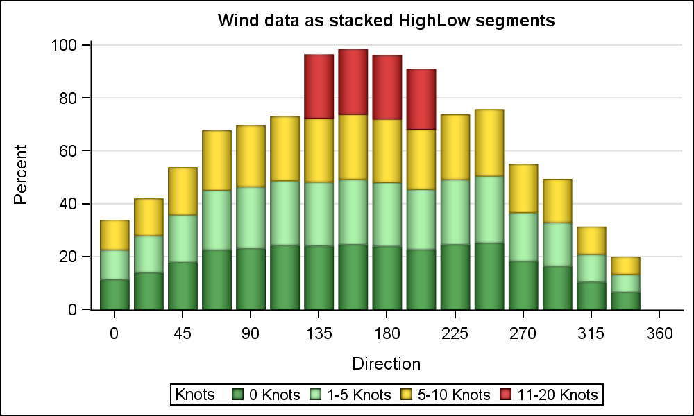
We can certainly plot this data directly as a HighLow plot in the XY space as shown below. Click on the graph for a higher resolution image.
 title h=10pt 'Wind data as stacked HighLow segments';
proc sgplot data=WindSpeed noborder;
styleattrs datacolors=(forestgreen lightgreen gold cxD00000);
highlow x=theta low=low high=high / group=knots type=bar ;
yaxis offsetmin=0 label='Percent' grid;
xaxis values=(0 to 360 by 45);
run;
Note in the bar chart on the right, the bars are actually plotted using the High-Low plot, with Type=bar. The overall wind values are easy to compare side by side. However, since the data is really directional, let us plot the bars on the compass directions.
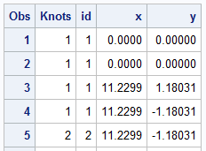 Using the equation shown above, we transform the (R, Theta) coordinates to the (x, y) coordinates. A polygon is generated for each segment of the high-low in the original (R, Theta) space. Then each vertex of the polygon is converted into the (x, y) space as shown in the table on the right. When plotted, the "Polar Bars" (pun intended) are displayed. The table includes the Knots variable to be used as color group and polygon Id.
In the same data set, data is generated for the 16 radial grid lines, with values 0-315, the angle around the circle. A Vector plot is used to display this on the graph as the 16 directions. A Text plot is used to display the labels for each direction using a user defined format. X and Y axes are turned off, and Aspect=1 is used. The result is shown in the graph at the top of the article.
title h=10pt 'Wind Rose created using SAS SGPLOT Procedure';
proc sgplot data=WindPolar aspect=1 noborder nowall noautolegend sganno=anno subpixel;
format label dir.;
format knots knots.;
styleattrs datacolors=(forestgreen lightgreen gold cxD00000);
polygon x=x y=y id=id / dataskin=sheen fill nooutline group=knots name='a';
vector x=x2 y=y2 / xorigin=x1 yorigin=y1 lineattrs=(color=lightGray) noarrowheads;
text x=xl y=yl text=label / textattrs=(size=7);
keylegend 'a' / position=right across=1;
xaxis display=none;
yaxis display=none;
run;
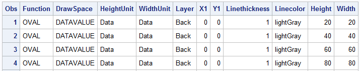 In the previous article for Polar Graph, I had used GTL to display the circular grid lines using the EllipseParm statement. In this graph, I have used SGAnnotate to draw the circular grids using the OVAL function. Click on the table on the right to see the annotate data in detail. Note the use of "Layer=back". This draws the circular grids behind the graph. To see these annotations, we need to turn off the Wall display.
A label for each circular grid can be added using the TEXT function. That exercise is left to the motivated reader.
Full SAS 9.4 SGPLOT Code: WindRoseGraph


4 Comments
Wind-rose chart looks really nice. Can the code be modified to create a chart as shown in
http://postsecondary.gatesfoundation.org/student-stories/america-as-100-college-students/
?
Thanks for sharing it.
I suppose you could, however the benefit is not clear. The graph you have linked arranges all the categories around the circle, but the benefit of doing this is not clear. They are independent categories, that do not add up to 100%. Each "slice" does not represent a % of the whole. Also, the subcategories in each slice are different, and only compare to other subcategories. Labelling around the circle is also harder, and this will be a very custom graph.
Personally, I would use a simple stacked bar chart to display this data as it is easier, and conveys the data more clearly. Maybe us a "Likert" graph.
Pingback: Likert Graph Revisited - Graphically Speaking
Pingback: Advanced ODS Graphics: Equated Axes and the Aspect Ratio - Graphically Speaking