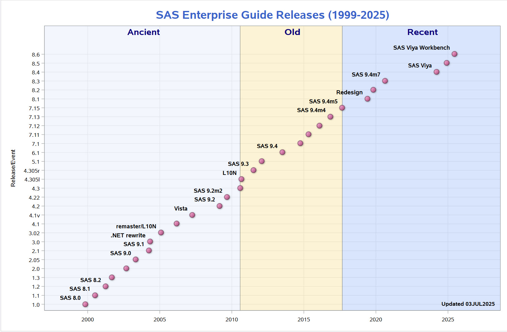
My colleague Rick Wicklin maintains a nifty chart that shows the timeline of SAS releases since Version 8. A few of you asked if I could post a similar chart for SAS Enterprise Guide. Here it is. Like Rick, I used new features in SAS 9.4 to produce this chart
Tag: SGPLOT
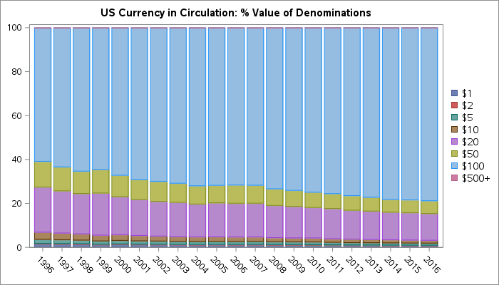
This phenomenon has been in the news recently, so I've updated this article that I originally published in 2017. The paper currency in circulation in the US is mostly $100 bills. And not just by a little bit -- these account for 34% of the notes by denomination and nearly
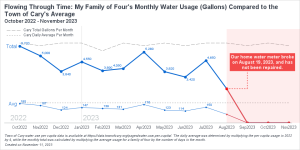
Have you ever been curious about your monthly water consumption and how it compares to others in your community? Recently, I had this question and decided to get ahold of my family's water usage data for analysis. Harnessing the power of data visualization, I compared my family of four's monthly
SAS SGPLOT already provides the necessary graphical elements for complex visualization. 3D or high-dimensional data can be easily visualized after being projected appropriately. With SAS' strong support for animation features, SAS users can create complicated 3D or high dimension visualizations quickly.
Amazing things can be created when you start with small pieces and stack them together. Just ask Bryan Berg. He is the current world record holder for the tallest house of cards. This same principle can be applied to the SGPLOT and SGPANEL procedures. You can take the individual plot
This article introduces how to solve the pirate game with a recursive solving algorithm in SAS, and how to analyze and visualize the law behind the complex logic of the pirate game. If you join in a pirate game next time, you can know your destiny ahead of time to reap the benefits and avoid getting killed.
A scatter plot is my go-to graph! It's what I often start with to get a feel for the data ... and I often end up using just a scatter plot. But some scatter plots are better than others ... In this blog post, I create a scatter plot of
These days, many countries are moving away from coal, and towards natural gas, hydro, wind, and solar as ways to meet their electricity needs. I had heard that some countries still use a lot of coal (especially those countries with large coal deposits), and I was curious which countries use
Recently, the news has been all abuzz about William Shatner traveling into space. This was a cool event because he's the oldest person who has traveled into space (at 90 years old) ... and he was also the iconic Captain Kirk from the original Star Trek television series. This got
The rumors are true - The Graph Guy is retiring! I've been working at SAS for about 30 years, and had lots of fun stretching the limits of SAS' graphing & mapping software over the years. But I've decided to retire while I'm still young enough to pursue a lot
Many cities have Open Data pages. But once you download the data, what can you do with it? This is my sixth in a series of blog posts where I download public data about Cary, NC, and demonstrate how you might analyze that type of data (for Cary, or any
Many cities have Open Data pages. But once you download the data, what can you do with it? This is my fourth in a series of blog posts where I download public data about Cary, NC, and demonstrate how you might analyze that type of data (for Cary, or any
Many cities have Open Data pages. But once you download the data, what can you do with it? This is my third in a series of blog posts where I download several datasets from Cary, NC's open data page, and give you a few ideas to get you started on
Many cities have Open Data pages. But once you download the data, what can you do with it? This is my second blog post where I download several datasets from Cary, NC's open data page, and and give you a few ideas to get you started on your own data
Many cities have Open Data pages. But once you download this data, what can you do with it? I'm going to download several datasets from Cary, NC's open data page, and try to give you a few ideas to get you started on your own data exploration! And what data
Some claim that deaths in the US have been increasing, and some claim they have been decreasing. Which do you think is correct? Let's take a look at the data ... The Data Here in the US, the Centers for Disease Control and Prevention is a good/official source of data
How long do dogs live? ... That's a good/tough question. Some live longer than others, but what are the determining factors? Let's throw some data to this problem, and see if we can fetch some answers! But before we get started, how about a random picture to get you into
Having earned the Eagle Scout rank in Boy Scouts, I am of course very conservation-minded, and against polluting. I'm also an avid boat paddler and fisherman, and therefore I'm especially concerned about pollution in our rivers, lakes, and oceans. I even volunteered for a week to help survey coral reefs
I've got this buddy, Carter Johnson - he's a little bit crazy, but a lot of fun to follow... He holds/held several different long-distance paddling world records, and was one of the coaches for the group that paddled kayaks from Cuba to the US (see my blog post). A few
You've probably seen a population pyramid, such as this one I showed in a previous blog post. But let's scrutinize population pyramids a bit deeper, with an eye on special features that can make them even more useful! I was inspired to give population trees a second look by this
Have you ever brought home a piece of furniture-in-a-box, and felt undue stress while trying to make sense of the directions to assemble it? ... Apparently you're not alone! A recent analysis studied ~50,000 tweets about IKEA furniture, and determined whether the people posting the tweets were frustrated. They then
This is another in my series of blog posts where I take a deep dive into converting customized R graphs into SAS graphs. Today we'll be working on bar charts ... And to give you a hint about what data I'll be using this time, here's a picture from a SAS
This is another in my series of blogs where I take a deep dive into converting a customized R graph into a SAS graph. Today I'm focusing on a diverging bar chart (where one bar segment is above the zero line, and the other is below). What type of data
This is another in my series of blogs where I take a deep dive into converting a customized R graph into a SAS ODS Graphics graph. This time the example is a needle plot (that's essentially like a bar plot, with lots of tiny bars, plotted along a continuous xaxis).
In the past, Sanjay showed how to create several basic graphs using both R and SAS ODS Graphics code. I'm going to take a bit of a "deeper dive" and focus a series of blog posts on highly customized graphs. Hopefully the code for these customizations will provide you with
I recently had a discussion with a friend, and we were wondering about Apple's market share. This led me to look into the actual data ... finding the online charts lacking, and then designing my own charts. Follow along if you're curious about the process of improving the charts, or
If you've been stuck at home a lot lately, and think you have run out of movies to watch -- think again! Here is a list of big-budget movies you might not have seen, because they flopped (lost lots of money). Follow along as I show you how I created
When it comes to plotting mortgage rate data, I often look to Len Kiefer for inspiration. He recently posted a retro-looking graph on twitter that caught my eye ... and of course I had to see if I could create something similar using SAS. For lack of a better term,
Here in the United States, we have our general election (where we elect the president) every four years - and 2020 happens to be one of those election years. This time we seem to have a lot more people voting early. I can't tell you the reason they're voting early
Now that we are many months into the COVID-19 pandemic, I've started going back and reexamining the data for lessons or trends (you might say hindsight is 20/20). This time, I want to explore how COVID-19 has been spreading around the US. I do this by using a graphical idea