Many cities have Open Data pages. But once you download the data, what can you do with it? This is my third in a series of blog posts where I download several datasets from Cary, NC's open data page, and give you a few ideas to get you started on your own data exploration!
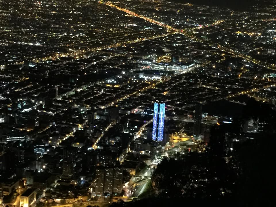
And what data did I choose this time? Here's a picture from my friend Joy, to give you a hint... it shows the city lights of Bogotá Colombia at night.
The Data
If you guessed "streetlight data" you are correct! Cary has a lot of streetlights, and keeps track of them all in a database.
I downloaded the csv version of the Cary streetlight data from this page, and then used Proc Import to read it into SAS. After running Proc Import, I saved the generated code to speed up future runs (the first time you run the proc, it has to analyze each field of each line in the file, to determine what length and type to make each variable). See link to my SAS code, at the bottom of the blog.
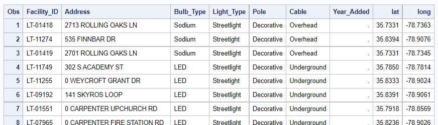
Here's my SAS table, showing some of the pieces of information in the data:
Data Cleaning
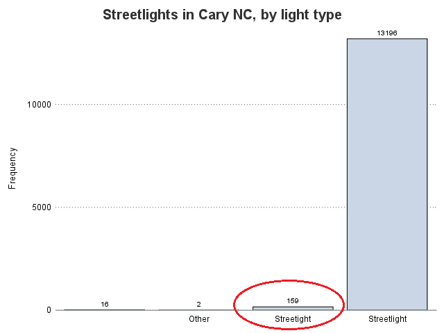
Although data cleaning isn't glamorous, it is often necessary and important. For example, although the file I downloaded was called streetlights.csv, I wanted to do a little sanity-check to make sure that all the rows of data were indeed about streetlights. Therefore I generated a bar chart showing the frequency count of each Light_Type - and to my surprise, I got more than one bar!
There was a bar with 159 observations in the data where 'Streetlight' was misspelled 'Streetight' (missing the letter 'l' just after the 2nd 't'). See the bar circled below:
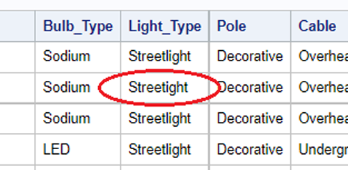
If you re-examine the table above, you can even find the 'Streetight' typo there - I bet you didn't notice that earlier! I'll enlarge/zoom it a little, and circle the typo, to make it easier to see. This is a good example demonstrating that you can not trust your eyes to find all the data errors in a text table, whereas graphs and/or frequency counts can easily detect errors like this - let the computer do the work for you!
The fix was easy - I used the following line in a data step:
if light_type='Streetight' then light_type='Streetlight';
Bulb Type
Glancing at the table, the thing that initially caught my attention was the bulb type - some of the lights had LED bulbs, some had Sodium bulbs (and some had other types). I was curious which type of bulb was more commonly used, and whether there were certain areas that favored certain types of bulbs.
I plotted the data on a map to get more insight. Each marker represents a light, and the color represents the type of bulb. I couldn't resist using a dark map background, with light white/yellow colors representing the lights (making it similar to maps that simulate lights at night ... looks a little similar to the Bogotá picture above, eh?)
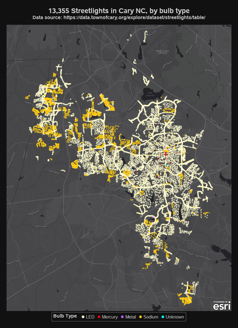
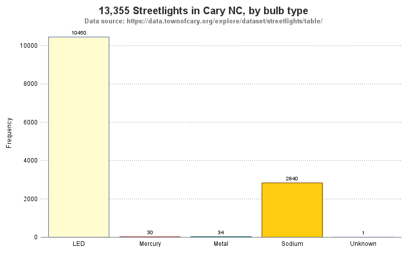
The map shows 'where' each type of bulb is used more often, but which bulb type is used more often overall? Looking at the map, I would guess there are more LED lights ... but why guess, when you could easily get the definitive answer with a bar chart!
Note that I use the same colors in the bar chart, as I used in the map. The code is slightly different - in the map (above) I set the datacontrastcolors, whereas in the bar chart (below) I set the datacolors - compare the two lines of code below. (Note that if I wanted to guarantee that certain values always got assigned certain colors, I could use attribute maps.)
styleattrs datacontrastcolors=(cxFFFCCF cxff0000 cxBF5FFF cxFFCC11 cx00FFFF);
styleattrs datacolors=(cxFFFCCF cxff0000 cxBF5FFF cxFFCC11 cx00FFFF);
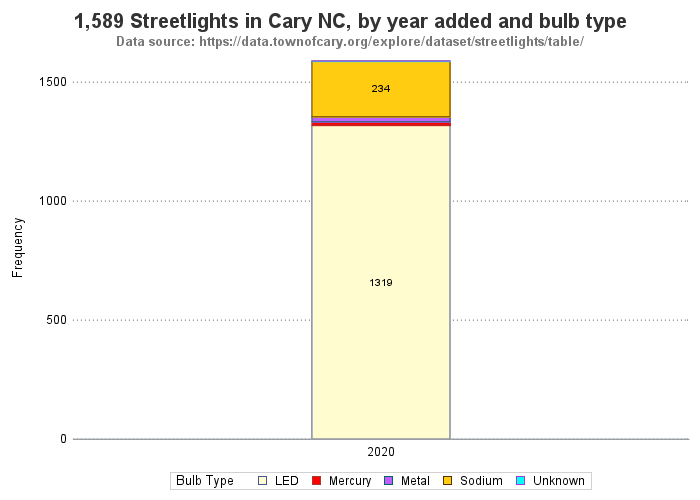
I was hoping to next use the year_added variable, to see if there were trends towards one bulb type or another, over time ... but it appears the year_added only has values for lights added in year 2020. Therefore I can see the 'mix' in 2020, but I can't compare it to previous years.
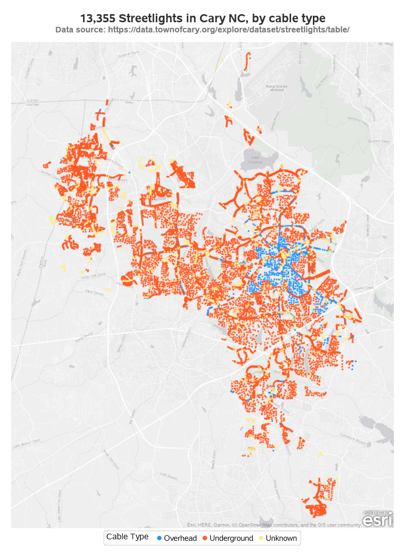
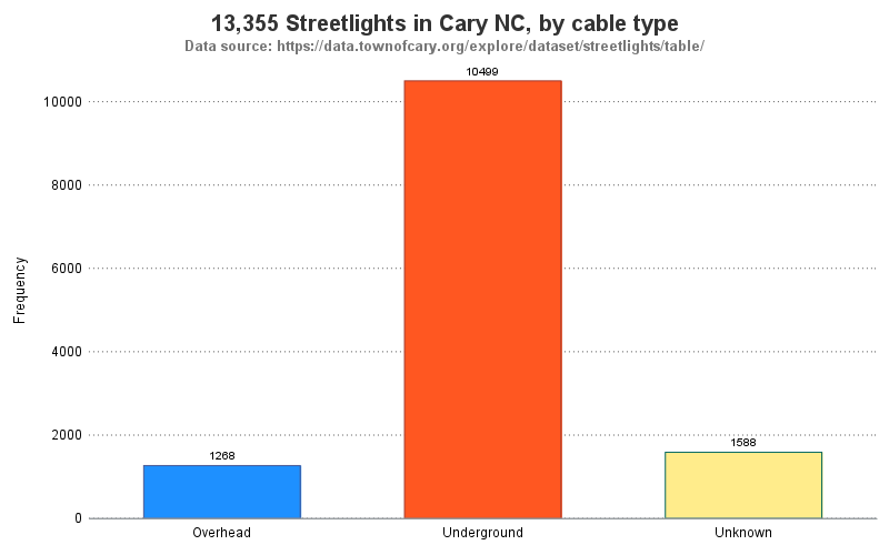
Power Cable Type
In my neighborhood (built in the 1980s) all the power cables are underground. But some sections of Cary have above-ground power cables. I thought this might make another interesting map & graph. Since I'm not simulating the lights shining at night this time, I go with a lighter gray map. In case you're curious, here were the commands I used in Proc SGmap to use the dark gray map, and the light gray map:
esrimap url="http://services.arcgisonline.com/arcgis/rest/services/Canvas/World_Dark_Gray_Base";
esrimap url="http://services.arcgisonline.com/arcgis/rest/services/Canvas/World_Light_Gray_Base";
In the map below, it looks like underground power cables are most often used (more orange dots). Note that the overhead power cables (blue dots) look to mainly be in the older/original parts of Cary.
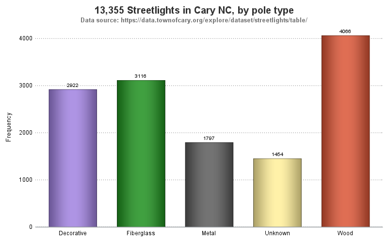
Pole Type
In addition to the types of bulbs and types of power cables, Cary also track the type of pole each light is mounted on. Looks like the poles are mostly wood (brownish-red dots), with fiberglass and 'decorative' poles coming in 2nd and 3rd. It's interesting to see that the decorative poles (purple dots) seem to be most often used in the western (newer) sections of Cary.
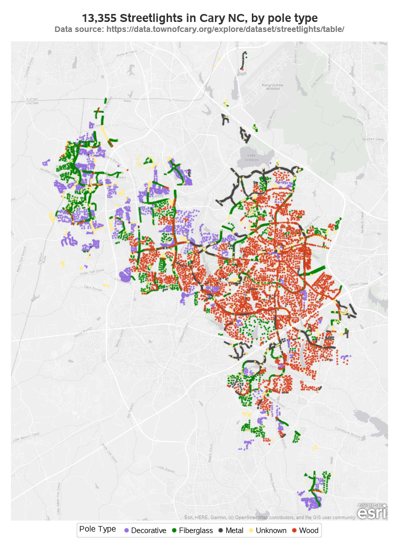
I don't normally use the fancy 'dataskins' on my bar charts, but I decided to make an exception in this case. Since I'm plotting data about the type of pole the streetlights are on, I decided to use the 'pressed' dataskin with shading that resembles a 3d cylinder/pole.
vbar pole / stat=freq group=pole datalabel dataskin=pressed;
What's Next
That's probably everything you ever wanted to know about Cary's streetlights, LOL! But if it's not, here's a link to my SAS code in case you would like to experiment with it, and modify it to answer your additional questions (or maybe plot your city's streetlight data).