Many cities have Open Data pages. But once you download this data, what can you do with it? I'm going to download several datasets from Cary, NC's open data page, and try to give you a few ideas to get you started on your own data exploration!
And what data did I choose to start with? The picture below is a hint. It's a vintage Cary front license plate (from the 1970s, I believe?) This is back when cities charged a tax on cars, and you had to display these plates to prove that you had paid the tax (... or something like that - if you know more details, help me out in a comment!). These days, it's just a cool/retro plate to put on the front of my Subaru Forester...

The Data
If you guessed "car crash data" you are correct! I downloaded the csv version of the data from this page, and then used Proc Import to read it into SAS. After running Proc Import, I saved the generated code to use in future runs, so it would be much faster (since it doesn't have to figure out the length and types of all the variables again). See link to my SAS code, at the bottom of the blog.
Analysis based on geography
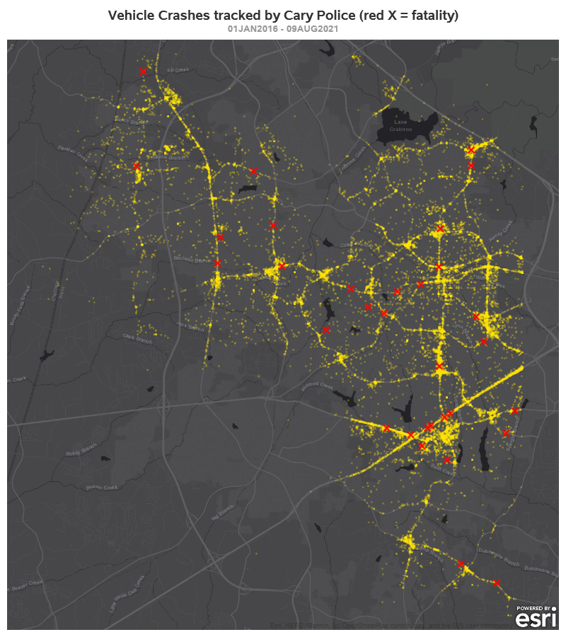
Since the data has latitude/longitude coordinates for each wreck, I decided to plot it on a map. This will (perhaps) help identify which areas have the most wrecks. I used Proc SGmap, and plotted the wrecks as yellow markers on a dark gray map. In addition to the yellow dot markers for each wreck, I also overlay a red 'X' on the locations that had a death.
Of course there's the problem of markers "stacking up" in exactly the same location, and looking like just one single marker. I made the markers slightly transparent, so that markers stacked in the same location look 'brighter'. The resulting map looks pretty good, I think!
Analysis based on time
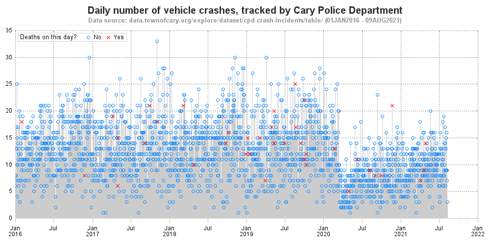
The data also contains a timestamp for each crash. I summarized the data to find the number of crashes each day, and created a needle plot (basically a bar chart with very skinny bars) to show the number of daily crashes over the ~6 year time period. I placed a marker at the top of each bar, and made that marker a red 'X' on days that had a death. Do you see any trends here? (discuss in the comments section!)
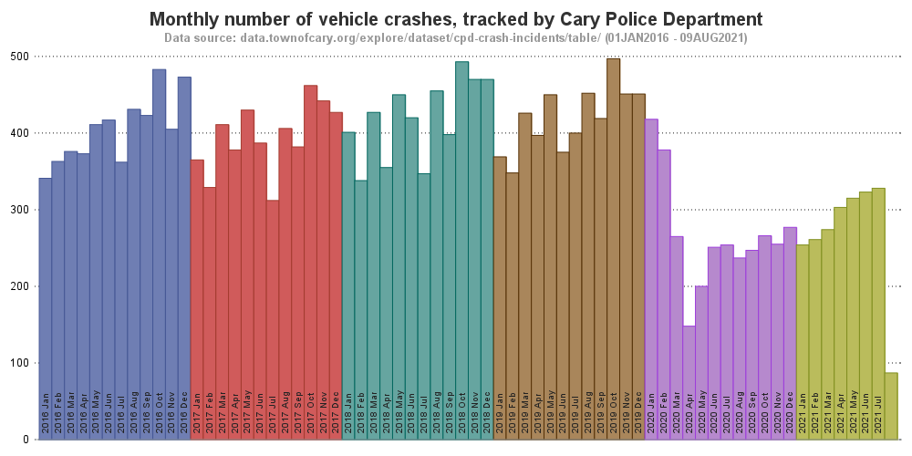
The daily plot (above) is a bit overwhelming. Therefore I summarized the number of crashes per month, and created the following bar chart. Is this an improvement? What's better/worse about this graph, compared to the daily one?
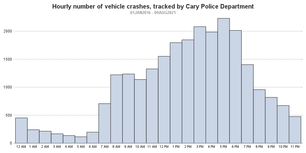
I was also curious whether there were more wrecks at certain times of day (perhaps the morning and/or evening rush hours?) I rounded the times to the nearest hour, and created a histogram to see if there were any trends. Based on this graph, what are the safest and most dangerous times to drive?
Analysis based on other factors
The crash data also contains several other details about the crashes. Cary's website lists these in summary tables, such as the following:
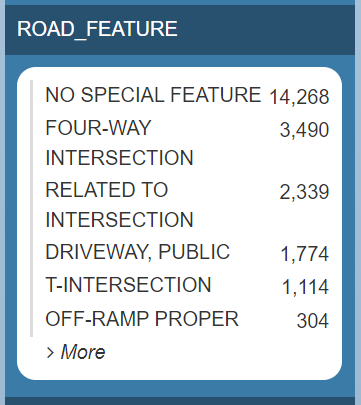
But a table doesn't let me quickly 'see' the data - I have to read & think too much with a table! I think this type of data would be better presented in a bar chart. For example, here's a bar chart of the values from the table above:
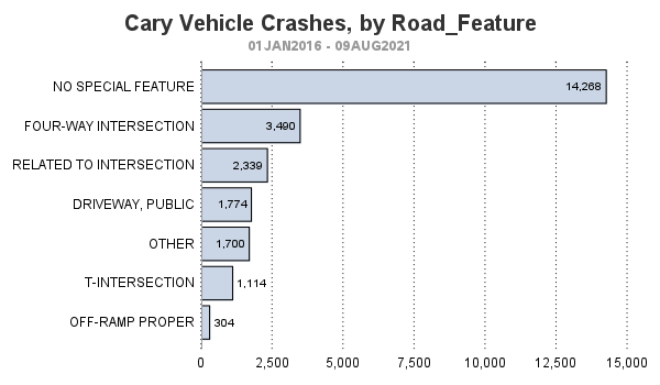
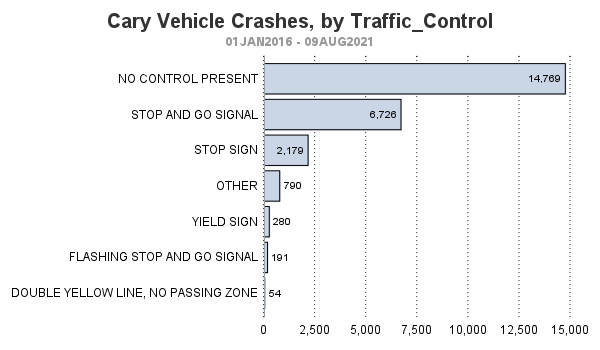
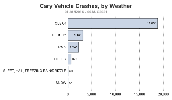
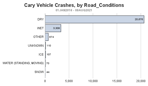
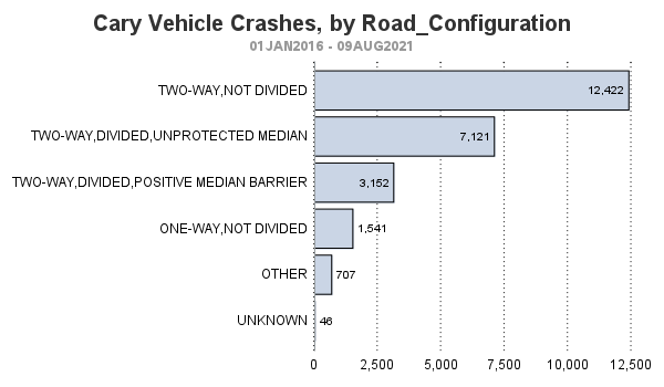
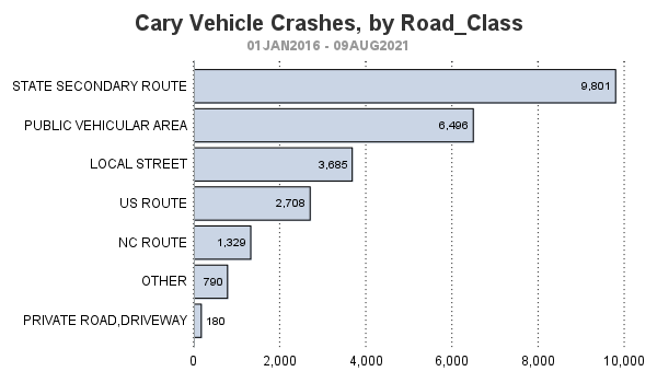
Here are some more bar charts, of additional factors in the data:
What's Next?
Did you learn anything interesting in these graphs? What other graphs/maps of this data would you like to see? Feel free to discuss in the comments.
Hopefully I've inspired you to check whether your city has similar data available, and maybe download it and try to create some graphs! Here is a link to my SAS code, in case you want to use it as a starting point for your own custom analysis.


3 Comments
Quite a dramatic drop in crashes during 2020/21 when no one was driving to work! SAS is one of the largest employers in Cary, and thus is probably associated with much of the commuter traffic. But we've been mostly working remotely since March 2020, and that reduction in traffic incidents certainly is reflected in the data.
Yep!
That plate is a smaller plate than normal and was for municipal employees. They would put a sticker in the upper right hand corner that had an identifying number on it. I bought one on eBay because I am a “Cary”