Some observant readers may have noticed a new icon on the right sidebar of this blog announcing the release of the new SAS Press book on the ODS Graphics Designer, written in collaboration with Jeanette Bottitta. Jeanette is a Technical Writer at SAS and has worked on various SAS Graphics products
Author
Browsing on the web, I ran into a simple but visually interesting graph of financial data. Really, it could be any data, but this one showed up under "Financial Graphs". I thought this would give me an opportunity to speak about an interesting new feature added to SERIES plot with
This is the 3rd installment of the Getting Started series, and the audience is the user who is new to the SG Procedures. Experienced users may also find some useful nuggets here. The Tukey box plot is popular among statisticians for viewing the distribution of an analysis variable with or without
Index of articles on "Getting Started with SGPLOT Procedure". Getting Started with SGPLOT - Part 1 - Scatter Plot. Getting Started with SGPLOT - Part 2 - VBAR. Getting Started with SGPLOT - Part 3 - VBOX. Getting Started with SGPLOT - Part 4 - Series Plot. Getting Started with
One of the key benefits of creating graphs using GTL or SG Procedures is their support of plot layering to create complex graphs and layouts. Most simple graphs can be created by a single plot statement like a Bar Chart. Complex graphs can be created by layering appropriate plot statements to
This is the 2nd installment of the "Getting Started" series, and the audience is the user who is new to the SG Procedures. It is quite possible that an experienced users may also find some useful nuggets here. One of the most popular and useful graph types is the Bar
Last week a user asked about BY variable group processing for SGAnnotate with SGPLOT procedure. The user provided a simple use case for the question (always a good idea) using the sashelp.class data set. The graph included a display of reference lines for the mean value of height using annotation. The
One request came in for the previous article on Circle link graph, for the addition of arrow heads to indicate the direction of the flow. Given that I am using a SERIES plot to render the links, it is relatively easy to add arrow heads to the links as the SERIES
There has been some interest in "Circle Link Graph" diagrams where the nodes are laid out in a circle, with links going from one node in the circle to another. I recall seeing one diagram during the 2014 World Cup Soccer tournament, showing the number of players from one country that
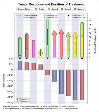
A Spider Plot is another way of presenting the Change from Baseline for tumors for each subject in a study by week. The plot can be classified by response and stage. Another way of displaying Tumor Response data was discussed earlier in the article on Swimmer Plot. This article is prompted
Over the past few weeks I have heard about the "Consort Diagram". This was mentioned in a Communities article, and also by a couple of users separately. This topic was also covered by Anusha Mallavarapu and Dean Shults from Cytel in a poster at PhUSE 2016 as shown on the
Last week I had the pleasure of presenting my paper "Graphs are Easy with SAS 9.4" at the Boston SAS Users Group meeting. The turn out was large and over 75% of the audience appeared to be using SAS 9.4 back home. This was good as my paper was focused on the cool new
In the area of graphical visualization of data, Edward Tufte is a thought leader and has put forth many innovative ideas that enhance the understanding of the information in the graph with minimal distractions and potential for misinterpretation. One of his ideas has been the use of "Spark" plots. As per my
Often I have written articles that are motivated by some question by a user on how to create a particular graph, or how to work around some shortcoming in the feature set to create the graph you need. This time, I got a question about Clinical Graphs that were mostly working
Last week I was visiting San Diego for the SANDS conference. I always enjoy this conference as I get to interact closely with the users to hear of their pains and innovative solutions to creating Clinical Graphs. In the conference Ed Barber asked about displaying A1c data along with some
A few weeks back I posted an article on ways to create a WindRose Graph using SGPLOT procedure. The process is relatively simple. Create (R, Theta) data with both numeric axes where the Theta is a value in the data range is 0-360, and R is the corresponding response value. Then
This weekend I was reviewing my portfolio of stocks as usual. Yes, I do have a small stock portfolio with a few stocks, and normally I use free stock charting software to review the stock plots. These sites allow you to view the daily stock prices along with many technical
As often is the case, this article is prompted by a recent post on the SAS/GRAPH and ODS Graphics page communities page. A user wanted to create a Graph Table showing a bar chart with tabular data for each of the category values along the x-axis. The user was creatively using
Last week I posted an article on displaying polar graph using SAS. When the measured data (R, Theta) are in the polar coordinates as radius and angle, then this data can be easily transformed into the XY space using the simple transform shown below. x=r*cos(theta * PI / 180); y=r*sin(theta * PI
There are many situations where it is beneficial to display the data using a polar graph. Often your data may contain directional information. Or, the data may be cyclic in nature, with information over time by weeks, or years. The simple solution is to display the directional or time data
Recently, I needed to view the list of products with the highest number of defects. I have a data set of defects reported against various products. The data set has over 30 products, and each observation contains the product name, name of the primary support person, and other relevant details of
A Turnip Graph displays the distribution of an analysis variable. The graph displays markers with the same (or close) y coordinate by displaying the markers spread out over the x-axis range in a symmetric pattern. Recently, a question was posted on the SAS Communities page regarding such a graph. Here is an example of
Often we see bar charts showing revenues or other related measures by a classifier using a visual of a stack of coins. Such visuals are not strictly for the purposes of accurate magnitude comparisons, but more for providing an interesting visual to attract the attention of the reader. In other words -
At the 2013 SAS Global Forum, I presented a paper titled "Make a Good Graph" which reviewed some of the features that make for a good graph. This paper presents an aggregation of ideas from various sources, including some recommendations from thought leaders in the graphics arena such as Edward Tufte,
The advent of the AXISTABLE statement with SAS 9.4, has made it considerably easier to create graphs that include statistics aligned with x-axis values (Survival Plot) or with the y-axis (Forest Plot). This statement was specifically designed to address such needs, and includes the options needed to control the text attributes of
A Volcano Plot is a type of scatter-plot that is used to quickly identify changes in large data sets composed of replicate data. In the clinical domain, a Volcano Plot is used to view Risk difference (RD) of AE occurrence (%) between drug and control by preferred term. One example of
Let us continue our review of the Clinical Graphs included in the CTSPedia repository. Today, I noticed this Heatmap of Benefits and Risks over Time for Subjects in a study by Treatment, submitted by Max Cherny using "R" code. I thought it would be a good exercise to see how to build this
Last week I was at PharmaSUG 2016, where I presented a 1/2 day seminar on creating Clinical Graphs using SAS. I was gratified to have a enthusiastic audience of about 28 attendees and we had a great interactive session. I also presented a paper on Clinical Graphs Using SAS. More
CTSPedia is a valuable resource for clinical research "... initiated to form an information resource created by researchers for researchers in clinical and translational science to share valuable knowledge amongst local researchers". This site includes a section on statistical graphs where you can find valuable information and a library of standardized
A few weeks ago I posted an article describing how to display simple Network Diagrams with Curved Links using SGPLOT procedure. The key requirement is that the node positions have to be computed by user. Often, for simple diagrams, nodes can be positioned using a simple layered layout. Separately, I also