At the 2013 SAS Global Forum, I presented a paper titled "Make a Good Graph" which reviewed some of the features that make for a good graph. This paper presents an aggregation of ideas from various sources, including some recommendations from thought leaders in the graphics arena such as Edward Tufte, William Cleveland and Naomi Robbins.
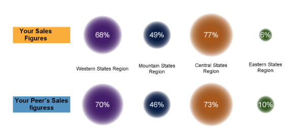 Recently, a question was posted on the SAS Communities site asking how to create the graph shown on the right using SAS. This graph is showing sales figures by company (and peer) by region using a bubble plot.
There are two issues here:
- How to make such a graph?
- Should you make such a graph?
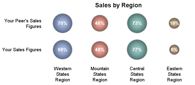 The answer to the first one is simple. The SAS SGPLOT procedure supports the BUBBLE statement that can create a graph like the one shown above.
On the right is one I created for the simple data in the plot using SGPLOT procedure. It is relatively easy to make and the generated visual is mostly like the one above, with a few differences. A more exact match can be created, but I stopped here. Here is the code.
Bubble Plot Code:
ods graphics / reset width=4in height=1.75in noborder imagename='Sales_Bubble';
title 'Sales by Region';
proc sgplot data=sales noborder noautolegend;
bubble y=Group x=Category size=value / bradiusmax=25 bradiusmin=12
group=category dataskin=pressed datalabel=value
datalabelpos=center datalabelattrs=(color=white size=8 weight=bold);
yaxis display=(noline noticks nolabel) fitpolicy=split valueattrs=(size=8);
xaxis display=(nolabel noticks noline) valueattrs=(size=8);
run;
Assuming the purpose of the graph is to better understand a company's sales vis-a-vis a peer, the second question becomes relevant. Using the bubble plot, it is relatively hard to make accurate magnitudes comparisons of sales figures between the company and its peers without the help of the numbers in the bubble.
The visual shown above would not be the best one to facilitate accurate magnitude comparisons. It has been shown by studies on the subject that using areas for comparison of magnitude is not very effective. A better way for such a goal would be usage of linear line segments from a common baseline. Also, it helps to bring the items to be compared close to each other.
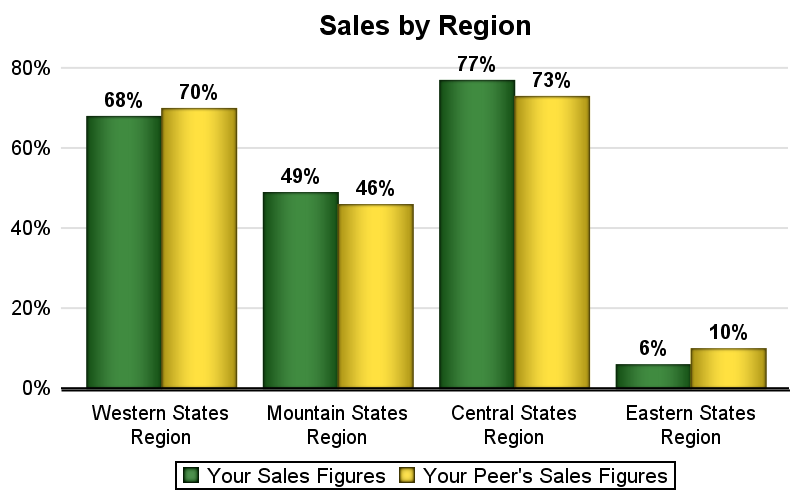 The clustered bar chart on the right provides a better visual for magnitude comparisons of sales by region between company and its peer. Putting the company and peer values adjacent allows for better comparisons which are clearly visible even without the numbers on the bars.
Bar Chart Code:
ods graphics / reset width=4in height=2.5in noborder imagename='Sales_Bar';
title 'Sales by Region';
proc sgplot data=sales noborder;
styleattrs datacolors=(darkgreen gold);
vbarparm category=Category response=value / group=Group
groupdisplay=cluster dataskin=pressed datalabel
datalabelattrs=(color=black size=8 weight=bold);
keylegend / title='';
yaxis display=(noline noticks nolabel) grid;
xaxis display=(nolabel noticks);
run;
Linear distance from common baseline along with proximity of items to be compared create a better graph. I am thinking it would be a good idea to have a thread for topics on how to create a "Good Graph". A bit close to "Good Grief", made famous by Peanuts. 🙂
Full SAS 9.40M3 code: Magnitude


3 Comments
An important consideration when plotting categorical data is the order of the categories. In this bar chart, the four regions are sorted geographically. Often a more relevant sort order is the magnitude of the response variable because analysts want to quickly locate the best performers and the worst performers.
Good point, Rick. Sorting by magnitude can certainly help. SGPLOT provides the CATEGORYORDER option to sort the categories by response. I need to look up what happens if GROUP is also in effect.
Yes. Keep it simple is a good guideline for graphs.
Another fault with the original is that it does not explain the percentages. Percentages of what? I'm guessing it might be of the total market in each region. The reader should not have to guess.