Last week I had the pleasure of presenting my paper "Graphs are Easy with SAS 9.4" at the Boston SAS Users Group meeting. The turn out was large and over 75% of the audience appeared to be using SAS 9.4 back home. This was good as my paper was focused on the cool new and useful features released with SAS 9.4 release, the most prominent of these (in my opinion) are the AxisTable statements that make it very easy to add axis-aligned textual information to the graphs.
A mixer was organized on the upper floor of the Microsoft NERD building that afforded great views of the river. Here, I got an opportunity to chat with attendees and her their opinions. During these conversations I noted that many users were very excited about the new graph features, but were not using these procedures for various reasons. So while I peddled this blog every chance I got, it became clear to me that we could use some "tutorial" style articles, geared towards the new user.
So, here is the first of such articles focused on the SGPLOT procedure. The SGPLOT procedure is really a great way to create graphs, from the simplest Scatter Plot to complex Forest Plots. The SGPLOT procedure supports multiple plot statements like Scatter, Series, Step, Histogram, Density, VBar, HBar, VBox, HBox, HighLow and many many more. These statements can be used individually to create many basic graphs. Many of these statements can also be combined to create more complex plots.
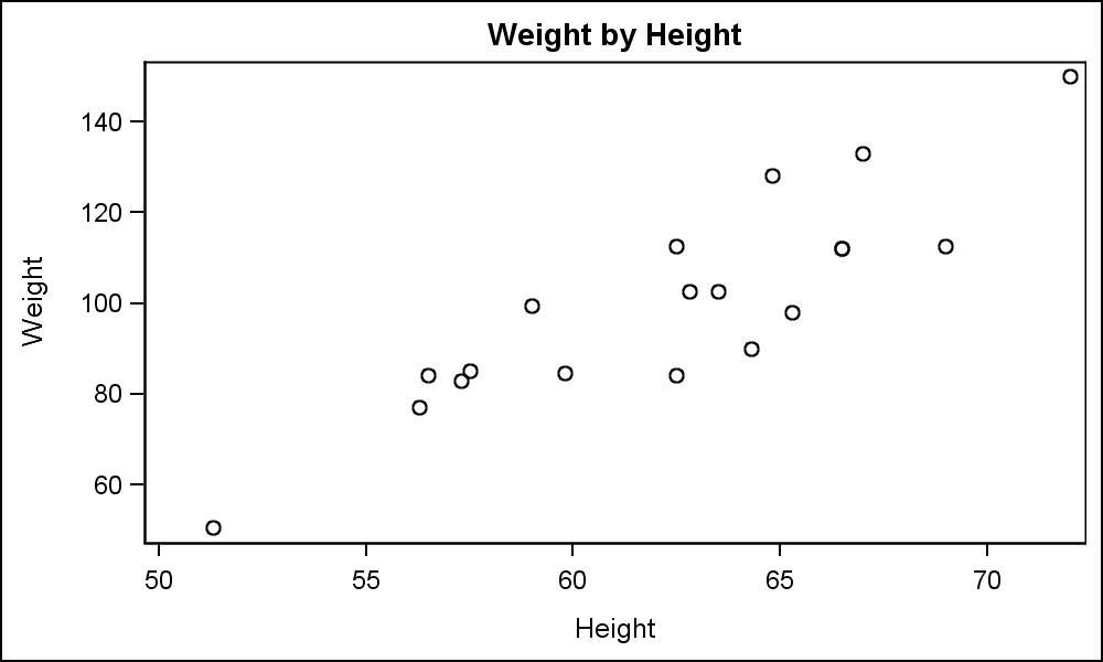 In this article, we will explore some of the key features of the Scatter plot, arguably the most simple, useful and commonly used plot. The most basic use case is shown on the right, displaying the weight x height for all the observations in the sashelp.class data set.
Click on the graph for a higher resolution image. The program code is shown below.
title 'Weight by Height';
proc sgplot data=sashelp.class;
scatter x=height y=weight;
run;
What could be simpler than the code above? The graph created by the SGPLOT procedure uses predefined style information to render a clean and uncluttered graph using the principles of effective graphics as recommended by thought leaders in the industry. Axis extents are derived from the data, and ticks on the axis are drawn only when necessary. Statement options are available to customize the graph.
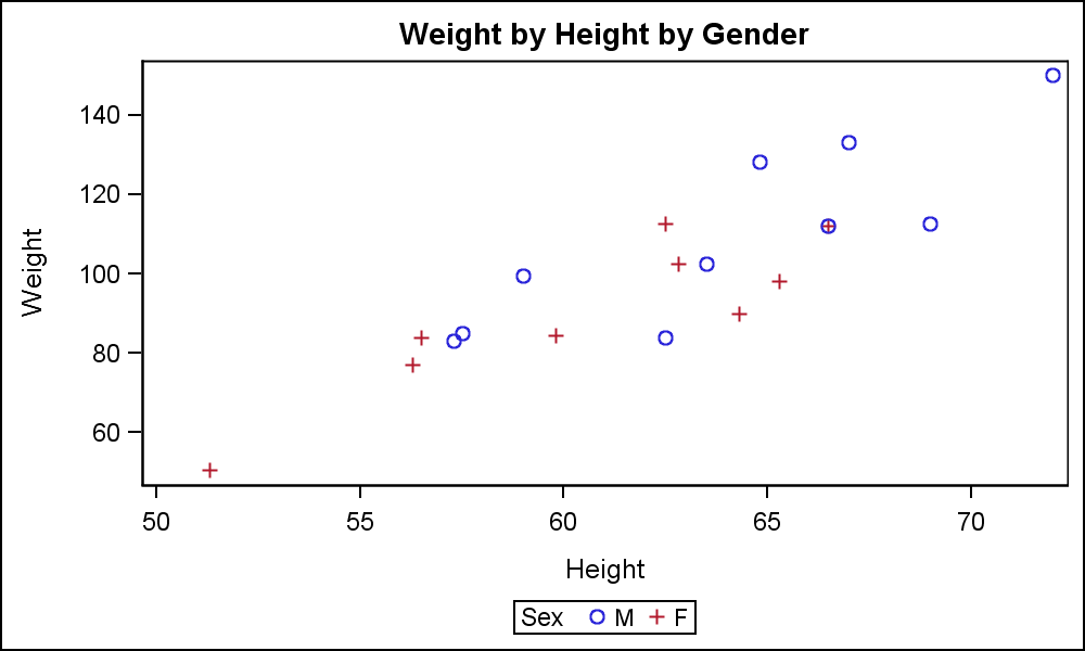 The graph on the right displays the same data by Gender of each student. Now, different marker shapes are automatically selected from the Style to represent the male and female persons in the graph. A legend is automatically displayed in the default location at the bottom of the graph.
title 'Weight by Height by Gender';
proc sgplot data=sashelp.class;
scatter x=height y=weight / group=sex;
run;
When a group role is in effect, the different unique values from the group variable are assigned distinct marker shapes and colors. The marker symbol and color are cycled at the same time for most styles with ATTRPRIORITY=none. For some styles like HTMLBlue, the ATTRPRIORITY=color. For such styles, only the color is cycled first. After all 12 color values are used up, then the marker symbol is changed. ATTRPRIORITY can be set to 'Color' or 'None' for any program in the ODS GRAPHICS statement to obtain the preferred cycling of attributes.
 Group attributes are obtained from the Style that is associated with the destination. If you want to use custom group colors and or symbols, you could derive a new style from an existing one and change the color and symbol settings for the GraphData1-12 elements in the style. This can be done using the TEMPLATE procedure or use the %MODSTYLE macro. An easier way is to set the group data colors and or symbols in the program code using the STYLEATTRS statement.
title 'Weight by Height by Gender';
proc sgplot data=sashelp.class;
styleattrs datasymbols=(circlefilled trianglefilled)
datacontrastcolors=(olive maroon);
scatter x=height y=weight / group=sex filledoutlinedmarkers
markerattrs=(size=12) markerfillattrs=(color=white)
markeroutlineattrs=(thickness=2);
keylegend / location=inside position=bottomright;
run;
In the graph and code above, we have made the following customizations:
- We have defined the list of symbols to be used for the groups.
- We have defined the list of colors to be used for the groups.
- We have requested the use of "filled and outlined" markers.
- We have moved the legend inside the data area.
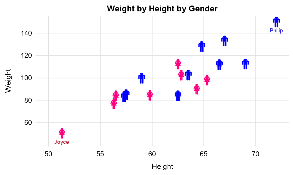 Finally, in the graph on the right, we have used custom symbols to represent the "male" and "female" persons in the data. Click on the graph for a higher resolution view.
Here are the steps we have used to create this graph:
- We have defined two custom named symbols using the SYMBOLIMAGE statement. Each symbols uses an image file to define the shape and color.
- We have provided these two named symbols in the list of symbols for drawing the graph.
- We have disabled the axis lines and ticks and enabled the grid lines.
- We have disabled the graph and data area borders.
- We have also removed the legend as the shapes are self explanatory.
- Also note, we have displayed the names of the students with the extreme weight values. The names are displayed below the marker. All names are not displayed to avoid clutter.
SGPLOT procedure code is shown below. See the link at the bottom for the full code.
title 'Weight by Height by Gender';
proc sgplot data=class noborder noautolegend;
symbolimage name=male image="&fileM";
symbolimage name=female image="&fileF";
styleattrs datasymbols=(male female);
scatter x=height y=weight / group=sex markerattrs=(size=20)
datalabel=label datalabelpos=bottom;
xaxis offsetmin=0.05 offsetmax=0.05 display=(noline noticks) grid;
yaxis offsetmin=0.1 offsetmax=0.05 display=(noline noticks) grid;
run;
Full SAS 9.4 SGPLOT Code: getting_started_1_scatterplots


8 Comments
Sanjay, Thanks for a nice tutorial. I learned a lot! There are so many new features in ODS Graphics, and it's easy to understand what is happening when you see the evolution from a very simple, default graph to a very polished, customized one. Susan
Thanks for the endorsement, Susan. Even after the excellent introduction to these new procedures in Chapter 8 of your "The Little SAS Book", there are a lot of users who have not used them. I hope this will help them get started.
Sanjay,
Good stuff. I'm hoping we can bring you back to Richmond so you can present this to the Virginia SAS Users Group.
Brian
Wow, my last visit to VCU in Richmond for Virginia SUG was in 2013. There have certainly been many good improvements to the software to speak about.
Pingback: Getting started with SGPLOT - Part 2 - VBAR - Graphically Speaking
Pingback: Getting started with SGPLOT - Index - Graphically Speaking
This worked beautifully!
Thank you.
Here is an example for changing the attrpriority statement:
ods graphics on / attrpriority=none;