As often is the case, this article is prompted by a recent post on the SAS/GRAPH and ODS Graphics page communities page. A user wanted to create a Graph Table showing a bar chart with tabular data for each of the category values along the x-axis. The user was creatively using a VBAR overlaid with multiple VLINE statements using SAS 9.40M?. The VLINE statements were used to display the statistics.
 I applaud the creativity of the user, who has clearly taken to heart the lesson that multiple plot statements can often be used creatively to build the graph you may want. Prior to SAS 9.4, this was one way to overlay additional textual data on a graph that contains a VBAR. However, with SAS 9.4, there is an easier way - AxisTable.
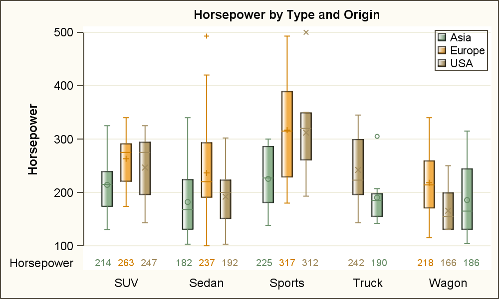
While we have discussed AxisTables in earlier articles, it seems worthwhile to review the subject. The graph above right shows how you can display multiple rows of data statistics aligned with the x-axis categories. The group values are clustered as shown for the box plot and in the table below it. Click on the graph for a higher resolution image.
 Our goal is to create the graph above. Let us start with a cluster grouped box plot along with textual display of data. In the graph on the right, a box plot of Horsepower is displayed by Type with Group=Origin for the data set sashelp.cars. The group values are clustered side-by-side. An xAxisTable is used to display the associated values for Horsepower, also classified by Origin.
Note, since the CLASS option is used with the xAxisTable, the statistical values for the three levels of "Origin" are displayed stacked under each category on the x-axis. Each class value is displayed on the left.
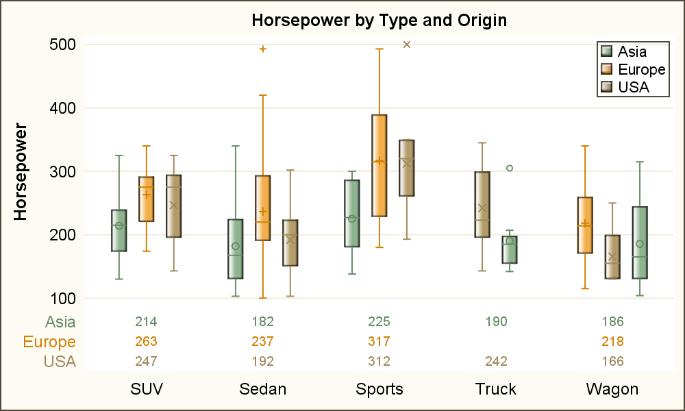
 With SAS 9.40M3, the CLASSDISPLAY option was added to allow the display of the class values in the clustered arrangement as shown on the right. Using CLASSDISPLAY=CLUSTER, values for each class are displayed side by side, and arranged in the same way as in the box plot. Now, the name of the variable is displayed on the left of the values. Note, we have used the COLORGROUP=Origin to color each value by the same variable to provide a visual that is easier to decode.
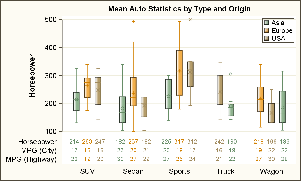
 The benefit of this option is that multiple statistics can be displayed with such grouped plot statements. The graph on the right shows the mean values for Horsepower, Mpg_City and Mpg_Highway. More variables can be used if necessary.
SAS 9.40M3 Code for grouped Box Plot with Table.
title h=10pt 'Mean Auto Statistics by Type and Origin';
proc sgplot data=sashelp.cars(where=(type ne 'Hybrid')) noborder;
format mpg_city mpg_highway horsepower 3.0;
styleattrs axisextent=data;
vbox horsepower / category=type group=origin name='a'
groupdisplay=cluster dataskin=gloss
meanattrs=(size=6) outlierattrs=(size=5);
xaxistable horsepower mpg_city mpg_highway / class=origin
classdisplay=cluster stat=mean
colorgroup=origin location=inside nostatlabel;
xaxis display=(nolabel noticks noline);
keylegend 'a' / location=inside position=topright across=1 title='';
yaxis grid;
run;
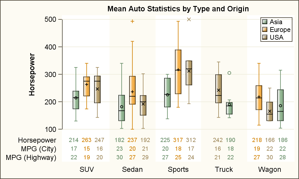 Finally, the user wanted to add vertical divider lines (column border) to separate the column of values. Unfortunately, the AxisTable statement does not currently support column or row borders. However, the x-axis color bands could be used to create such a grouping as shown in the graph on the right. Click on the graph to see this more clearly. The banding intentionally uses a soft color, matching the color of the background. However, that can be controlled in the syntax.
A Graph Table is very effective for display of results of an analysis. The AxisTable is ideally suited to help create such visuals. Graph Tables such as the Survival Plot or the Forest Plot are popular examples of the usage of Axis Tables.
Full SAS 9.40M3 code for Graph Tables: GraphTableWithClass


6 Comments
Sanjay,
Somehow I can't access your site named "Graphically Speaking Index". Is that under construction?
Ethan
Yes, last week there was a change in the Web site that caused the hiccup. This is now fixed.
Apologies for a comment that is not related to this post (though it is an interesting post). But I wanted to make you aware that the link to the "Visual Index of Blog Articles" is currently producing a "Page not found" error.
http://support.sas.com/rnd/datavisualization/graphicallyspeakingindex/
I have followed up on this matter. It appears some changes were made to the way the website is designed that has caused this break. I hope it will be fixed soon. It is good to note however, that you are finding this index useful. Good to know.
Update: This is now fixed.
Is it possible to create this plot by SAS GTL?
Absolutely! A fast way to see the GTL for this example would be to use the TMPLOUT="temp.sas" on the Proc SGplot statement to dump a GTL template to "ftemp.sas". tt will give you a great starting point for your own template.