A few weeks back I posted an article on ways to create a WindRose Graph using SGPLOT procedure. The process is relatively simple. Create (R, Theta) data with both numeric axes where the Theta is a value in the data range is 0-360, and R is the corresponding response value. Then simply transform the (R, Theta) values to (X, Y) using the transform shown in the article and plot the data as a regular rectangular XY plot.
 A reader chimed in asking whether it was possible to create the graph shown on the right using a similar process. This graph was published in a report on Post Secondary School Success.
While I feel confident such data could be displayed in the manner shown on the right, it was not clear to me if this is indeed the best way. Here are my concerns:
- The categories around the circle have no real positional information.
- The categories do not add up to 100%, normally expected for a Pie Chart.
- The categories do not have any directional or "cyclic" information.
- The "subgroup" values are harder to compare as it is not clear if they are represented by the radial value or the segment area.
- Each subgroup label and value has to be individually labelled using some custom tool.
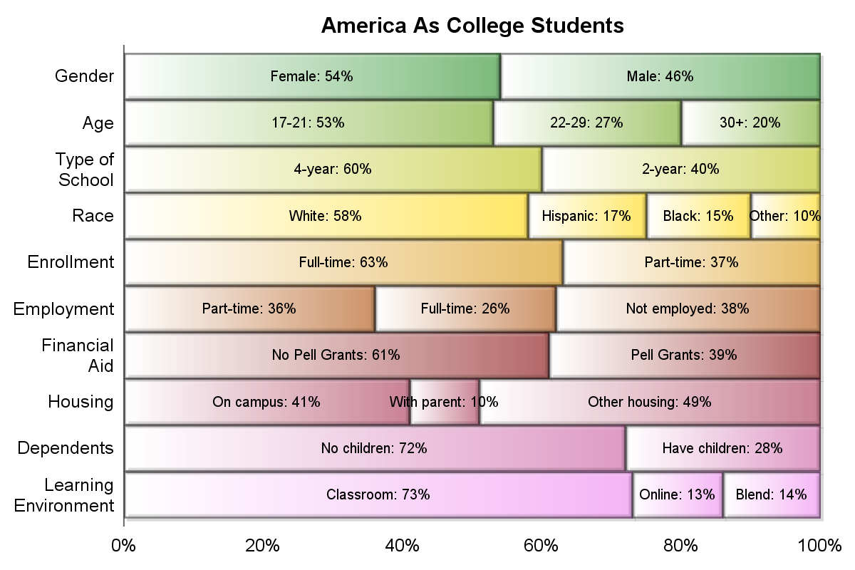
 While the graph above is attractive, the information is may be easier to consume as a Likert graph shown on the right. Click on the graph for the full resolution graph. This representation of the data on the right follows the principles of effective graphics and has the following benefits:
- The categories are shown as horizontal bars.
- The subgroups add up to 100% for each category.
- Subgroup magnitudes within the category are easy to compare.
- Subgroup magnitudes can even be compared across categories.
- Labelling is done programmatically. No custom labeling is required.
- Y-axis label splitting is used to fit the categories.
- Since both subgroup label and value are displayed in the segment, we have to compute the label, and its location to display the label using an overlaid TEXT plot.
- Custom labeling may be needed for very small segments.
SGPLOT code for the graph:
title "Top 100 American Colleges";
proc sgplot data=labels noautolegend subpixel nocycleattrs noborder;
hbarparm category=category response=value / group=group dataskin=crisp barwidth=1;
text y=category x=Lbl_Loc text=label / contributeoffsets=none textattrs=(size=7);
xaxis display=(nolabel noticks noline);
yaxis display=(nolabel noticks noline) fitpolicy=splitalways splitchar='^';
run;
 One could make the graph more visually interesting. Here I have used gradient color for each horizontal bar using the ColorGradient option. I have also set FillType=Gradient so each segment is drawn distinctly. Color itself is not significant, so no legend is needed. Click on the graph to see the high resolution graph.
Also see my previous article on Likert Graphs.
Full SGPLOT code: Likert

2 Comments
Sir, this is a great chart. However, when I try to run the code on SAS 9.4m2, it throws an error around colorresponse and colormodel options. Any workarounds for these errors?
Likert scale questions are simple to create, easy to complete, and can open your eyes to the feelings of people. They reveal the intensity of the feelings of an individual concerning a particular subject. Read more here: https://ppcexpo.com/blog/Likert-scale-questions