Just this morning I received a request for a brief survey from Apple on my feedback about the new iPhone6+. Yes, I finally got one, dead last in the family. The survey followed the usual format, with a number of questions on what I like or dislike about it, with a 5 level scale for my response - Strongly Agree, Agree, Neutral, Disagree and Strongly Disagree.
Coincidentally, I recently also received an article from a co-worker on making Likert Graphs using R. So, my curiosity was stirred, and I proceeded to dig into it. Turns out these graphs are frequently used to evaluate the response data for such surveys and I was curious to see how far I could get using SAS 9.3 SG procedures.
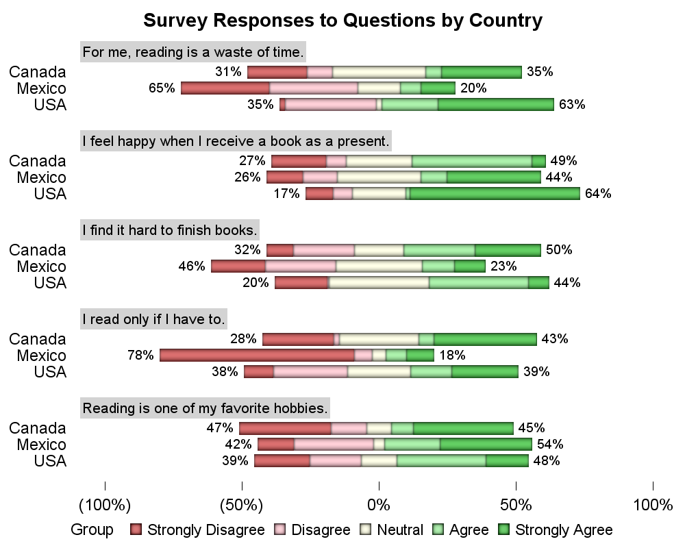
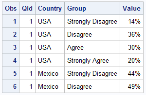 I proceeded to make up some survey data based on the sample I saw in the article, which was a survey on books in 3 countries with 10 questions or statements. The answers are summarized into the 4 or 5 groups. Here I have used 4 groups. Later I will show an example with 5 groups.
The data looks like the table on the right, each question has a QID for our convenience. The question itself is also in the data but I did not include it here to keep the table relatively narrow. The statement is like "Reading is one of my favorite hobbies".
 My data is sorted by the Qid, Country and Group. I can process the data and compute Low and High values for each group, starting with zero. You can see the data step in the full program attached below.
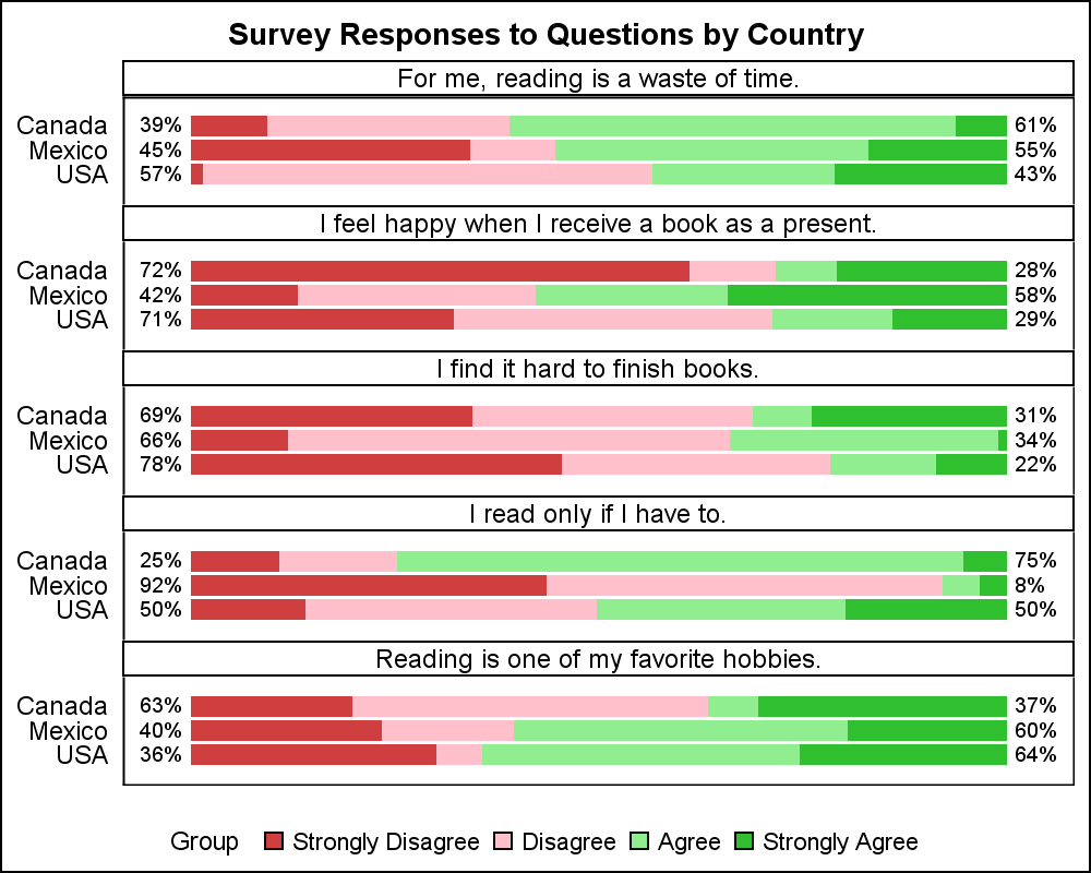
First, I want to use SAS 9.3 features to create the graph using the SGPanel procedure. I used the PANEL layout, with the Question as the class variable. Each question is displayed in the cell header, with a HighLow plot in each cell showing the summarized percent values for each response group by country.
SAS 9.3 SGPANEL procedure syntax:
ods listing style=styles.likert; title 'Survey Responses to Questions by Country'; proc sgpanel data=Likert_4 ; panelby question / layout=panel columns=1 onepanel novarname noborder nowall; highlow y=country low=low high=high / group=group type=bar nooutline lowlabel=sumdisagree highlabel=sumagree; rowaxis display=(nolabel noticks) fitpolicy=none; colaxis display=(nolabel noticks novalues); keylegend / noborder; run; |
As you can see, the basic graph is very easy to create using the SGPANEL procedure syntax shown above. Note, I have used the MODSTYLE macro to derive a new style with the colors I want to use and specified it on the ODS Listing statement.
Also note in the graph and code above, I have used the LowLabel and HighLabel options of the HighLow plot to display the cumulative % of the disagree and agree values at each end. The SAS 9.3 SGPANEL procedure does not provide an easy way to turn off the cell and header borders. So, I have derived a style from the Likert style to turn off borders and axis lines.
 /*--Create style to suppress border and axis lines--*/
proc template;
define style styles.noborder;
parent = styles.likert;
class GraphBorderLines / lineThickness=0px;
class GraphAxisLines / linethickness = 0px;
end;
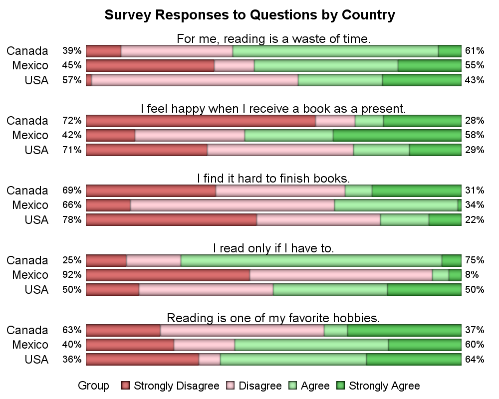
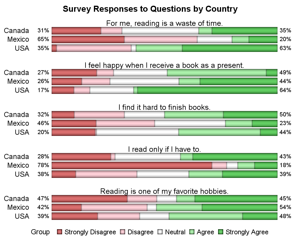
Now, I have used this new NOBORDER style, along with some SAS 9.4 display options to create the graph shown on the right. I have suppressed the panel HEADER, displayed the question using a new INSET option and used a skin for the HighLow plot as shown above.
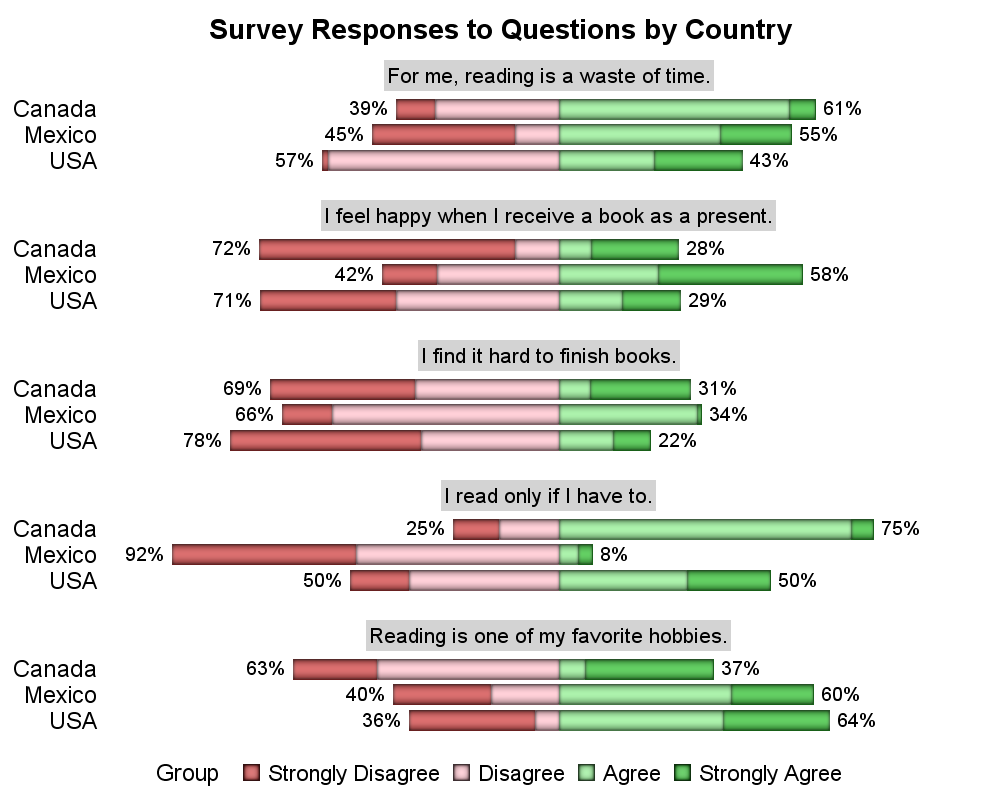 In the graph on the right, I have positioned the strip such that the zero value is at the center of the x axis. This alternate view may provide a better feel for the trend, whether negative or positive. Of-course, this data is simulated using random numbers, so any trend is accidental.
The x axis is now set to span from -100% to 100%. Each strip no longer spans the entire x axis, so I added an inset background to allow the "Question" to stand out a bit from the rest of the text information in the graph.
 The same technique can easily be extended to the 5 group level case as shown below. The graph on the near right shows the full spanning strips, with a "Neutral" group in the middle. The graph on the far right centers the middle of the neutral segment at zero on the x axis. Also, I moved the inset labels to the left side.
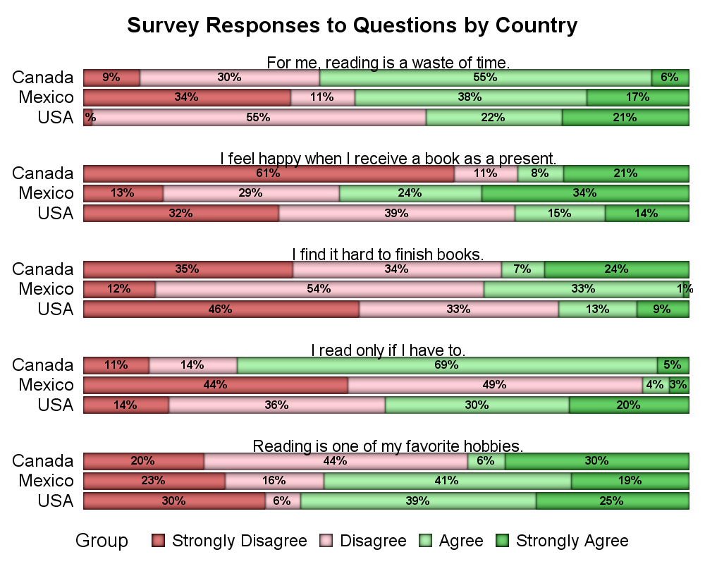 Finally, the graph on the right shows the 4 group graph with segment labels. Here I have used the new SAS 9.4 VBarParm statement to draw the strips with stacked groups instead of the HighLow bar. I have used the SEGLABEL option to automatically label each segment. I did not include the High and Low labels from the HighLow plot, but if needed, that can be done.
As usual, this exercise flushed out some deficiencies in the code, but mostly to the lack of a way to turn off the header borders. We will be sure to address such issues.
Full SAS code: Likert_SGPanel2

4 Comments
Thanks for the interesting presentation with lots of options. I think everyone will be able to find a presentation that they like.
I am partial to the "butterfly plot" in which the bars are centered at the neutral response. However, in the five-response plot, I prefer not to include the "percent positive" and "percent negative" labels at the ends of each bar. I think they conflict with the axis tick marks for the horizontal axis. For example, there are several bars that hang to the right of the 50% reference line, but have labels that are less than 50%. I think it is confusing to have 50% mean two different things on the same graph.
Just a quick question ... when running your program on SAS 9.4 (TS1M1) we get syntax errors in te nolabel, groupdisplay=stack, and seglabelfitpolicy=none.
Are these options only in later maintenance releases of 9.4?
Thanks
Eric
That is quite possible. Just remove the offending options.
Pingback: Likert Graph Revisited - Graphically Speaking